Fantastic Emails and Where to Find Them

More emails? Do marketing folks still get excited about that?
The answer to that question should be yes. If it’s not, let’s take a few minutes to reignite that once burning passion of yours.
All marketers know that sometimes, a small spark of inspiration is all you need to set off a chain-reaction of creativity and drive. In many cases, that first step of finding your inspiration can be the hardest step.
Here at Knak, we take that first step for you with our Inspiration Centre and Email Gallery. We just added some exciting new examples to our gallery, and are thrilled to share them with you.
What is the Email Gallery and Inspiration Centre?
Let’s start with the Inspiration Centre. The Inspiration Centre allows users to take fully designed, real-world emails (and landing pages!) and adjust them with Knak’s no-code email builder. Instead of using your classic “Lorem Ipsum” text and placeholder images, Knak uses real emails from recognizable brands, giving our community the opportunity to make their own edits, add their own touches, and redesign with their own unique branding.
The Email Gallery features the best examples from the Inspiration Centre. Every email showcased in the Email Gallery is hand-picked; we even explain why. The emails showcased in our gallery highlight the best of recent email marketing campaigns. We break the emails down individually, analyzing the type of email and why each one is a fantastic example.
What's happening in 2024 with Email Marketing?
What isn’t happening in 2024 with email marketing? I could write three blogs answering this question alone.
Recently, I was scrolling through Google and came across a "People Also Asked" box that said "Is email marketing still relevant in 2024?". I laughed.
By the end of the year, there’s to be an estimated 4.76 billion email users, with 361 billion emails sent per day. Read that again.
So to whoever asked, “Is email marketing still relevant in 2024?”, yes, yes it is still relevant.
Email marketing is constantly evolving and continues to adapt, utilizing the technology and trends that seem to be hitting the market at an ever increasing rate. With an overall ROI of over 4200%, it’s one of the best investments a company can make. Now, more and more companies are starting to catch on and up their email marketing game. If you're interested in the impact that this is having on businesses, check out this blog by HockeyStack for a deep dive into email marketing, conversions, and revenue in B2B SaaS.
Some of the biggest trends in email marketing include personalization, dynamic content, integrations, interactive emails, mobile optimization, automation, and of course, AI. However, none of these topics rival the rise of no-code campaign creation using modular development to build emails. Knak’s drag and drop email builder is the best in the market. Conveniently, it also is on top of the game with every single trend listed at the beginning of this paragraph.
Greatest Hits from the Email Gallery
Below, you'll find our best examples from the new additions to the Email Gallery, hand-picked to showcase excellency in enterprise email marketing.
Newsletter Email Example - Ford

Newsletters in 2024 are one of the most commonly used email marketing strategies. This is a fantastic example of a monthly newsletter by Ford. Their January newsletter highlights some big accomplishments and tells their audience about it in style. Here’s what we like about it:
- Using clean, captivating visuals, they highlight their feature products with design work that almost appears to jump off of the screen.
- Their CTAs are phenomenal. Not only do they use unique language like “Pop the Hood”, but they are also strategically placed at the beginning, middle, and end of the email, maximizing their chances of engagement.
- Although they make bold claims about their products, they effectively use facts and statistics to back up their statements. Providing heavy statistics and proof can easily bore a reader, but Ford does it exceptionally well here by bolding important text and using visuals elements like logos and badges to increase readability.
Webinar Email Example - Zoom
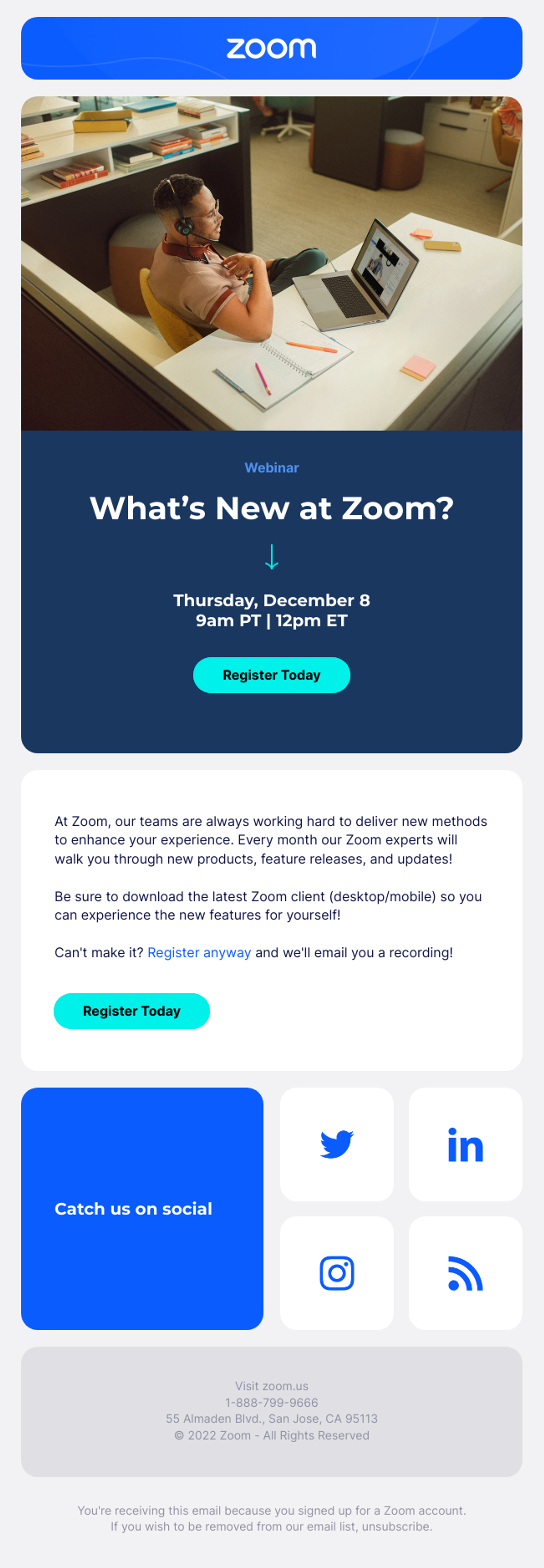
Boosting registration for your webinar can be tough. However, with a great webinar email invite, you can make it a whole lot easier. Zoom exemplifies a fantastic webinar invite with this email. Here’s what we like about it:
- The CTA is impossible to miss. With a simplistic email design and a clear CTA, zoom does a great job of making it easy and compelling for readers to sign up.
- The event details are highly visible. The location and visibility of event details are an underlooked factor of webinar invite success - if they aren’t easy to find, readers can easily become frustrated and close the email
- Zoom offers absent registrants a recording of the video. They do a great job of making this clear to readers who want to watch but cannot attend. Expressing this highlights that they care and are willing to adapt to every customer’s unique needs.
Virtual Event Email Example - Miro
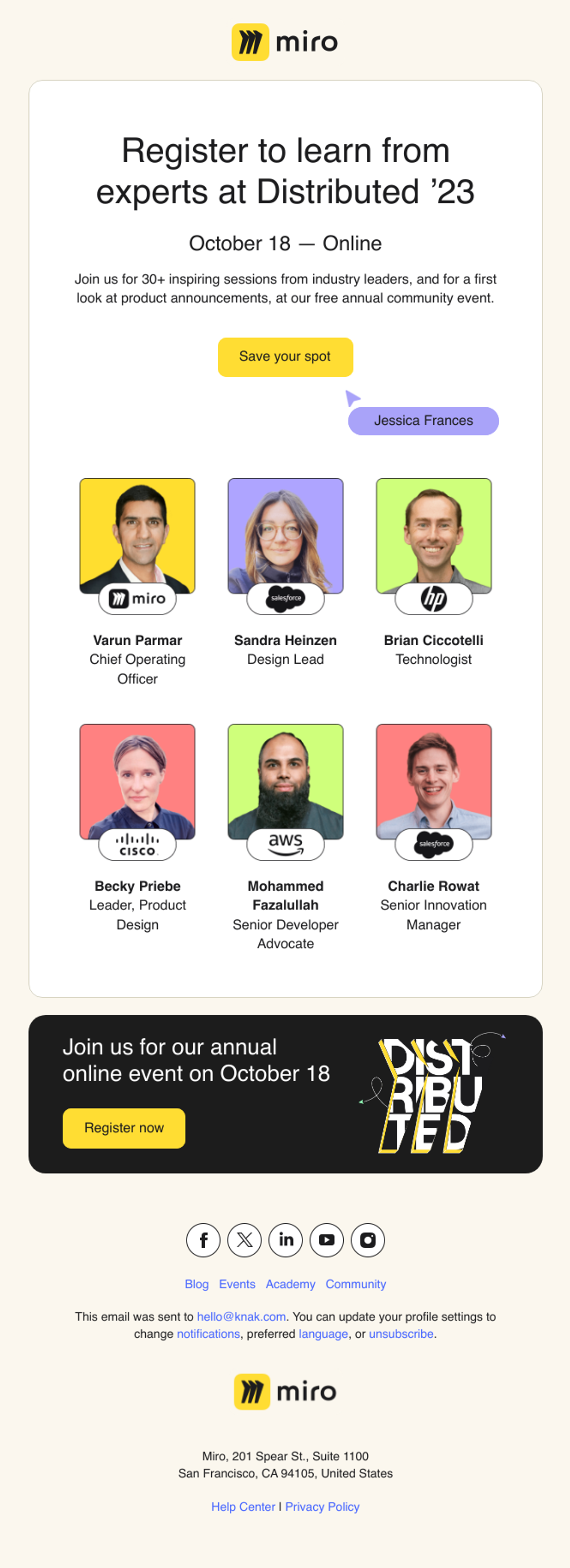
Gathering a large audience for a virtual event can be tricky business, but it’s not impossible. The following example by Miro utilizes some key methods that organizations should consider following. Here’s what we like about it:
- Personalization in emails has been happening for a long time, but can still be impressive when done well. Miro does this in a creative way around the CTA.
- Not only do they highlight their industry professionals, but they also include pictures, logos, and job titles. Great way to build credibility and hype.
- The email is purpose driven and simple to read. With limited copy but lots of beautiful design to back it up, clicking the CTA is increasingly enticing.
Product Update Email Example - Withings

Nowadays, most people are at least slightly aware of the marketing tactics we use on them to push products and services. The trick now is how to promote our businesses in ways that make viewers want to read on, regardless. In this product update email, Withings makes it hard not to read on. Here’s what we like about it:
- Their use of visuals is amazing. They use contrasting colors and open space to increase visibility. The images display how the product works, allowing their target audience to envision themselves using the product.
- The copy is simple and easy to read. In fact, the whole email takes a minimalistic approach that is simple and easy to read.
- Although they have multiple CTAs, they all have one overarching message: learn more. Instead of pushing readers to “buy now”, or “add to cart”, they invite them to learn more about the product and how it can help them.
In-Person Event Email Example - Apple

When it comes to in-person events, so much time goes into planning the event. Because of this, amassing an audience can be a struggle. Having a good invite is necessary, and Apple excels with this example. Here’s what we like about it:
- Apple displays their iconic brand in this email that blends simplicity and minimalism with sleekness. In addition, it is highly compatible in dark mode.
- The content is short, concise, and easily digested. Given this is an early outreach email, it builds hype just as intended.
- The short email directs towards a single, easy-to-spot CTA, eliminating any confusion for readers and increasing engagement.
Content Download Email Example - Marvel
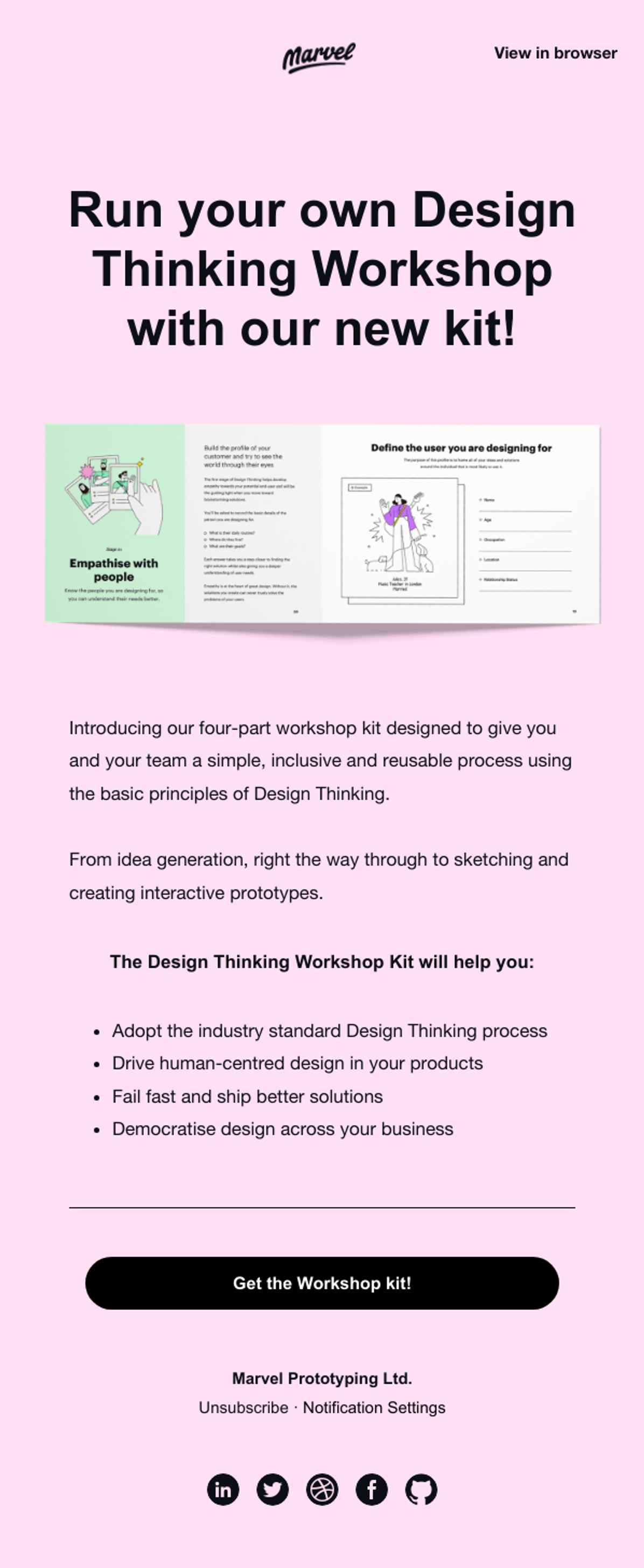
Enticing readers to download content from your email is no easy feat. Marvel does a great job of promoting their Design Thinking Workshop Kit in this email. Here’s what we like about it:
- Marvel doesn’t keep their audience guessing - they clearly outline why and how their workshop kit will help you with four concise bullet points.
- They use a singular, strong CTA that stands out from the rest of the email. Using a large black button on a light pink background ensures that anyone who’s looking to download their kit has easy access to it.
- The entire email is very succinct, boasting high readability. With lots of empty space and to the point copy, Marvel wastes no time in highlighting the core purpose of this email.
Welcome Email Example - Spotify
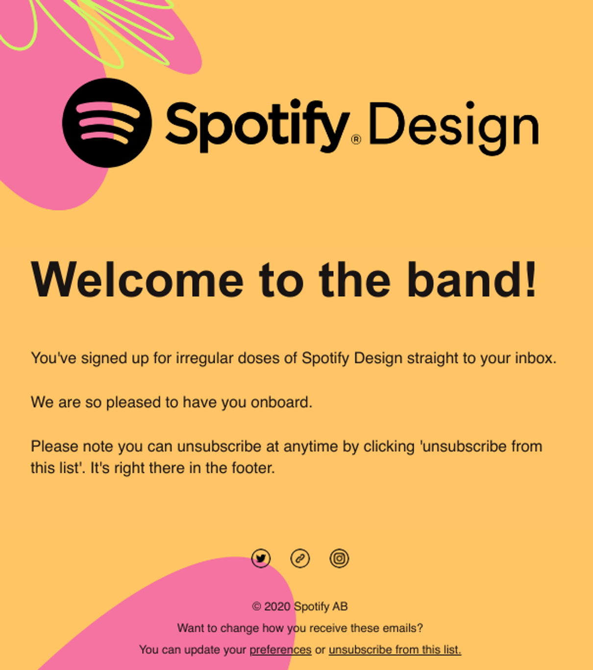
What’s worse than small talk? Unnecessarily long welcome emails. In this example, Spotify demonstrates how you can welcome a new member to your community without wasting anyone’s time. Here’s what we like about it:
- They clearly communicate what to expect; a lot of emails. By keeping things clear and simple, Spotify is starting this new relationship off on the right foot.
- It’s a purpose driven email. Instead of information overload, Spotify sends this easy-to-read email to let the reader know that they have successfully joined the club.
- They give a direct opportunity for the member to unsubscribe. This essentially screams “we don’t want you here if you don’t want to be here”. Again, by setting this tone early, readers know exactly what they have signed up for.
Promotional Email Example - Skillshare

These days, people are constantly bombarded with emails attempting to promote a product or service. With this in mind, it’s important to be able to differentiate your promotional emails from your competitors. Skillshare’s example stands out from the rest. Here’s what we like about it:
- The most important part of a sign-up email is the CTA. Skillshare puts their CTAs in the most visible locations - the top and bottom of the email.
- Skillshare outlines their unique value propositions, distinguishing themselves from competitors and further enticing sign-ups.
- Colour choices are extremely important in email marketing. Skillshare uses contrasting colours to increase readability and highlight their CTA.
Product Onboarding Email Example - Dropbox
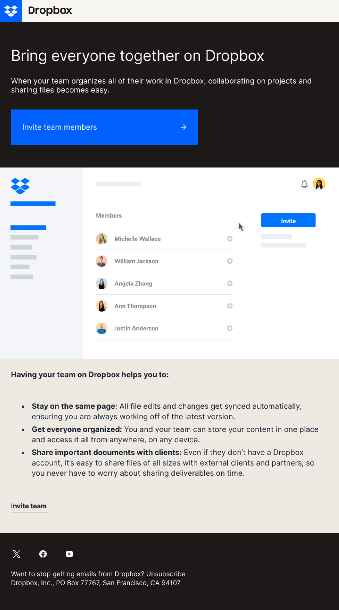
First impressions matter. Effectively onboarding a new customer is essential in creating a strong, long-lasting relationship. Product Onboarding emails are a great way to ensure you achieve this with your new customers. Dropbox showcases how they do so in the example below. Here’s what we like about it:
- Their CTA is excellent. Not only is it highly visible, but it effectively invites their new customer to fully take advantage of the product by inviting their team to join.
- The imagery helps the reader visualize their next steps. It gives them a snapshot idea of what it would look like to have their own team on the platform, making the CTA even more enticing.
- At the bottom, they clearly outline their value propositions, bolding the major takeaways to ensure high readability.
News Announcement Email Example - Logitech

There’s only one thing better than a big win: sharing that big win with your community. News Announcement Emails are an excellent way to share exciting news to your audience. In this example, Logitech celebrates the success of Lando Norris and McLaren. Here’s what we like about it:
- The use of photo and video elements is highly impactful, creating a complete email from start to finish.
- Logitech uses this opportunity to push multiple CTAs. From learning more about the victory story, to checking out racing simulation gear, Logitech gives the reader many attractive options.
- Branding elements throughout the email are clean, aesthetic, and promote Logitech’s message as a masterclass, top-tier brand.
Confirmation Email Example - Vimeo
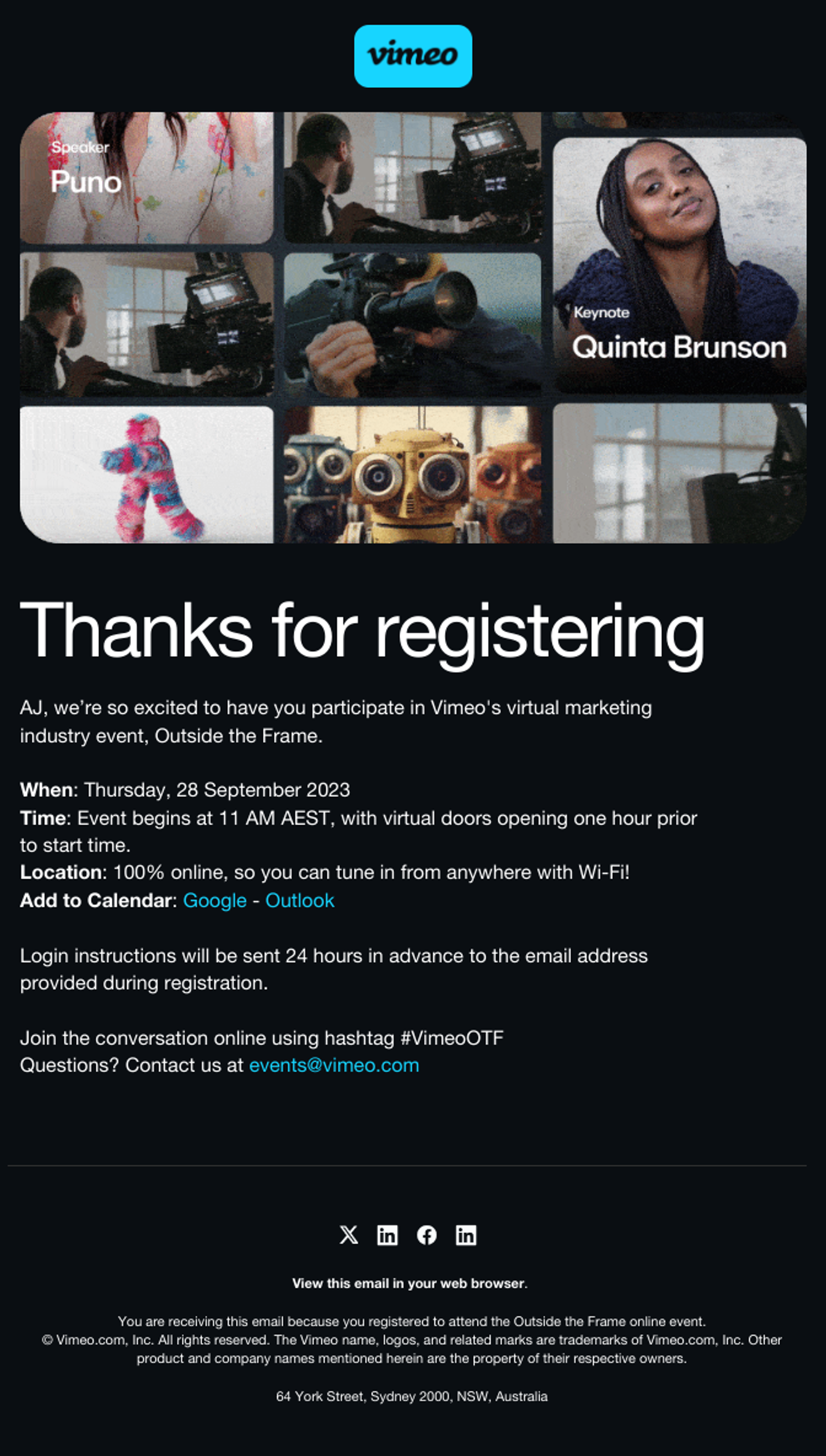
Everyone loves to feel confirmation and validation. Confirmation emails are integral to ensure your audience successfully signs up for your products, services, events, and more. Let’s dive into an event confirmation example from Vimeo. Here’s what we like about it:
- Vimeo gives the reader an option to add the event to their calendar. This is an extremely effective way to ensure attendees stay reminded of your event.
- The imagery is visually striking, highlighting their unique branding. In addition, they integrate their speakers into the design.
- Key points regarding event details are highlighted in bold. Information like this must be highly visible in a confirmation email to create a fast, easy process for the reader.
Event Follow-Up Email Example - Stripe

Following up after events is an impactful way to solidify new connections and potential leads. Using a sleek and engaging event follow-up email is one of the best, easiest ways to do so, and Stripe does it wonderfully with this example. Here’s what we like about it:
- Stripe summarizes the key learnings from their conference, highlighting what to expect with their recap guide.
- The copy is highly succinct, which results in a reader-friendly, scannable email.
- Event follow up emails shouldn’t be complicated. Stripe simplifies theirs with a clear, easy to spot CTA that is supported by the points made above.
Customer Appreciation Email Example - TurboTax

We love our customers. Everyone does. After all, what would we do without them? Showing customer appreciation is crucial to keep loyal customers, and TurboTax does it very well with this example. Here’s what we like about it:
- Their offer is clearly highlighted. No one wants to beat around the bush with marketing emails, so TurboTax gives their offer plainly and visibly.
- Next steps are easy to spot. With a secure code (that also adds an interactive element!), customers can immediately redeem their offer.
- TurboTax integrates their stunning branding throughout the entire email. Making beautiful emails can be tough, but this one is done exceptionally well.
Survey Email Example - Uber

Collecting customer feedback is one of the best ways to improve your product offering. However, you can’t collect feedback from anyone if they don’t fill out your survey. Check out this survey request email from Uber. Here’s what we like about it:
- The copy is well written and inviting. Instead of demanding, Uber invites readers to participate in the survey, even asking if they have a few minutes to spare.
- A visible CTA is always important, especially for a survey email. In this example, Uber places it in a central location, uncrowded by any other content.
- The design of the email is eye-catching, simplistic, and thorough. Even their image at the top is a strong reflection of the brand and the topic at hand.
Creating Beautiful Emails
As we wrap up our exploration of the Email Gallery and the outstanding emails featured within, one thing becomes increasingly clear: email marketing in 2024 is as vibrant as ever. With BILLIONS of users and emails exchanged on a daily basis, the importance of mastering email marketing is paramount.
Our carefully curated selection of emails seen throughout our Email Gallery and Inspiration Centre act as both a creative kickstart for marketers as well as a benchmark for email marketing success.
However, perfection takes time. Creating beautiful, on-brand emails like this can take days, or weeks even. Coding. Editing. Collaborating. Testing. Optimizing. Reviewing. Integrating with your marketing automation platform. All of these together accumulate to one very long, drawn-out process.
But with Knak? 22 minutes. No-code campaign creation is the future. Learn more about how we can save you time, money, and peace of mind.


