Marketo Forms Best Practices for Lead Generation


Most Marketo forms work well enough to render, submit, and drop a record into the right program. Working like that is only the floor, and the difference between a form that merely works and one that actually converts comes down to design.
You live in Marketo, and so does most of your audience: 42% of marketing teams run Marketo as their primary platform, which means the form on your latest landing page is competing with hundreds of others built the same way. The default Marketo form is the most common form your prospects see, and familiarity is not the same as performance. A form earns its conversion when every field, every step, and every layout choice respects what the visitor came to do.
This guide covers the form patterns that move the most pipeline, with real examples for each. None of them require leaving Marketo. All of them require a decision you have to make on purpose.
What makes a Marketo form convert
A form converts when the ask matches the moment. The visitor arrives with a goal, whether that is a checklist, a demo, or a report, and the form is the toll between them and that goal. Three levers control whether they pay it: how much you ask, when you ask it, and how the form feels on the device in their hand.
The patterns below are applications of those three levers, and the teams that treat forms as a design surface rather than a data-collection afterthought are the ones who watch their submission rates climb without touching their traffic.
Match form length to the value of the offer
The right number of fields depends on what you are offering. A top-of-funnel content offer is a low-commitment trade, so the form should feel like one. Ask for the few things you genuinely need to follow up, and leave the rest for later.
The example below gates a report behind four fields: first name, work email, company, and job title. That is the ceiling for a content download, not the starting point. Each field you add past the minimum is one more reason for a curious visitor to close the tab, and a curious visitor who leaves is a lead you never had the chance to score.

A short gated form for a content offer. Four fields collect enough to qualify and route the lead without taxing the visitor.
The discipline here is asking what each field is for. If sales will not act on a field in the first follow-up, it does not belong on a first-touch form. Job title earns its place because it routes and scores. A phone number on a checklist download rarely does.
Marketo gives you two levers to keep a short form qualifying rather than just short. Mark only the fields you will genuinely act on as required, and use field validation to block free email domains so a work-email field actually returns a work email. A four-field form with one well-validated email does more for your scoring model than a ten-field form full of personal Gmail addresses.
Use progressive profiling to keep forms short
Progressive profiling is the Marketo feature most teams know exists and few use well. It lets you ask new questions on each visit instead of asking everything at once. The first form stays short. The next time that known visitor hits a gated asset, Marketo recognizes them and serves different fields, building a fuller profile across visits without ever showing a long form.
The example below shows the pattern in two states. On the first visit, the form asks for the essentials to create an account. On the return visit, with the basics already known, it asks for phone number, department, and company size instead. The visitor never re-enters what you already have, and you never front-load a ten-field form to get there.
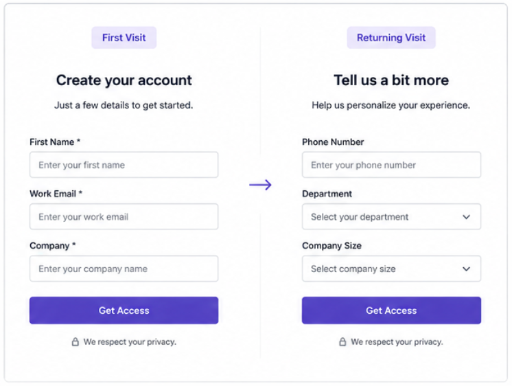
Progressive profiling in two states. The first visit collects the basics; the return visit asks for new details, so no form ever feels long.
This is where the Marketo audience has an advantage over teams on lighter tools. Progressive profiling is native, it ties directly into your lead records, and it turns a single long qualification form into a relationship that deepens over time. Set the number of new fields to show per visit, order them by what qualification matters most, and let Marketo skip anything it already has a value for. If you run a content program with repeat visitors, this is the single biggest win on the list.
Break long forms into multiple steps
Sometimes you genuinely need more information, on a demo request or an event registration where qualification matters. When the ask is unavoidably long, do not show it all at once. Break it into steps with a progress indicator, so the commitment feels staged instead of steep.
The example below splits a form into three labeled steps: contact info, company details, and interests. The visitor sees "Step 1 of 3" and a short first screen, which is far easier to start than a single page of a dozen fields. Each step carries its own small commitment, and momentum from completing one carries into the next.
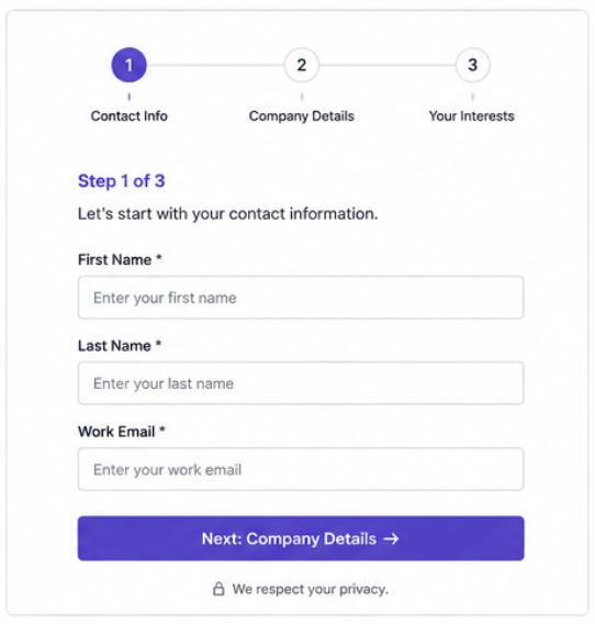
A multi-step form with a progress indicator. Splitting a long ask into stages lowers the barrier to starting and reduces mid-form abandonment.
The progress indicator does real work: it sets expectations, shows the visitor how close they are to done, and reframes a long form as a short series of easy ones. Order the steps from easiest to hardest, with the low-friction contact fields first and the more considered questions last, so the visitor is already invested by the time the harder ask arrives. For any form past five or six fields, break it into steps.
Design Marketo forms for mobile first
Many of your form views happen on a phone, and a layout that looks clean on a desktop can fall apart on a small screen. Out of the box, Marketo forms do not always reflow the way you want. Side-by-side fields stack awkwardly, tap targets shrink, and a visitor pinching to fill a field is a visitor about to give up.
The example below shows the same demo request form on desktop and mobile. On mobile, the fields stack into a single column, the inputs and the button stay large enough to tap with a thumb, and nothing requires horizontal scrolling. The form does the adapting so the visitor does not have to.
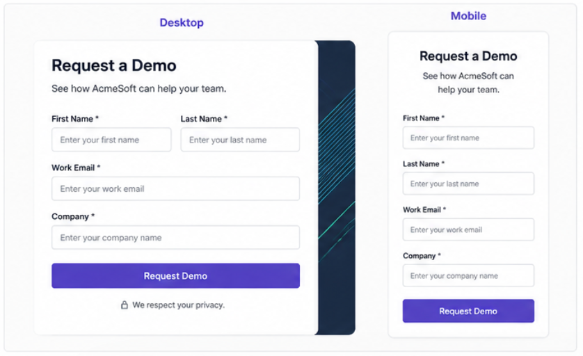
The same form on desktop and mobile. Stacked fields, thumb-friendly inputs, and a full-width button keep the mobile experience effortless.
Test every form on an actual phone before it goes live. Two-column layouts that save space on desktop are usually the first thing to break on mobile, and the fix, a single stacked column with generous spacing, costs you nothing in conversion and saves you the leads who would have bounced.
Choose between embedded and pop-up forms
Where a form appears changes how it performs, and the choice between an embedded form and a pop-up is a choice about intent. An embedded form sits inline on a landing page, visible and patient, right for a visitor who is already reading and ready to act. A pop-up interrupts, which is right when you have a specific, high-value offer and a reason to ask for attention now.
The example below shows both patterns: the embedded form invites a newsletter signup inline, as a natural next step for an engaged reader, while the pop-up surfaces a checklist download as a deliberate interruption, timed to a moment of interest.
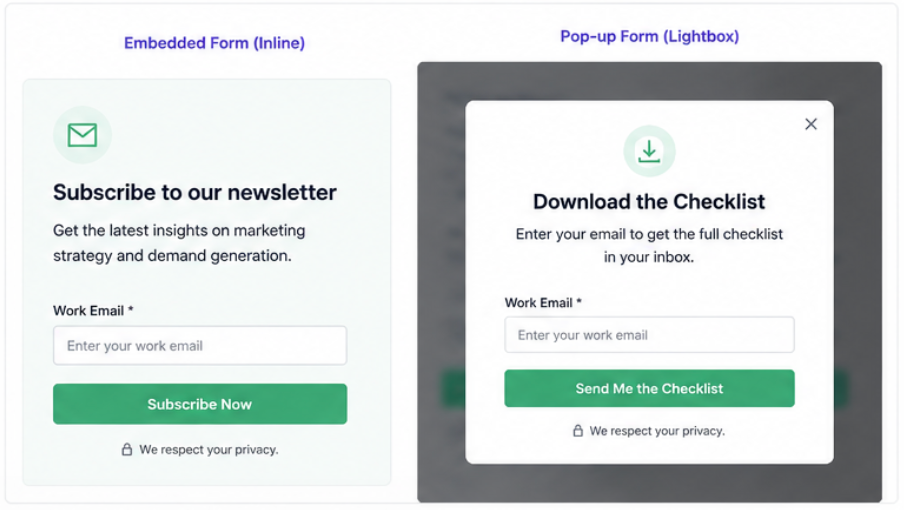
Embedded versus pop-up. Inline forms suit ready-to-act readers; pop-ups suit a specific, well-timed offer worth interrupting for.
Neither pattern is better in the abstract. The mistake is using a pop-up for a low-value ask, which trains visitors to dismiss your modals, or burying a high-intent offer inline where nobody scrolls to find it. Match the format to the value of the trade, and time the interruption to genuine engagement rather than the moment the page loads.
Connect your forms to lead scoring
A form that converts is only half the system; the other half is what happens to the record the moment it lands. Every field you collect should feed a decision: routing, scoring, or the first line of a follow-up. If a field informs none of those, reconsider why it is on the form.
This is where the Marketo audience pulls ahead and where integration matters most. With 89% of teams naming integration the top priority for new technology, the value of a form is measured by how cleanly the lead it captures flows from your Marketo programs out to the rest of your stack. Map your fields to your scoring model before you build the form. Job title and company size drive fit scoring. The asset they converted on signals interest, and the form fill itself is the trigger.
In Marketo terms, that means wiring the form to the system behind it. A form submission sets data values, a smart campaign listens for the fill and adjusts the score, and an assignment rule routes the lead based on the fit fields you just collected. When you design the form and the campaign together, a submission becomes a qualified, scored, and routed lead the moment it lands, instead of a record someone has to enrich and clean up by hand. The form is the front door; the scoring logic is what decides which room the lead walks into.
Where better forms show up in your pipeline
Form design is one of the few conversion levers a marketing operations team controls outright, without waiting on traffic, budget, or a new tool. Ask for less, stage the rest with progressive profiling and multi-step layouts, design for the phone, and wire every field to a decision. The patterns above are the difference between a form that collects data and one that builds pipeline.
The harder part at enterprise scale is consistency: keeping every form across regions and campaigns on-brand and correctly wired without rebuilding each one by hand. That is the work Knak is built for, with forms that stay consistent and sync straight into your Marketo programs. Design the form once, deploy it everywhere, and let the pattern do the converting. See Knak in action.