Email Header Design Best Practices


The header is the first thing a reader sees when they open an email, and it is the part most teams never think about twice. The logo goes top-left, a couple of nav links go top-right, and that template gets copied for years. It works, which is exactly why nobody revisits it. But engagement after the open is thinning: click-to-open rates are down more than 8% year over year, and an email that opens to a header indistinguishable from every other email gives the reader no reason to keep going.
Intentional header design is not about a single best layout. It is about matching the header to the email's job. This guide walks through six header approaches with a real example of each, less as a ranking than as a range of choices, so you can see what each one does well and when it fits.
The minimal, logo-centered header
The most common header is a single centered logo on a white or brand-color background, with no navigation at all. There is nothing wrong with it. It is clean, it loads fast, and it keeps the focus on the message below. For a transactional email, a nurture sequence, or any send where the body is the point, this is often the right call.
Airbnb's version does it with confidence: one logo, generous space, and a headline that does the work a navigation bar would only get in the way of.
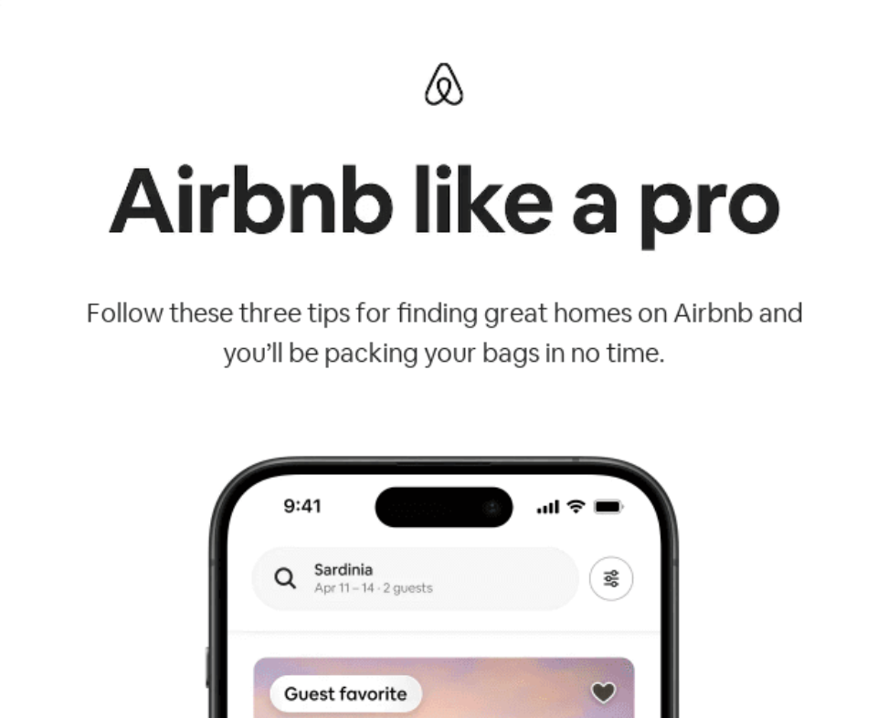
The default, done well. A single centered logo and open space keep the focus on the message, which suits transactional and nurture email. Email credit: Really Good Emails
The navigation header
Adding two to four text links to the header turns it into a small menu: Shop, Blog, Account, New Releases. This earns its place when the email is a gateway to a larger destination, which is why it is standard for e-commerce and editorial newsletters. It works against you in transactional or nurture email, where every extra link is a way out of the message you actually want read.
Nike keeps it to a logo and a tight set of category links. The restraint is the point: a few well-chosen destinations, not a full site menu crammed into an email.
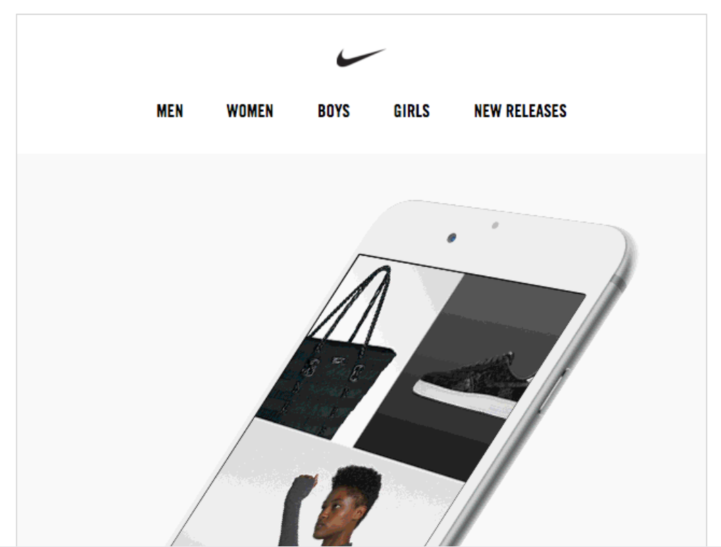
Navigation that fits the job. A logo and a few category links suit e-commerce and newsletters, where the email is a doorway to a bigger catalog. Email credit: Really Good Emails
The full-bleed hero header
A header does not have to be a separate bar at all. In a full-bleed hero, the top image runs edge to edge and the logo is overlaid on it or integrated into the design, so the header and the hero become one moment. It is the boldest of the patterns, and it suits product launches, events, and brand campaigns where the goal is impact in the first second.
Spotify dissolves the line between header and content entirely. The brand mark sits inside the artwork, and the whole top of the email reads as a single deliberate image.
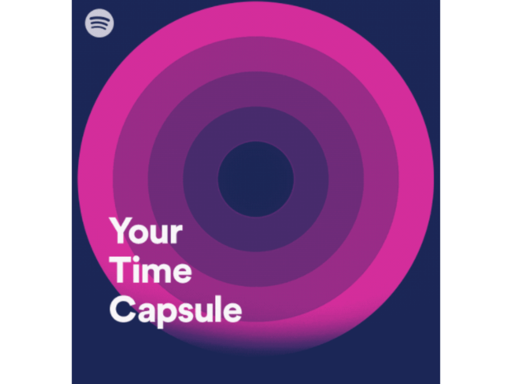
The header as a brand moment. A full-bleed hero with the logo integrated into the artwork suits launches and campaigns built for impact. Email credit: Really Good Emails
The header in dark mode
Whatever pattern you choose, it has to survive dark mode, and the header is where dark mode breaks most visibly. A logo built for a white background can end up framed in a white box on a dark one, text set in near-black can disappear, and color schemes can invert in ways you never intended. Designing the header defensively, with transparent logo files that work on any background and contrast that holds up either way, is the difference between a header that adapts and one that falls apart.
The same header below, shown in both modes, makes the breakage easy to spot. Seeing them side by side is the fastest way to catch what breaks before a subscriber does. For the full set of fixes, Knak's guide to avoiding common dark mode rendering issues covers the patterns that hold up.


Light and dark, side by side. Checking both modes catches the logo backgrounds and contrast problems that dark mode introduces at the top of the email. Email credit: Really Good Emails
The header on mobile
Most email is opened on a phone, and a header that looks balanced on a desktop often stacks awkwardly on a narrow screen. Logos scale down too far to read, navigation links wrap onto two cramped lines, and a layout that relied on horizontal space collapses. A header built mobile-first, with a logo sized for small screens and navigation that stacks or collapses cleanly, holds up everywhere instead of only on the desktop where it was designed.
Compare the same header on mobile and desktop below. The test is simple: open it on your own phone before it ships, because that is where most of your audience will see it.


The same header, two screens. Desktop layouts often reflow badly on mobile, so the phone view is the one that decides whether the header works. Email credit: Really Good Emails
The personalized header
The header is prime real estate for personalization, not just branding. Dropping a recipient's name, location, or segment-specific message into the top of the email makes the first thing they see feel addressed to them rather than blasted to a list. Used well, a personalized header lifts relevance at the exact moment a reader decides whether to keep reading.
Withings greets the recipient by name in the header itself, turning a standard top-of-email into a moment that belongs to one person. For more ways to use dynamic content well, Knak covers 25 ways to personalize emails.

The header as personalization space. A name or segment-specific message at the top makes the email feel addressed to the reader, not the list. Email credit: Really Good Emails
The header is a decision, not a default
None of these six approaches is the right answer on its own. The minimal logo suits a nurture email, the navigation header suits a catalog, the full-bleed hero suits a launch, and every one of them has to survive dark mode and a phone screen. The mistake is never picking at all, and letting a years-old template decide for you.
At enterprise scale, getting this right across dozens of templates is where it turns from a design choice into a coordination one. When intentional, dark-mode-safe, on-brand headers live in a shared template system rather than in each team's memory, every email starts from a header that was actually decided on. That consistency is the work Knak is built for. See how a shared template system keeps every header intentional, so the top of every email holds the attention the rest of the message needs.