Email Footer Design That Builds Trust and Drives Action


The footer is the most overlooked part of an email and the one section every email is legally required to have. Most teams treat it as a legal dump: shrink the text, bury the unsubscribe link, and move on. That habit wastes the one piece of real estate every subscriber scrolls past on the way out. The teams that design the footer well use it to stay compliant, hold the reader's trust, and earn a second action, all without making the bottom of the email an eyesore.
This guide walks through six footer patterns, from the bare compliance baseline to the conversion-minded and the accessible, with a real example of each and one example of how it goes wrong.
What every footer is required to include
Before a footer does anything clever, it has to clear the legal bar. In the United States, CAN-SPAM requires a valid physical mailing address and a working, easy-to-find unsubscribe mechanism in every commercial email. GDPR adds a privacy policy link and a clear basis for contacting the recipient. Canada's CASL requires sender identification and a functioning unsubscribe. The through-line across all three is the same: say who you are, tell people how to leave, and make leaving easy.
One detail catches enterprise senders out: these rules are not triggered only by where a subscriber lives, but by where the email is opened. A US-based recipient who opens your email while traveling in the EU brings GDPR into play for that send. Because you cannot predict where any given email lands, the safe default is to build the footer to the strictest standard that could reasonably apply, rather than the one that matches your head office.
The example below is the baseline done cleanly. It names the company, states the corporate address, and puts the unsubscribe and privacy links in plain sight. Nothing here is decorative, and nothing is hidden.

The compliance baseline. Sender identity, a physical address, and visible unsubscribe and privacy links are the minimum every commercial email needs.
The unsubscribe link is also a deliverability tool, not only a legal one. Gmail and Yahoo now hold bulk senders to a spam-complaint rate below 0.3%, with a strong push to stay under 0.1%, and a buried unsubscribe is what drives that number up. When people cannot find the exit, they hit "report spam" instead, and that signal costs you the inbox. An easy unsubscribe protects the deliverability of every email you send next.
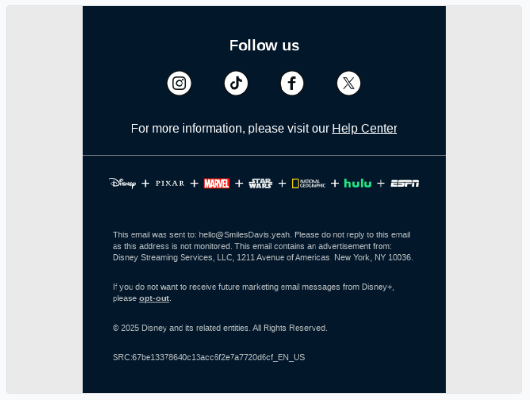
Use the footer to earn a second action
A compliant footer is the floor, not the ceiling. The same space that carries your legal copy can carry a low-pressure invitation: follow the brand on social, refer a friend, download the app, or update what kinds of email you send. The reader is already at the bottom of the email, so the ask costs you nothing and occasionally earns a conversion you would not have gotten otherwise.
The examples below show the footer working as more than a disclaimer. One pairs social icons with an app download and a campaign call to action; the other surfaces platform links alongside the standard legal text. Both stay readable, because a secondary action only works when it does not crowd out the compliance basics or overwhelm the eye.
The footer as conversion space. Social follows, an app download, and a campaign CTA sit above the legal copy without burying it.
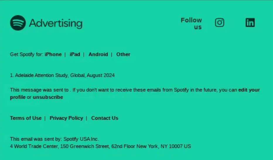
A Spotify email footer with links to get Spotify on iPhone, iPad, and Android, plus Terms of Use, Privacy Policy, and Contact Us links and the sender identity "Spotify USA Inc."
Give people a reason to stay with a preference center
The single highest-value upgrade to a footer is replacing "unsubscribe" as the only option with "update your preferences." Most people who unsubscribe are not rejecting the brand; they are rejecting the volume or the topic. A preference center lets them dial down frequency or opt out of one stream instead of leaving entirely, which keeps the relationship alive and keeps a usable subscriber on your list.
The example below offers both paths: the unsubscribe link is still there, as it must be, but "manage preferences" sits right beside it as the softer option. Offering control is the most reliable way to turn a would-be opt-out into a quieter, still-subscribed reader.

The footer as afterthought. Low-contrast text and a hard-to-find unsubscribe are both an accessibility failure and a compliance risk.
The fix is rarely a redesign, just treating the footer with the same care as the rest of the email: real contrast, a findable unsubscribe, the required legal elements present, and links a person can actually use.
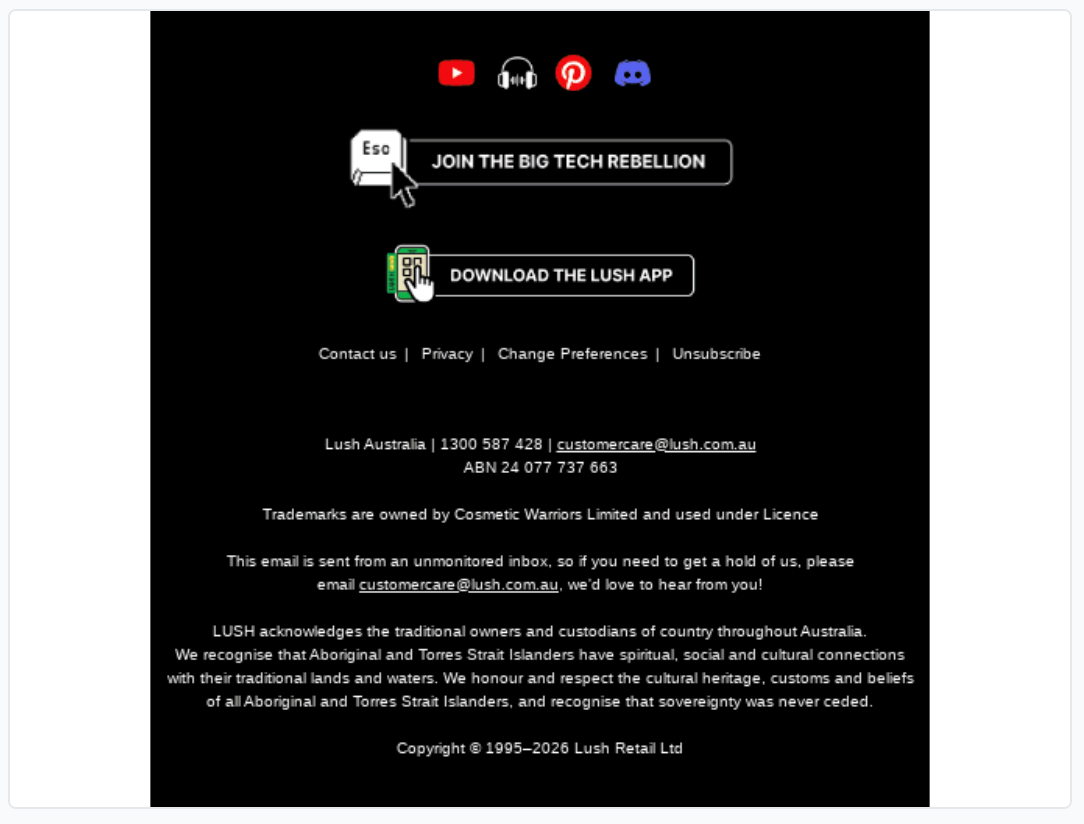
Footers get harder at enterprise scale
For a single brand in a single country, a footer is a solved problem. For a global enterprise, it is a governance problem. Different regions carry different legal language, a parent company may sit above several sub-brands, and an audience that spans languages may need a language selector before it even reaches the legal copy. Every one of those variables has to be right in every send, or the compliance you thought you had quietly breaks in one market.
The example below shows that complexity handled: a parent brand with several recognizable sub-brands, a help link, and region-aware legal text, all in one footer that still reads cleanly.
Compliance at scale. A multi-brand footer carries several logos and region-specific legal language without turning into clutter.
This is exactly the point where governed templates earn their keep. When the footer is a shared, approved component rather than something each team rebuilds, the address, the legal language, and the brand marks stay correct everywhere by default instead of by last-minute review.
Design the footer to be accessible
A footer is small, often low-contrast, and dense with links, which makes it one of the most common places for accessibility to fall apart. That matters more than most teams act like it does. Email on Acid found that 99% of emails carry serious or critical accessibility issues, fewer than a quarter of senders write alt text, and only 14% use accessibility testing tools at all. The footer is where those gaps show up as grey-on-grey legal text no one can read.
An accessible footer uses sufficient color contrast, a legible font size, link text that is clear on its own, and a logical reading order for screen readers. The example below keeps its text high-contrast and its unsubscribe a real, tappable button rather than a faint line of grey. For the full picture, Knak's guide to compliant and accessible email design covers the patterns that hold up across clients.
Readable by design. High contrast, a clear unsubscribe button, and legible text make the footer work for everyone, including screen-reader users.
Dark mode turns these gaps into a compliance problem on top of a readability one. Many email clients invert colors automatically, and a footer designed only for a white background can lose its legal copy in the process: dark grey text on a now-dark background, or an unsubscribe link that fades into it. A footer that satisfies CAN-SPAM in light mode is no longer compliant if the unsubscribe disappears in dark mode. Test the footer in both, set explicit background and text colors instead of relying on client defaults, and confirm the address and unsubscribe stay legible whichever way the email renders. Knak's guide to designing emails that work in dark mode covers the rendering quirks in detail.
What a bad footer looks like
Every reader recognizes the bad footer from their own inbox: tiny grey text on a slightly darker grey, an unsubscribe link hidden in a wall of legal copy or missing entirely, no physical address, and social icons that are the only thing anyone bothered to style. It is the footer as afterthought, and it fails on every count at once. It is hard to read, it is hard to leave, and in many cases it is not actually compliant.

The footer as afterthought. Low-contrast text and a hard-to-find unsubscribe are both an accessibility failure and a compliance risk.
The fix is rarely a redesign, just treating the footer with the same care as the rest of the email: real contrast, a findable unsubscribe, the required legal elements present, and links a person can actually use.
The footer is brand work, not busywork
A footer carries three jobs in a few square inches. It keeps you legal, it protects the deliverability of everything you send next, and it gives the reader one more reason to trust you or take an action. Designed with care, it does all three. Designed as an afterthought, it quietly works against you on all three.
At enterprise scale, getting that right in every email across brands, regions, and languages is less a design task than a coordination one. A team building from shared, approved footer components in Knak keeps the compliance, the brand, and the accessibility consistent everywhere, so the footer stops being the part of the email nobody owns. Get the bottom of the email right, and it earns its space on the way out.