Compliance and Accessibility Best Practices for HTML Email Templates

Compliance shouldn’t be an afterthought. The foundation of effective email marketing is trust – this starts with complying with regulations for consent, offering clear opt-out mechanisms, and respecting consumers’ data privacy. It extends beyond legal requirements set by regulations like CAN-SPAM, GDPR, and CASL, and includes accessibility to ensure your content is available to everyone.
Your HTML email templates play a pivotal role in compliance and accessibility. Designing templates with compliance in mind gives you the opportunity to create better, more authentic experiences for your customers.It may seem counterintuitive, but by creating a thoughtful unsubscribe and communication management system, you are more likely to lower unsubscribe rates.
Without a clear opt-out mechanism (or a poorly designed one), consumers are more likely to report you as spam, which can have major consequences for your email deliverability. In 2023, Google made this a core part of its deliverability requirements.
Following industry best practices for compliance and accessibility ensures better outcomes and improved email marketing metrics. In this post, we’ll explore best practices you can use in your template development process.
Ensuring Compliance with Email Regulations
First and foremost, complying with international regulations is a requirement for doing business globally. Not complying can result in hefty fines and penalties as well damages to your brand's reputation.
Before going any further, let's look at a few of the main regulations that impact email communications.
Regulation | Jurisdiction | Key Requirements | Penalties |
|---|---|---|---|
CAN-SPAM Act | United States |
| Up to $51,744 per email |
GDPR | European Union |
| Up to €20 million or 4% of global annual turnover |
CASL | Canada |
| Fines up to CAD 10 million |
CCPA | California, United States |
| Applicable to businesses meeting specific revenue/data thresholds; potential fines vary based on violation severity |
Regulation | CAN-SPAM Act |
|---|---|
Jurisdiction | United States |
Key Requirements |
|
Penalties | Up to $51,744 per email |
Regulation | GDPR |
|---|---|
Jurisdiction | European Union |
Key Requirements |
|
Penalties | Up to €20 million or 4% of global annual turnover |
Regulation | CASL |
|---|---|
Jurisdiction | Canada |
Key Requirements |
|
Penalties | Fines up to CAD 10 million |
Regulation | CCPA |
|---|---|
Jurisdiction | California, United States |
Key Requirements |
|
Penalties | Applicable to businesses meeting specific revenue/data thresholds; potential fines vary based on violation severity |
Compliance Elements for HTML Email Templates
Okay, so we know that violating these regulations can be costly. But what are the common elements for complying with all of these regulations? To be safe, your email content and design should cover the following:
- Clear consent and opt-in mechanisms
- Transparent unsubscribe or opt-out process
- Subject lines and sender identity that is honest and accurate
- Include legitimate business address and contact information
- Data privacy and protection notices
Clear consent and opt-in mechanisms
The first step in complying with privacy regulations happens before the first email is sent at the moment when consent is first obtained. This is typically done when someone fills out a form on your landing page requesting to be added to your newsletter, submitting a contact request, or making a sales inquiry.
The best practice is to have a double opt-in process which means having a clear, unchecked checkbox to allow users to decide if they want to opt-in to further communications. It’s important that the checkbox is left unchecked to comply with GDPR and CASL requirements, avoiding situations where opt-in is assumed by default. The second part of the process is done through email where users will be asked to confirm their opt-in status by clicking on a link in an email.
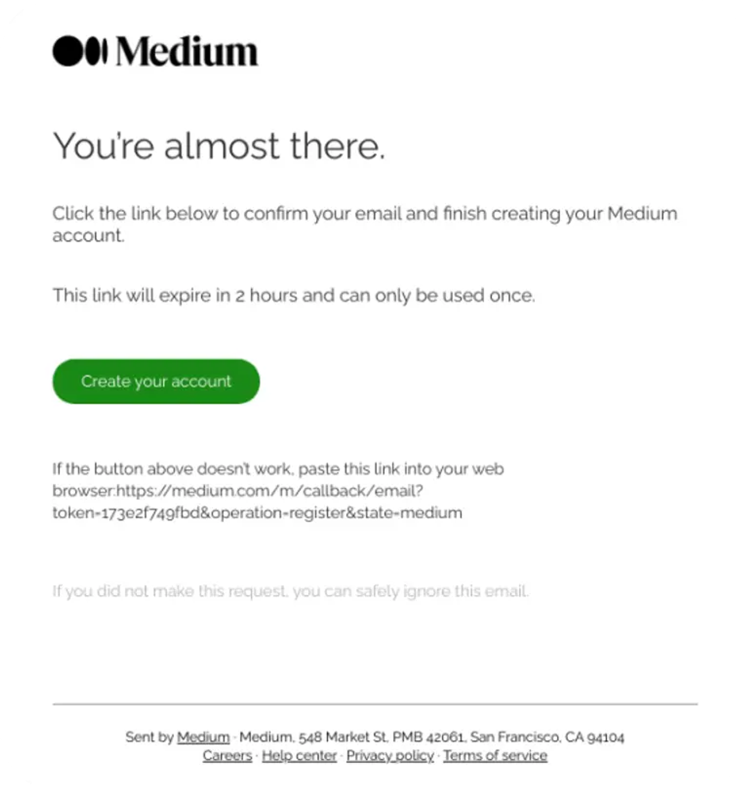
This first email is critical, and the opt-in email template should not be neglected in your marketing process. Designing a trustworthy email clearly identifying the legitimacy of your brand can make a huge difference on improving opt-in rates. Sending a plain text email with a generic sender name like “No Reply at Acme” will discourage recipients from engaging with your brand.

Medium provides a clear opt-in mechanism for its confirmation email.
Transparent unsubscribe or opt-out process
International privacy regulations are clear in outlining the need for a transparent unsubscribe process. To adhere to this standard, you should clearly display an unsubscribe link in every email, conventionally this is shown at the end of the email. The unsubscribe process should be simple, not require any skill-testing questions, and should be completed with as few clicks as possible. Both CAN-SPAM and CASL require processing unsubscribe requests within 10 days, but this is usually automatically done in platforms like Marketo or Pardot.
One best practice that is worth considering is providing email subscribers with a preference center. This center can be used to help users manage their subscriptions, choose specific types of content, or specify how often they'd like to receive email content from your brand. Preference centers can reduce unsubscribe rates and encourage long-term relationships with subscribers.
Subject lines and sender identity that is honest and accurate
Writing good subject lines has never been easier. Tools like Knak are integrating AI to help create accurate, yet compelling subject lines. This is important because regulations require marketers to write honest subject lines that are not deceiving. Gaming subject lines to entice opens is expressly prohibited in regulations like CAN-SPAM and GDPR, something that has been abused in the history of email spam.
It’s equally important to identify the sender using your company or brand name in the “from” field and avoid generic email addresses like “no-reply@domain.com.” You can greatly boost the authenticity of your brand by using email specifications like BIMI as well as authentication protocols like SPF and DKIM to verify your identity to ESPs.
Include legitimate business address and contact information
CASL and CAN-SPAM both require your physical address to be included in the email footer. It's another way to validate your authenticity and build trust with your email subscribers. Providing contact information helps users get in touch with you if they need support or additional information.
Marketers will also see the opportunity to add in social media contact information. The pervasive use of social media logos to encourage subscribers to visit other channels is both legitimate and helpful. Ultimately, you want to verify your identity in multiple ways to prove you are who you say you are. This is critical as many spam or phishing emails may try to imitate brands for less than commendable reasons.

Zoom's webinar registration email provides a simple, yet effective way to display legitimate company information.
Data privacy and protection notices
Data privacy is a big deal. Modern marketers must follow stricter guidelines when it comes to the storage and usage of personal information. As such, you should include a link to your privacy policy in the footer of every email. This policy will explain how data is used, stored, and provide information on how subscribers can request access to or deletion of their personal data, which is required by GDPR and CCPA.
It’s important to keep your privacy policy up to date and write it in a way that is readable to users. While legal jargon is somewhat unavoidable, it's important to ensure that the policy can be interpreted by all your users. Some examples of good privacy policies include: Shopify, Airbnb, and Slack.
Accessibility standards for email templates
make the internet more accessible to everyone—for instance, those with visual impairments who may require a screen reader—but accessibility best practices also generally align with good email UX design principles. It's a win-win. If you're wondering how to make your emails more accessible, then we've got a few best practices for you.
- Design and Layout
- Typography and Text
- Images and Media
- Links and Buttons
- Code and Structure
- Testing for Accessibility
Design and Layout
Creating an accessible email design is about inclusivity for all users. Simple, single-column layouts improve readability, especially when using assistive technologies like a screen reader. Using semantic HTML elements and a logical tab order, you provide guidance for screen readers to navigate content effectively. White space strategies shouldn't be forgotten either; they prevent visual overload, improve readability, and help users with cognitive impairments.

Stripe's content download email is simple and utilizes white-space for maximum effect.
Typography and Text
Sans-serif fonts are the default font for platforms like Google Docs and Microsoft Word because they are highly legible. In addition to pick fonts that are legible, you will want to use a font-size of 14px or more to improve readability, especially on mobile screens. Color contrast between the text and the background is also important and you'll want to aim for a ratio of 4.5:1 to support users with visual impairments.
Images and Media
Descriptive alt text is a critical part of accessibility on the web and in email design. You can use tools like Knak's AI features to do this automatically for you, or do this on your own. You will want to avoid embedding text directly in images and steer clear of sending image-only emails, as both impede the user experience. If you include video or audio, be sure to provide transcripts for those who are deaf or hard of hearing.
Links and Buttons
Clear, descriptive text is preferred over vague phrasing. For instance, writing "Explore our services" versus "click here." Links should be distinguishable from other text with underlining or bolding. Buttons should be large enough to accommodate users with motor disabilities, and a good guiding principle is setting them at a minimum of 44x44 pixels.

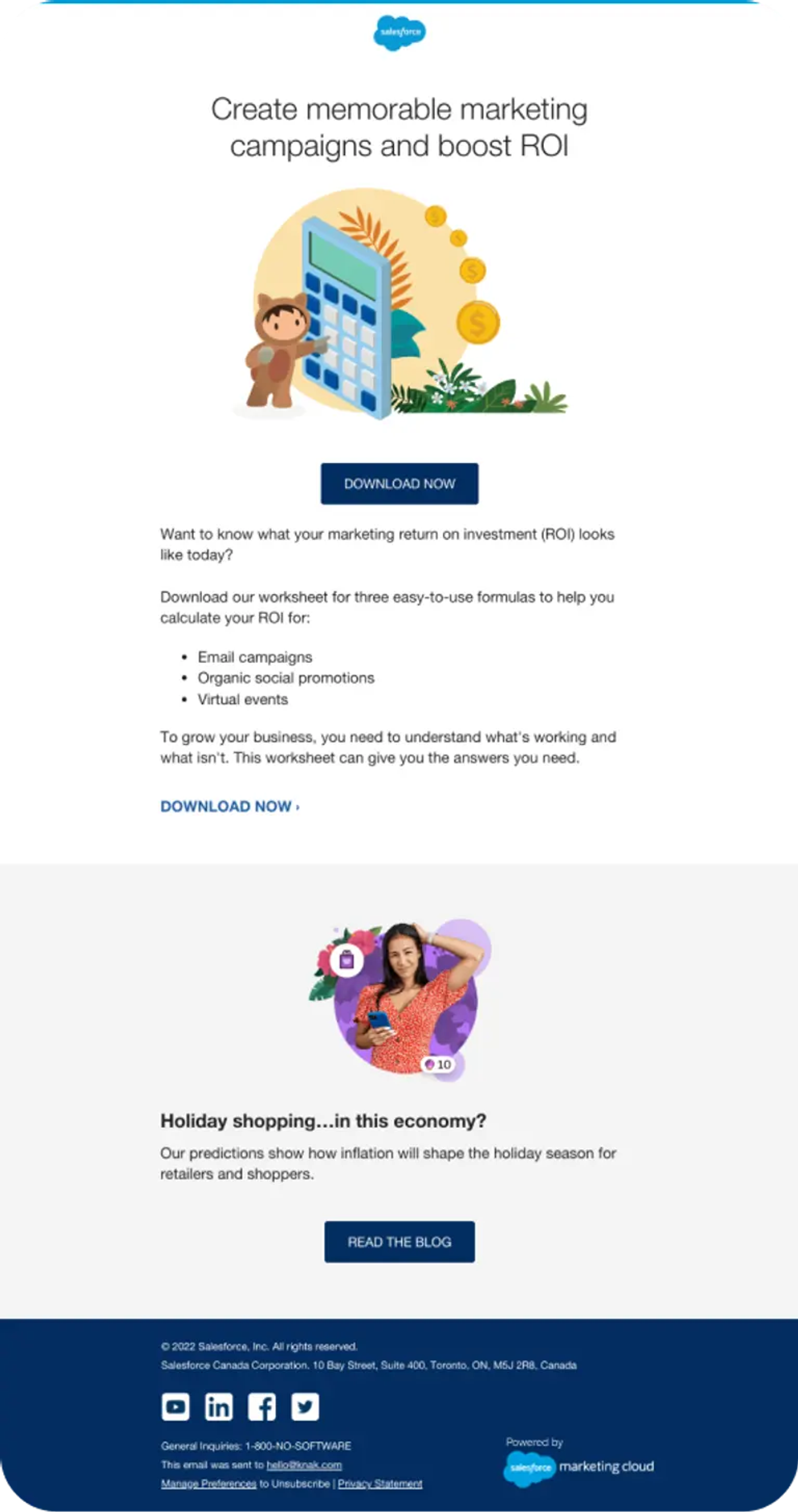
Salesforce's content download email provides a well-placed, high contrast button for users.
Code and Structure
Using semantic HTML elements like <header>, <main>, and <footer> improves readability for screen readers, providing a logical structure to interpret the content. Adding ARIA roles to content is a good idea as well, especially for layout tables, where screen readers may misinterpret them as data tables.
Testing for Accessibility
Before sending your emails, run them through an accessibility test to ensure content is navigable. Validate items like color contrast to ensure compliance with minimum contrast standards, check that links are easily distinguishable, and confirm that the layout and design are optimized for readability. Lastly, ensuring your email renders on all mobile devices and email clients is critical considering that more than 43% of emails are opened via mobile devices.
The Future of Email is For Everyone
Compliance with privacy regulations like GDPR, CCPA, and CASL are table stakes for modern email marketing. Adhering to accessibility standards isn't just best practice, it's a way to create inclusive marketing campaigns that reach your entire audience. Whether you're in demand generation trying to speed up campaign creation, a marketing ops leader improving workflows, or a marketing leader looking to scale globally, these regulations and best practices are important.
Knak has the tools you need to create on-brand, compliant, and accessible email campaigns. Our no-code platform enables marketers to exercise their creativity muscles while creating beautiful emails. The best part is that Knak ensures your emails look great for everyone in your audience, and allows you to embed compliance processes directly into your HTML email templates. With Knak, you’re not just keeping up with compliance; you’re setting the new standard for innovative, accessible, and impactful email marketing.


