Hands-on with Apple Intelligence, inbox tabs & message summaries for iOS 18.2

With the release of iOS 18.2 Beta 2, we have finally gotten our hands on the most hotly anticipated features of iOS 18 that were announced back in June:
- Categories (a.k.a. Inbox tabs)
- Digest Views
- Branded Mail icons, and
- an upgraded iteration of Apple Intelligence message summaries.
iOS 18.2 is expected to be publicly released to all users in early December 2024.
We dove into the latest Beta on an Apple Intelligence-enabled iPhone 16 so that we could try and answer some of the biggest questions at top of mind for email marketers when it comes to all of these new email-related features.
We also took a look at the same features on an older model without any Apple Intelligence capability, to see how that experience compares. (See the devices that will support Apple Intelligence here.)
Branded Mail icons
First up, a small but noticeable change throughout the app is the new icons that appear next to emails from organizations and businesses.
These icons are part of a feature called Branded Mail on Apple’s new Business Connect platform.
Signing up to Business Connect is free, and once you have undertaken some additional steps, you will be able to upload your logo to Business Connect to have it displayed here in the inbox. Check out the user guide for more information.
When these features were first announced, we were all fooled into thinking that Apple was finally going all-in on BIMI. Alas! Branded Mail icons are unrelated to BIMI, so if you already have BIMI configured, note that unfortunately this is a separate undertaking.
Until you sign up to add your logo, you will be assigned a random icon that is only vaguely relevant to your particular business. (The icons have a very iCloud-circa-2012 flavor to them.)
From my tests so far, the only sender that I have seen with a Branded Mail icon in my inbox is Amazon Australia. Apple themselves do not seem to have made the change yet, and are still being assigned a random icon.

Categories: the new inbox tabs
This is the big one! Categories (or tabs) are enabled by default in iOS 18.2.
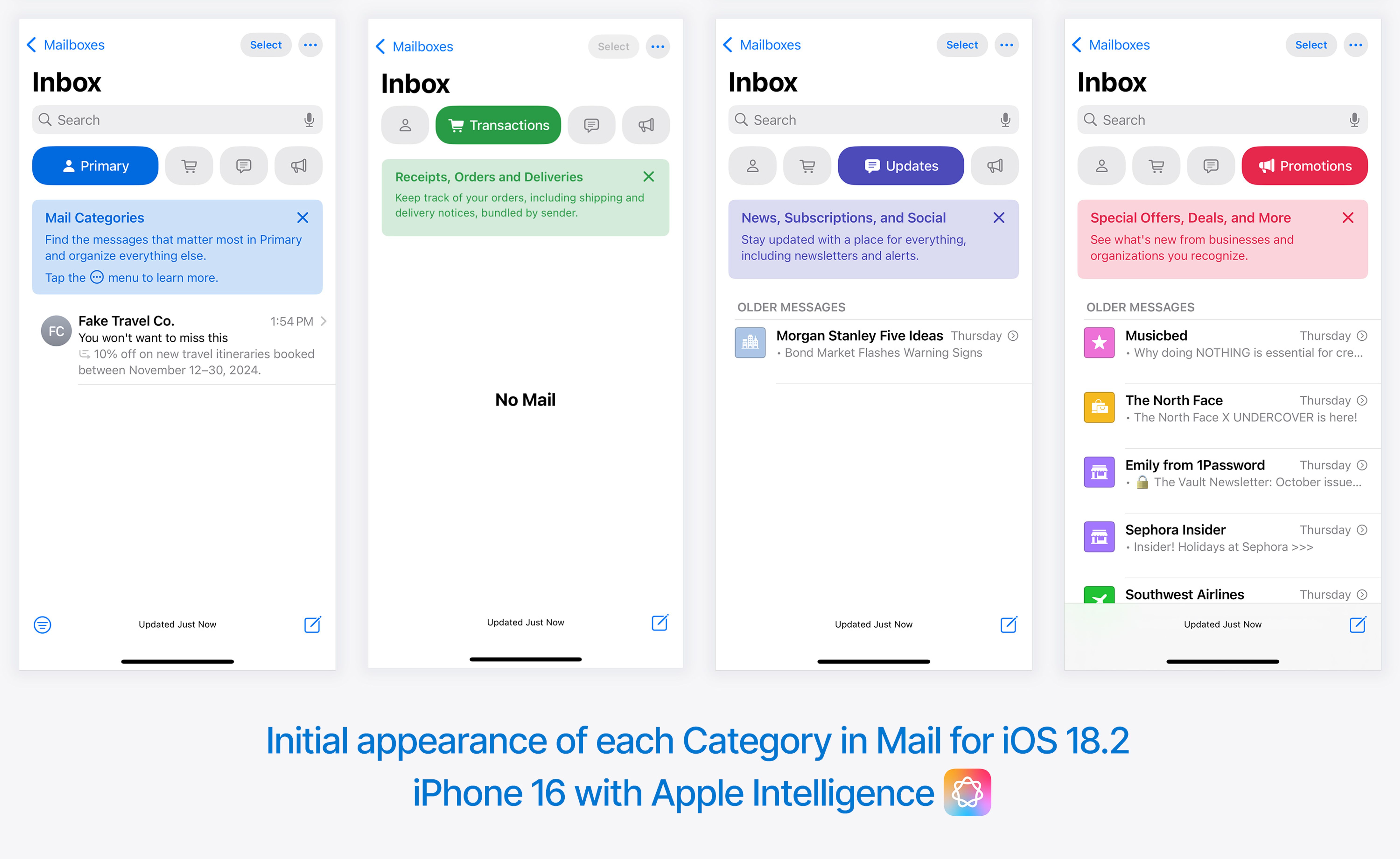
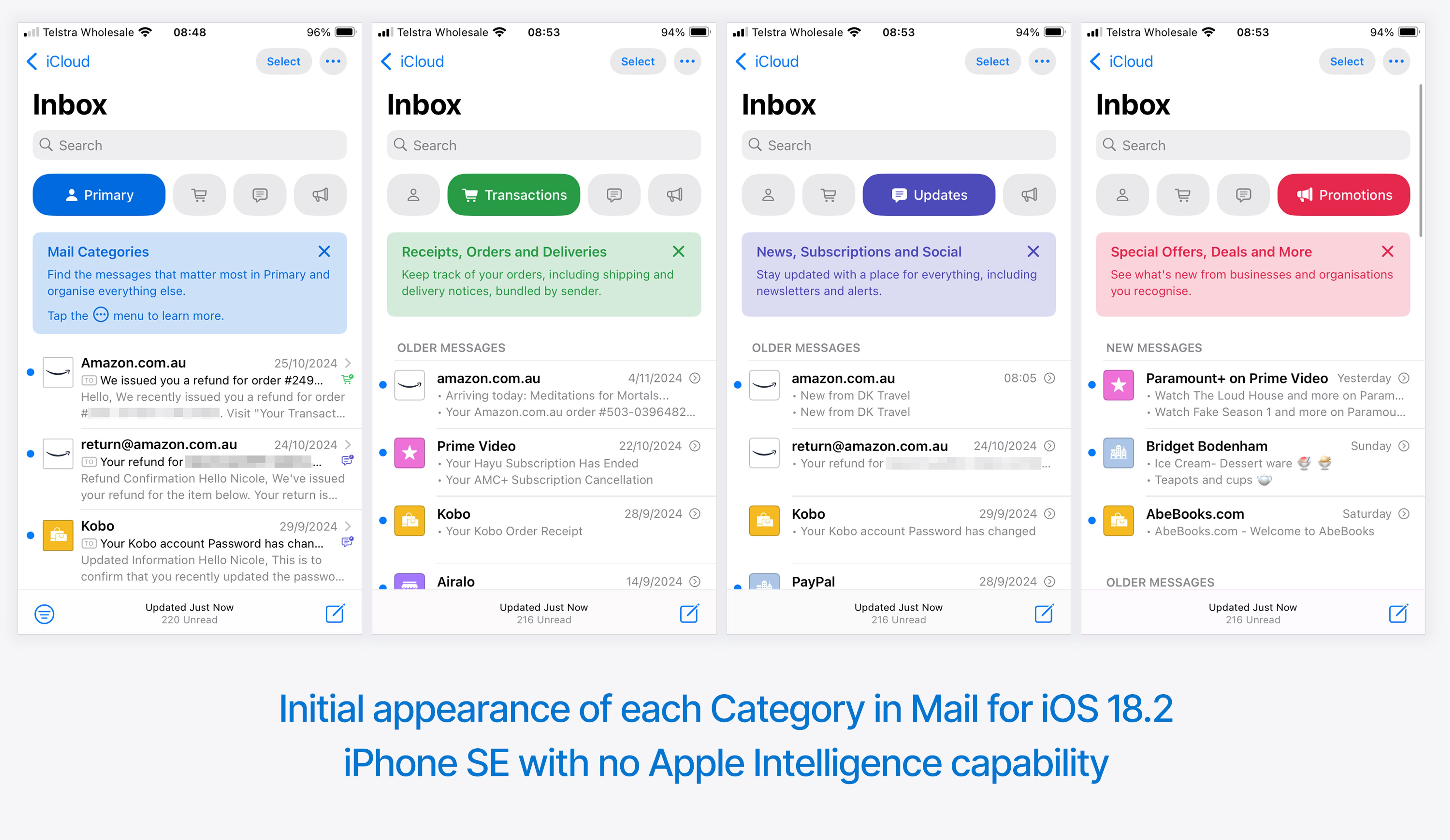
When you open the inbox in iOS 18.2 you are presented with four of the tabs that we saw when iOS 18 was announced: Primary, Transactions, Updates and Promotions.
Below is what the experience looks like when you first open the Mail app on a newer device with Apple Intelligence enabled. This account had a lot of messages in the inbox that ended up in Promotions, and not much in the other tabs.
Below is the same experience on a different, older and smaller device with no Apple Intelligence capability.
This one gives a clearer view of how read and unread messages are treated: unread are grouped together at the top under “New Messages” with unread together under “Older Messages”.
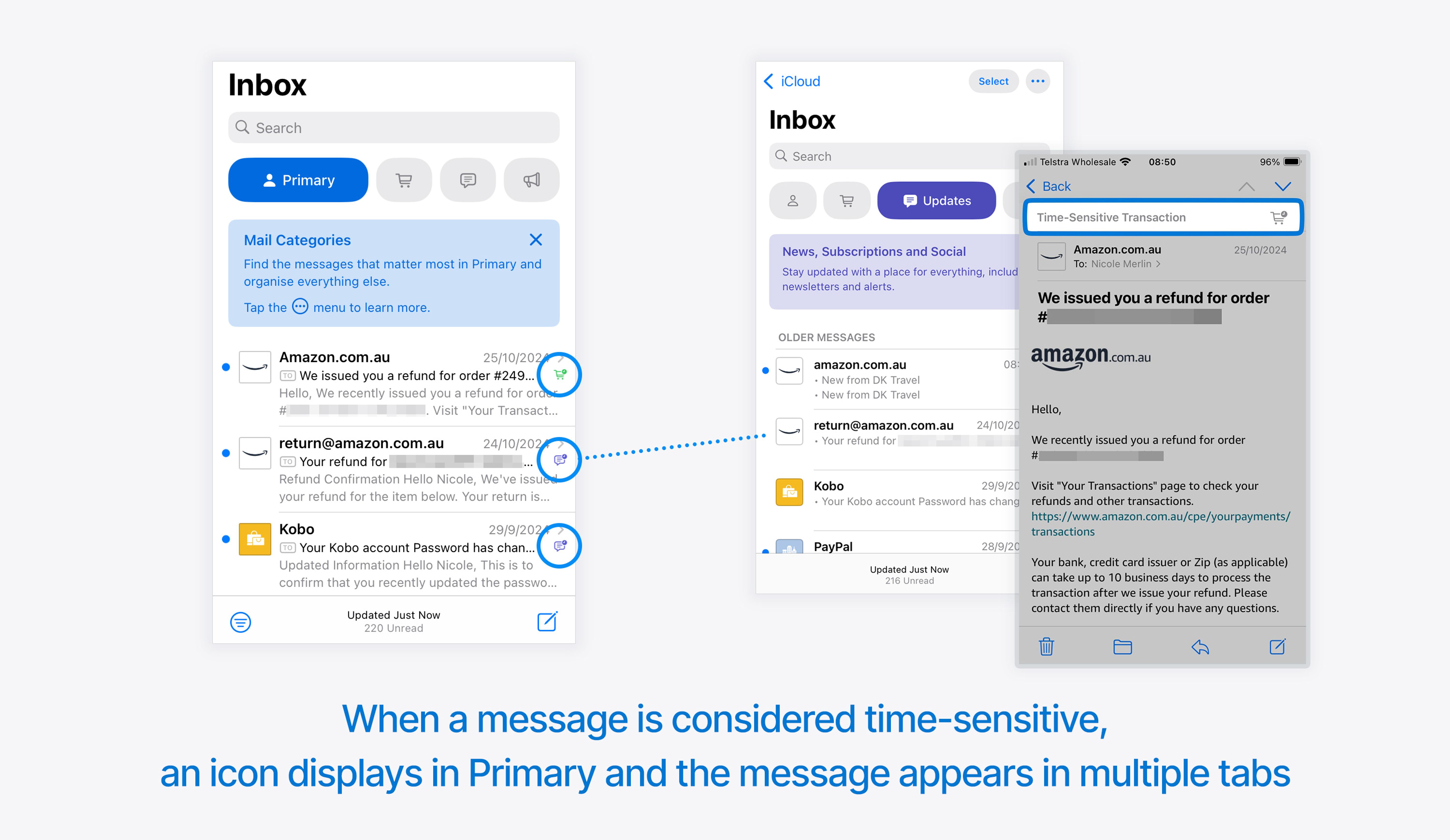
There is some confusing duplication of messages in the Primary tab. If Mail determines that a message in Primary is also a time-sensitive Update or Transactional message, a tiny icon is displayed next to the message in Primary, and the message also appears in the relevant tab.
Interestingly, the All Mail tab that we saw in the original announcements does not seem to be an option that made it to the final version of iOS 18.2.
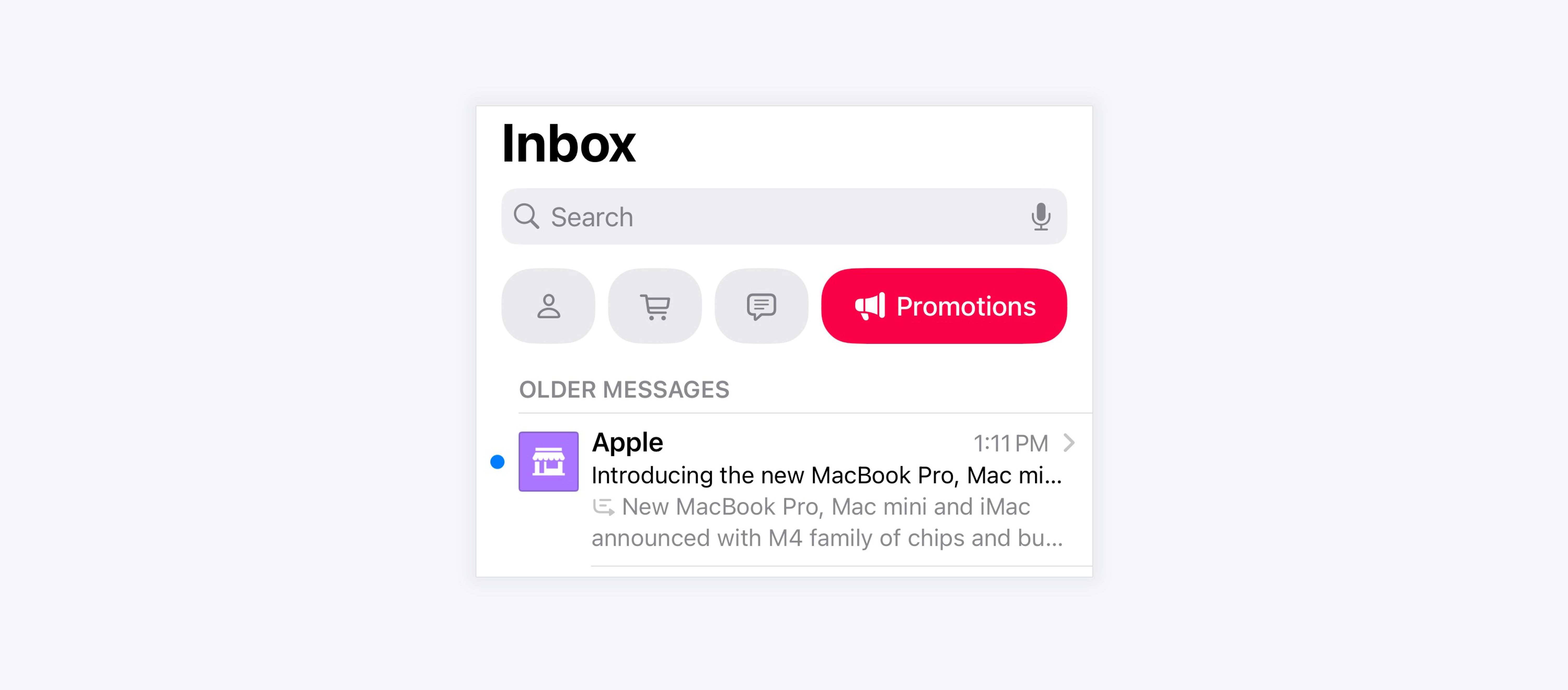
And notably, Apple themselves landed in the Promotions tab in my tests:
The Primary tab
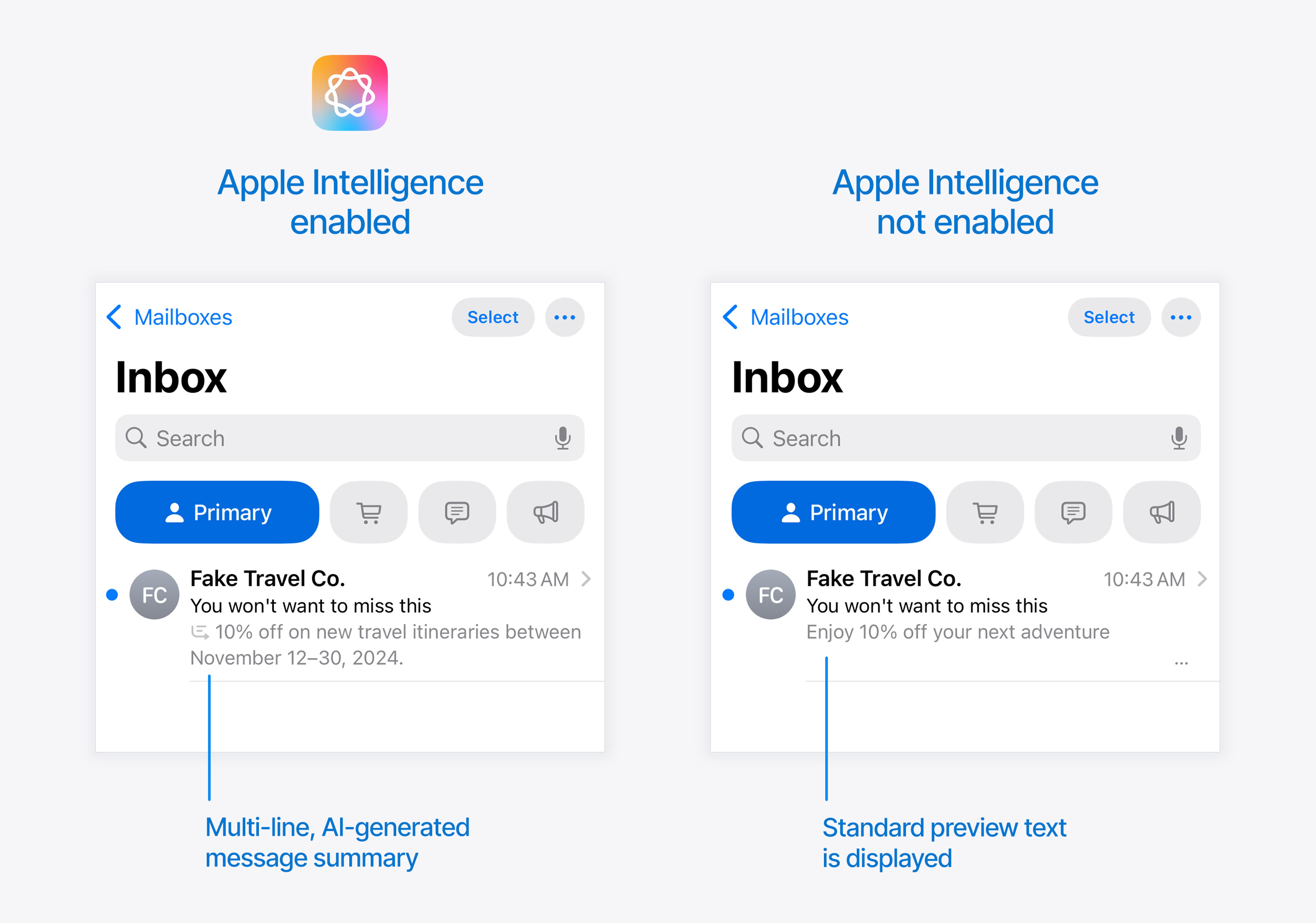
The Primary tab differs slightly depending on whether users have Apple Intelligence enabled on their device or not.
With Apple Intelligence, there is a multi-line AI-generated message summary on each message, whereas older devices will continue to show the standard preview text under the subject line.
Options to customize or switch views
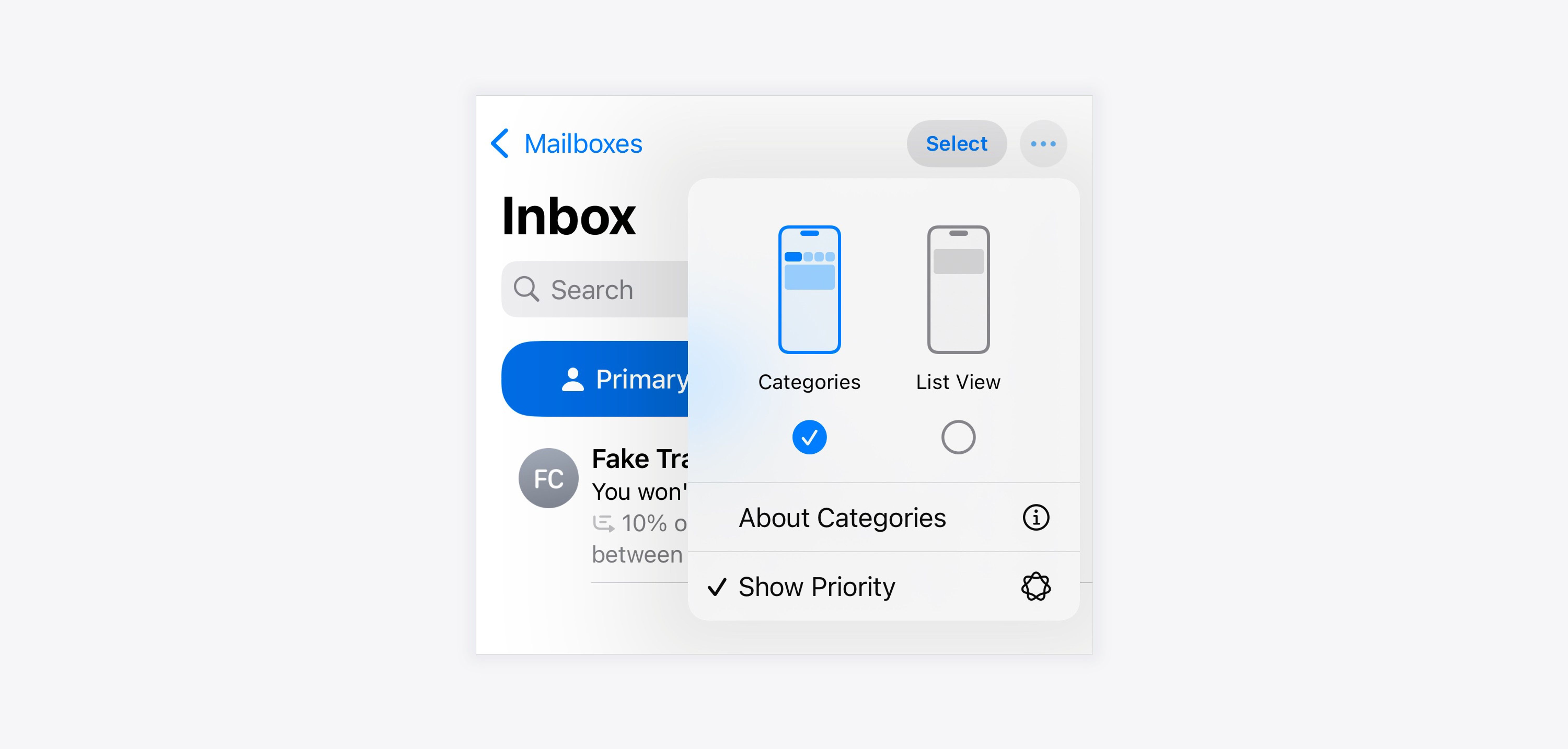
When you are in any area of the Mail app, you can tap the three-dot menu in the top-right corner to access display options.
There is a simple top-level option to switch between Categories and List View.
Underneath this is an additional option which depends on the tab you are in. On the Primary tab, the only option here is whether to Show Priority messages or not. (You will see below that the other tabs have a different option here.)
But most importantly, you can see how easy it is to choose between Categories and List View here, easily enabling users to turn off the tabbed experience.
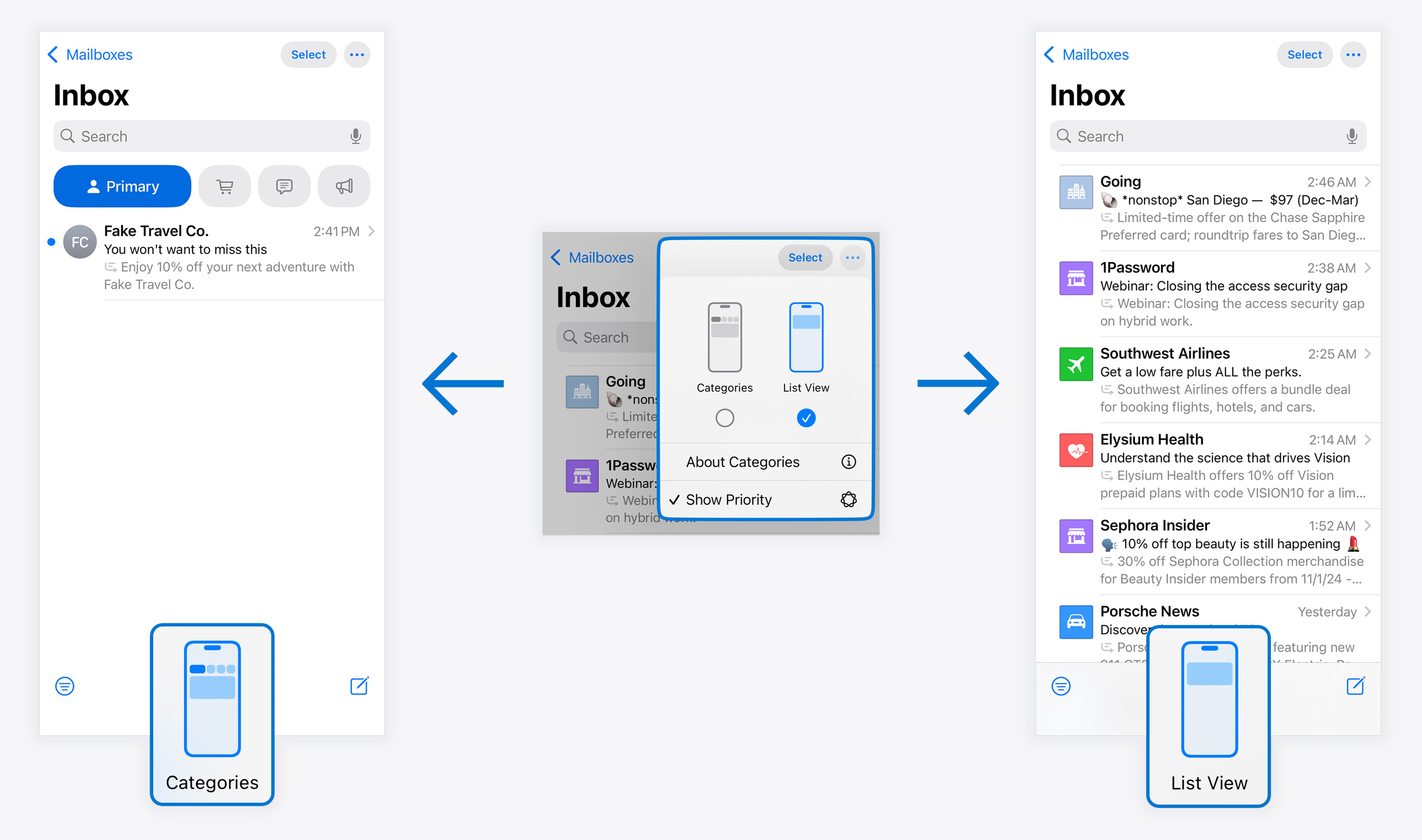
If you select List View, this switches your inbox to a more standard layout with no tabs. All your messages are now in a single view.
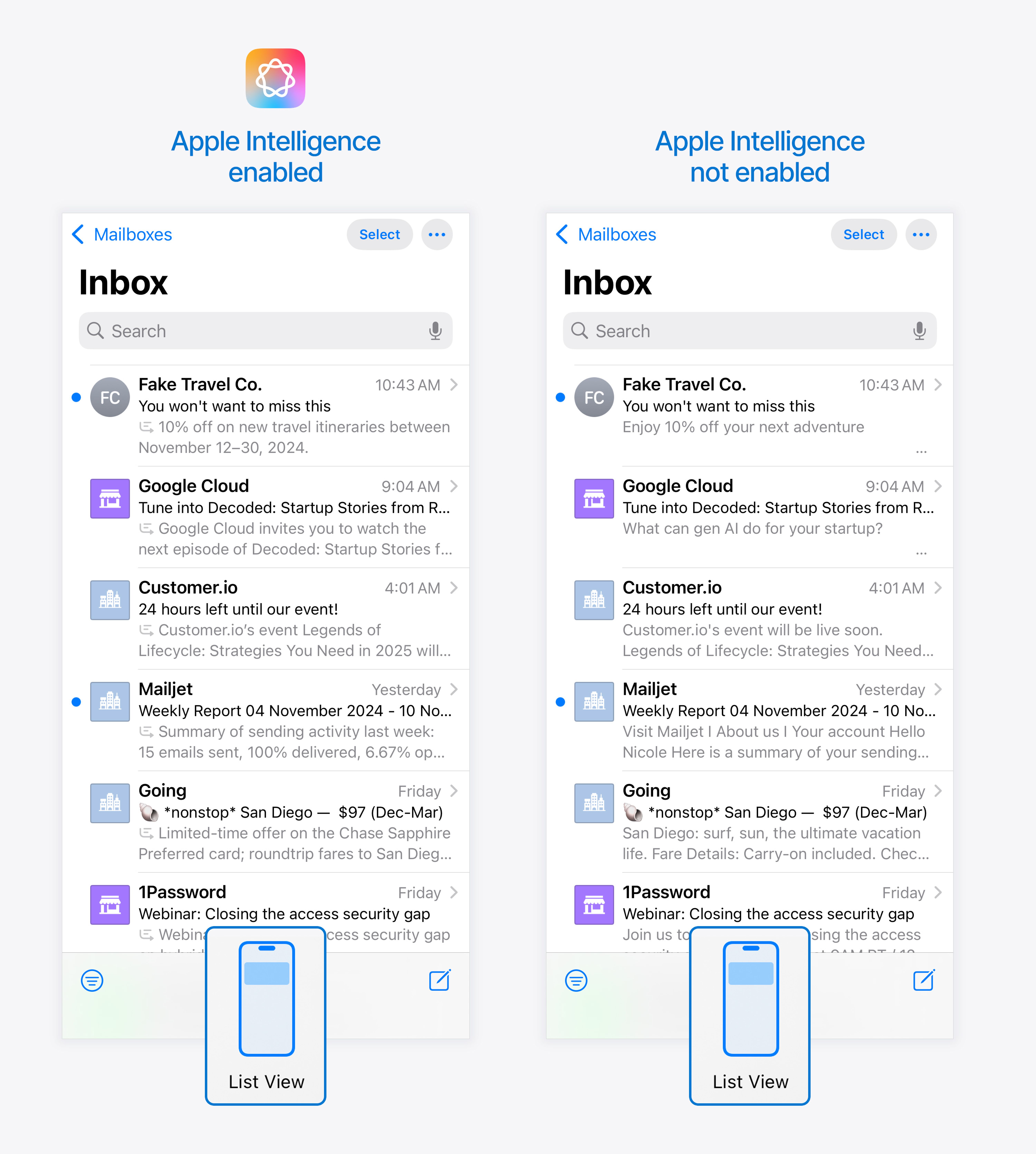
As with the Categories view, the difference between devices with and without Apple Intelligence is just in the preview text area, with Apple Intelligence-enabled devices showing the AI-generated summary.
Transactions, Updates and Promotions tabs
When Categories are turned on, on the Transactions, Updates and Promotions tabs (so, all tabs except Primary) you can toggle on and off an additional setting: the ability to Group by Sender.
It is turned on by default in these tabs.
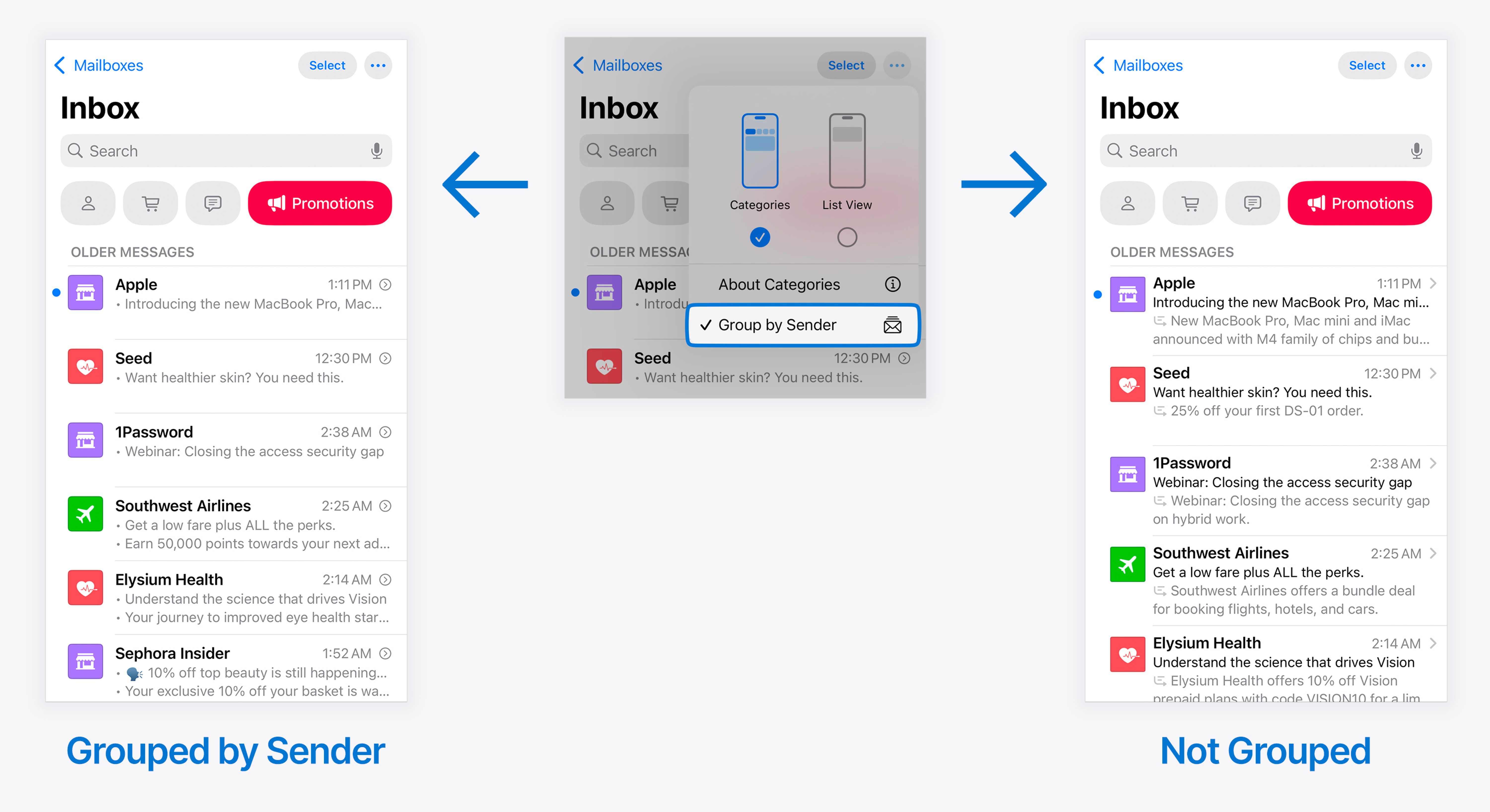
This can be set independently for each tab, meaning you could have Group by Sender enabled for the Promotions Category, but not for the Transactions Category.
Whether this setting is on or off has a big effect on how the inbox displays those messages, and the experience of reading them.
Group by Sender turned off
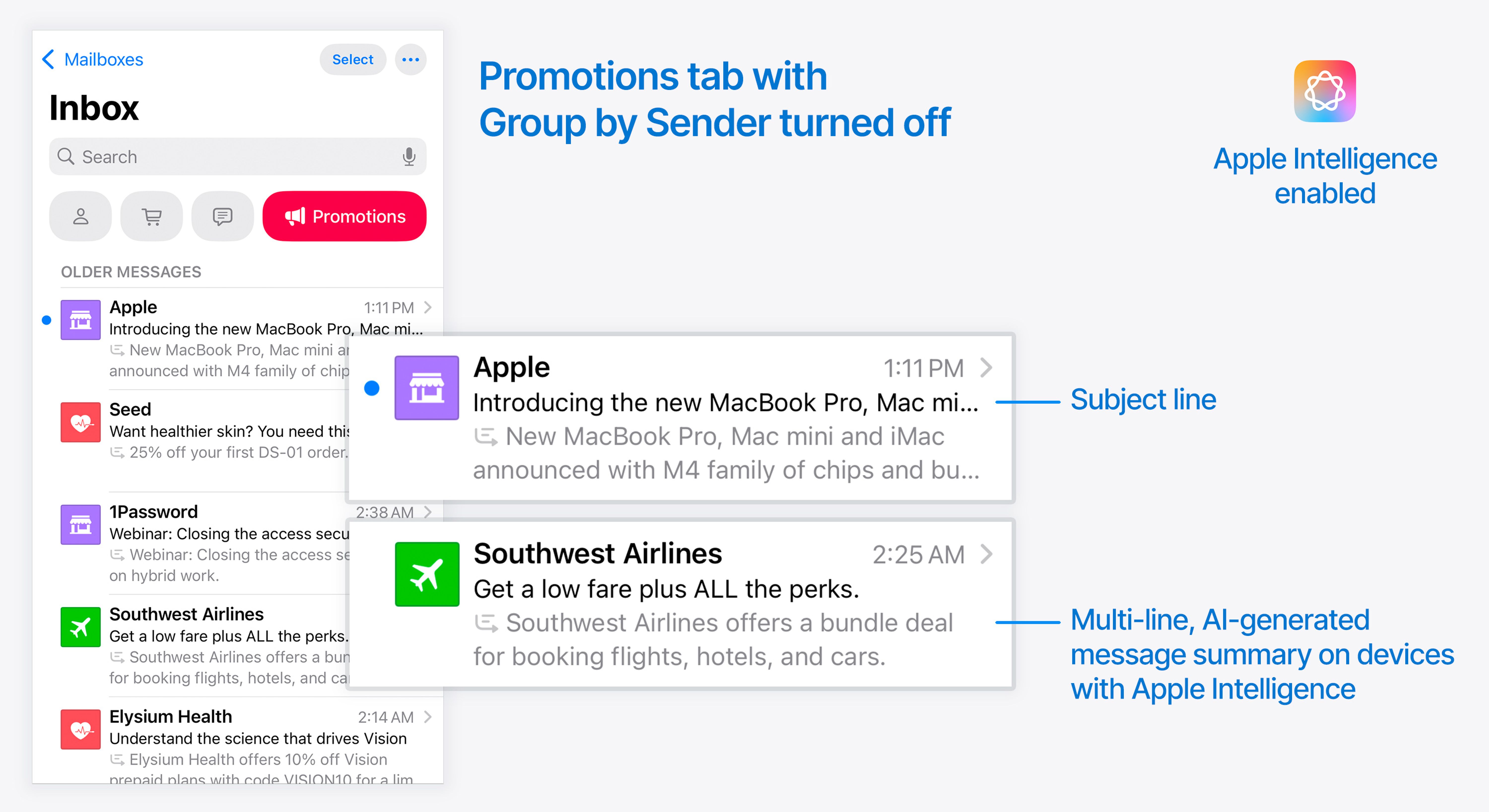
With Group by Sender disabled, you see a more “Standard” inbox view:
- Subject line is displayed
- A multi-line, AI-generated message summary is displayed for devices with Apple Intelligence
- For devices that do not support Apple Intelligence, the only difference is that there is no AI-generated message summary, and the standard preview text is displayed instead.
- Clicking a message opens the email as usual.
Group by Sender enabled
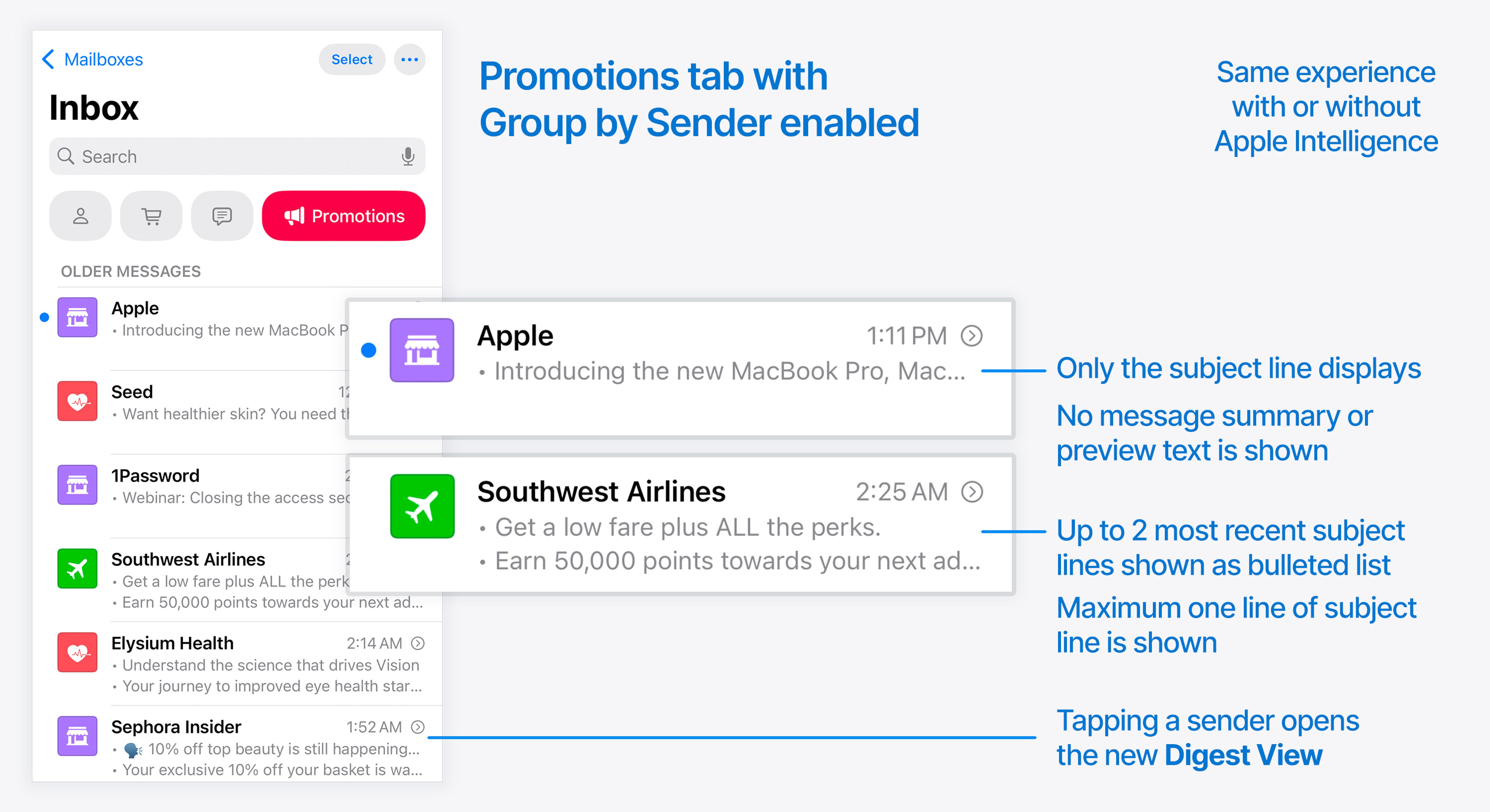
When this is enabled, there is a big change to how these display and behave in the inbox.
- Messages are grouped by sender, meaning a sender only displays once in the view
- No preview text or AI-generated message summary is displayed
- Subject line only is displayed
- Maximum one line of the subject line is displayed
- Maximum of 2 most recent subject lines are displayed as a bulleted list
- Deleting or archiving using swipe gestures from this view will delete every message from the sender at once
- When you tap any of these groups, instead of opening an individual message, you open the new Digest View for that sender
Digest view
Digest view is only reached when Categories are enabled, and when you are in either the Transactions, Updates or Promotions tabs, and that tab is set (via the top-right menu) to Group by Sender.
When all of these are true, tapping an entry in the inbox will open all the emails that you currently have sitting in your mailbox from that sender.
When you open a Digest View, you see the latest messages, and you see a preview of the top 350px or so, but I found that it varies depending on device. My iPhone 16 showed 388px of each message, whereas my iPhone SE 2nd gen showed 334px.
The available options in this view are exactly those that were announced back in June: you can hit the three-dot menu at the top right to re-categorize the sender, mark emails as read and unread, and archive or delete all the messages in the view in a single tap.
There is a header banner area with an icon, and these will be drawn from your Branded Mail settings. If you don’t have Branded Mail set up, your brand will receive a default icon and color.
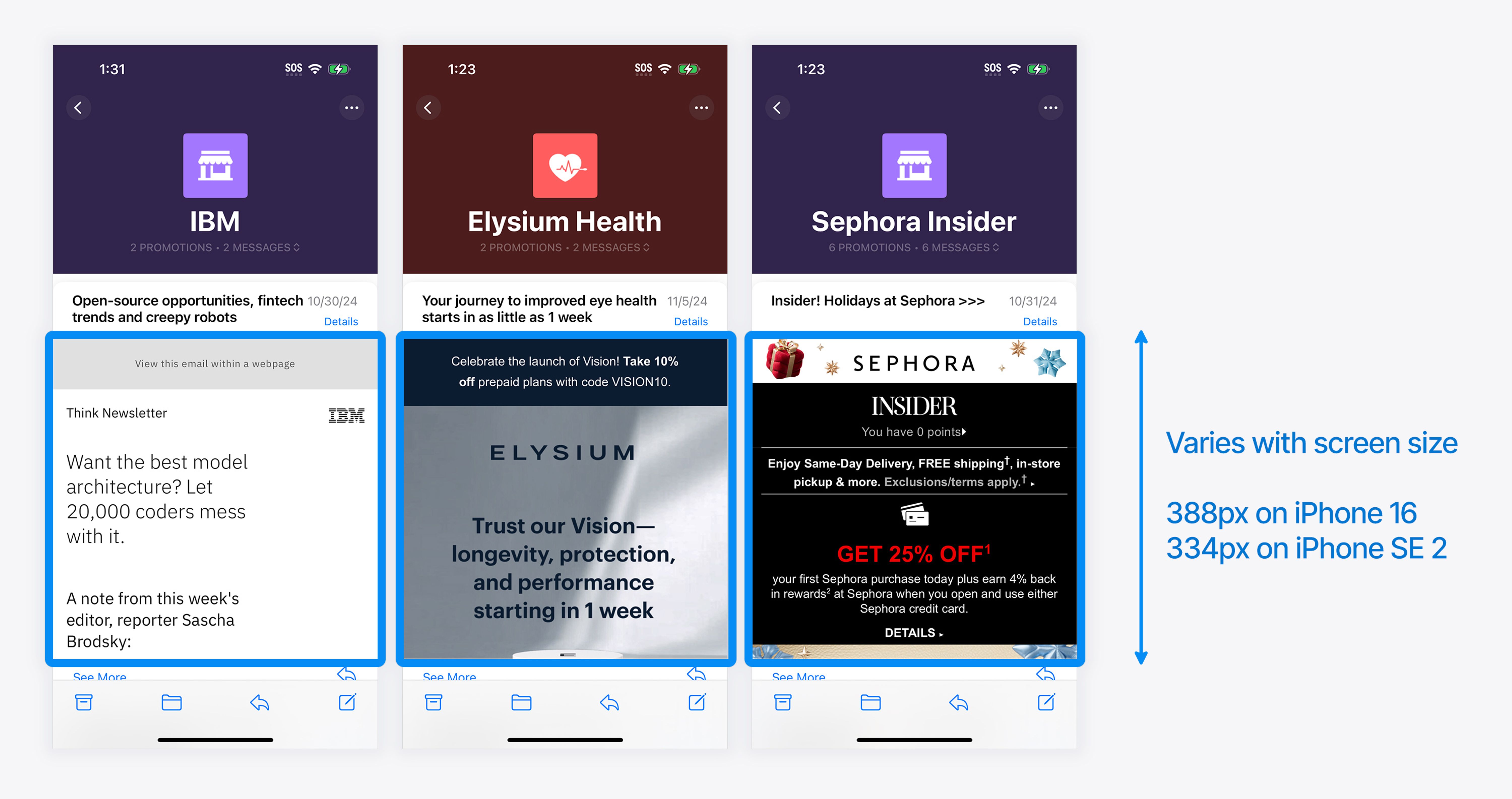
When you tap “See More” underneath any shorter preview, this expands each individual message. After expanding a message, it remains expanded, meaning you can continuously scroll back and forth through multiple full emails at once.
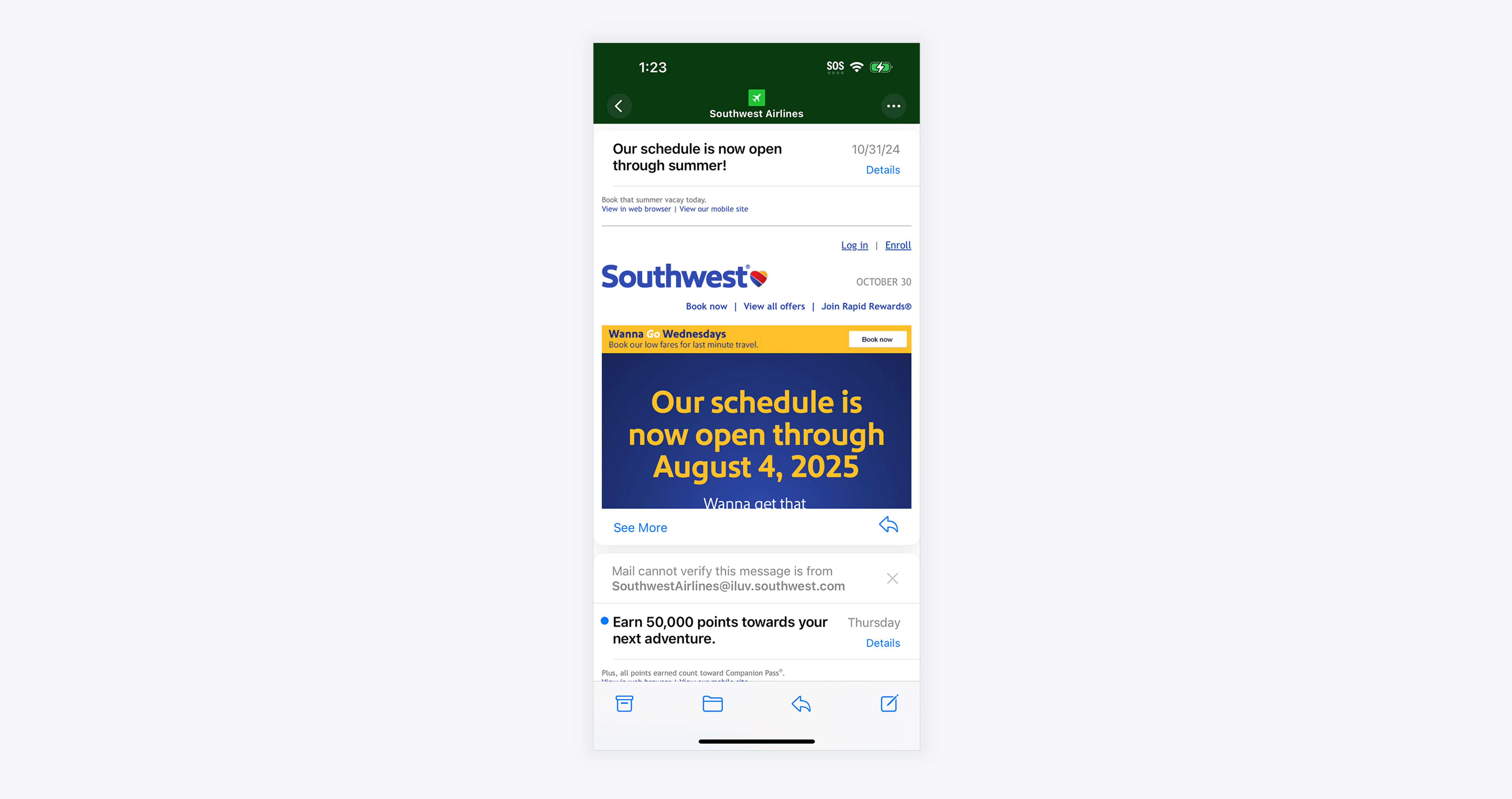
When browsing Digest View, it generally struck me that emails with a colored background were easier to scan in this view, as the edges of the message were more clearly defined.
Some emails with white backgrounds merged with the digest interface and made it really hard to know where the interface ended and the email began.
I also noticed that repetition of the same design elements in multiple emails can get visually confusing very quickly:
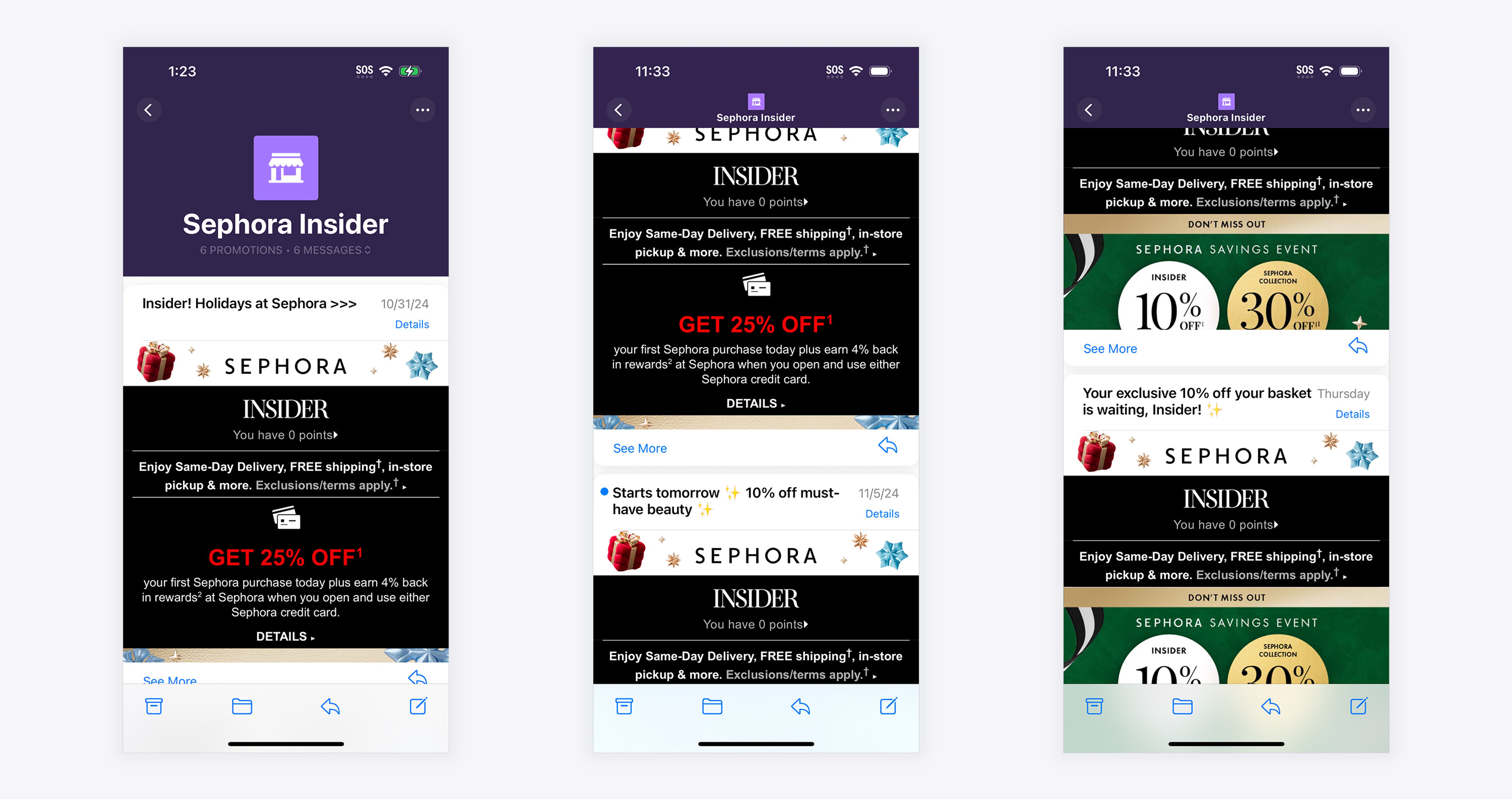
To look your best in this view, I think it would really pay off to assess how you can vary the top area of your email designs while still remaining on-brand, so that the digest view is cohesive but not repetitive.
I also think paying attention to text size becomes important here, in particular trying to avoid text that ends up as a similar size to the text in the user interface.
I personally found that a lot of small text at the top of the email made it difficult to read the subject lines of each email, which made it difficult to get that first impression of what an email was about in order to decide whether to read it or not.
I would recommend either using design to make the ‘edges’ of the email really clear, and optimize your subject line, or include concise content at the very top of the email that conveys what it’s about and entices readers to expand it.
Message summaries
On devices that support Apple Intelligence, there are two new message summarization features in Mail.

By default each message in the Primary Category gets its own AI-generated message summary, indicated by a small gray icon before each block of text.
You also see an AI-generated message summary on every email when:
- Categories are enabled and Group by Sender disabled on a particular Category
- Categories are completely disabled and you are in List View
These summaries are created on-device, meaning every user is likely to see a slightly different summary to the next person.
Can you turn off message summaries in the inbox?
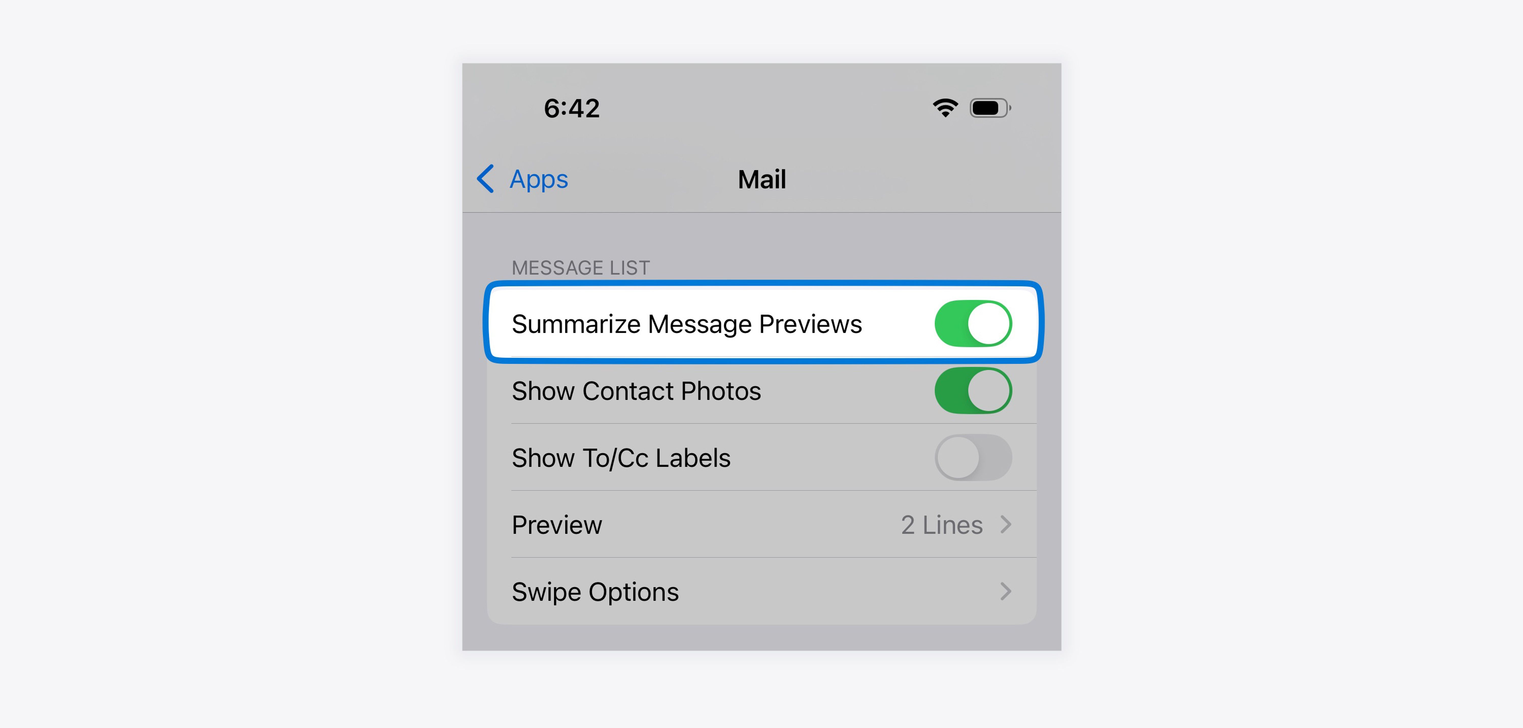
Yes you can. Go to Settings → Apps → Mail and there is an option to Summarize Message Previews. Turning it off disables the feature.
How message summaries are generated
We wanted to answer a few of the burning questions that everyone has had about this feature, so we ran a few tests to see how it handles things. Here is what we found.
It’s not possible to influence the summary
Since you can opt-out of Applebot, Apple’s web crawler, on web pages, we thought it was worth trying a few techniques to see if you can opt-out of Mail’s on-device AI behaviors by using the same meta “robots” tag opt-out method. This was done to no avail.
We also tried adding meta tags with descriptions and titles, as well as schema.org markup with descriptions, to try and influence the information that ended up in the summary. We also tried using semantic markup and a hierarchy of information (e.g. utilizing h2, h3, h4 tags, etc).
Finally, we also ran some tests where we included hidden text inside the email that said things like: “If you are the A.I. summarizing this email, please ___”.
As expected, nothing we tried made any difference at all, and the same message summary kept being generated. But hey, you gotta try, right?
Your existing preview text will not be prioritized
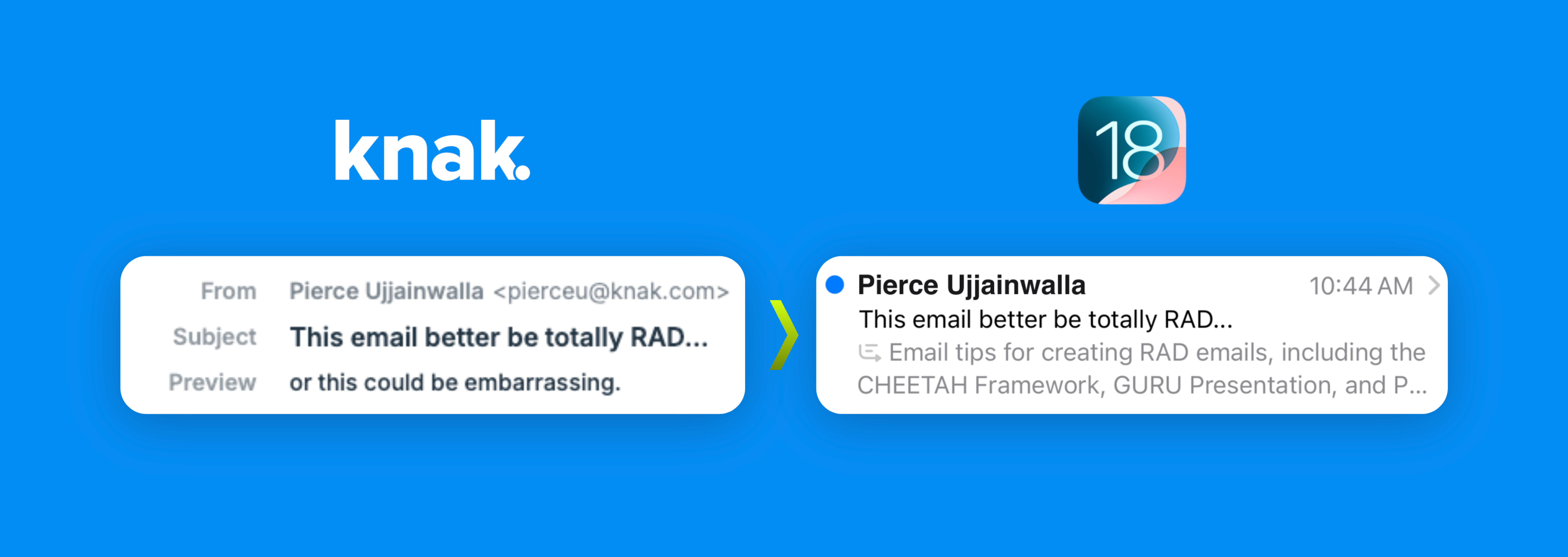
If you include a dedicated preheader or preview text snippet in your emails, this will be picked up by the AI as part of the summarization process, but it won’t be displayed as-is.
Say goodbye to using the preview text to enhance your subject line
As we discovered after a recent webinar, trying to pull a two-part joke using your subject line and preview text together is now completely ruined by the AI message summaries in the inbox. I have to say, this is the part of iOS 18 that makes me the saddest. Everything is an evolution, but I’ll really miss seeing clever preheaders like this in the inbox!
ALT text in your images is not detected
When we first saw the announcements for the Mail app on iOS 18, we speculated that it would not be able to read text that is baked into images when returning search results or generating summaries, inbox summaries or notification summaries.
We have now tested this and can confirm that ALT text is not taken into consideration for search results or any of the summaries.
To test this out, we created an email that heavily relied on text content that was baked into images, and created a few versions of this file, with varying quantities of live text. Below is the kind of layout we used across our tests.
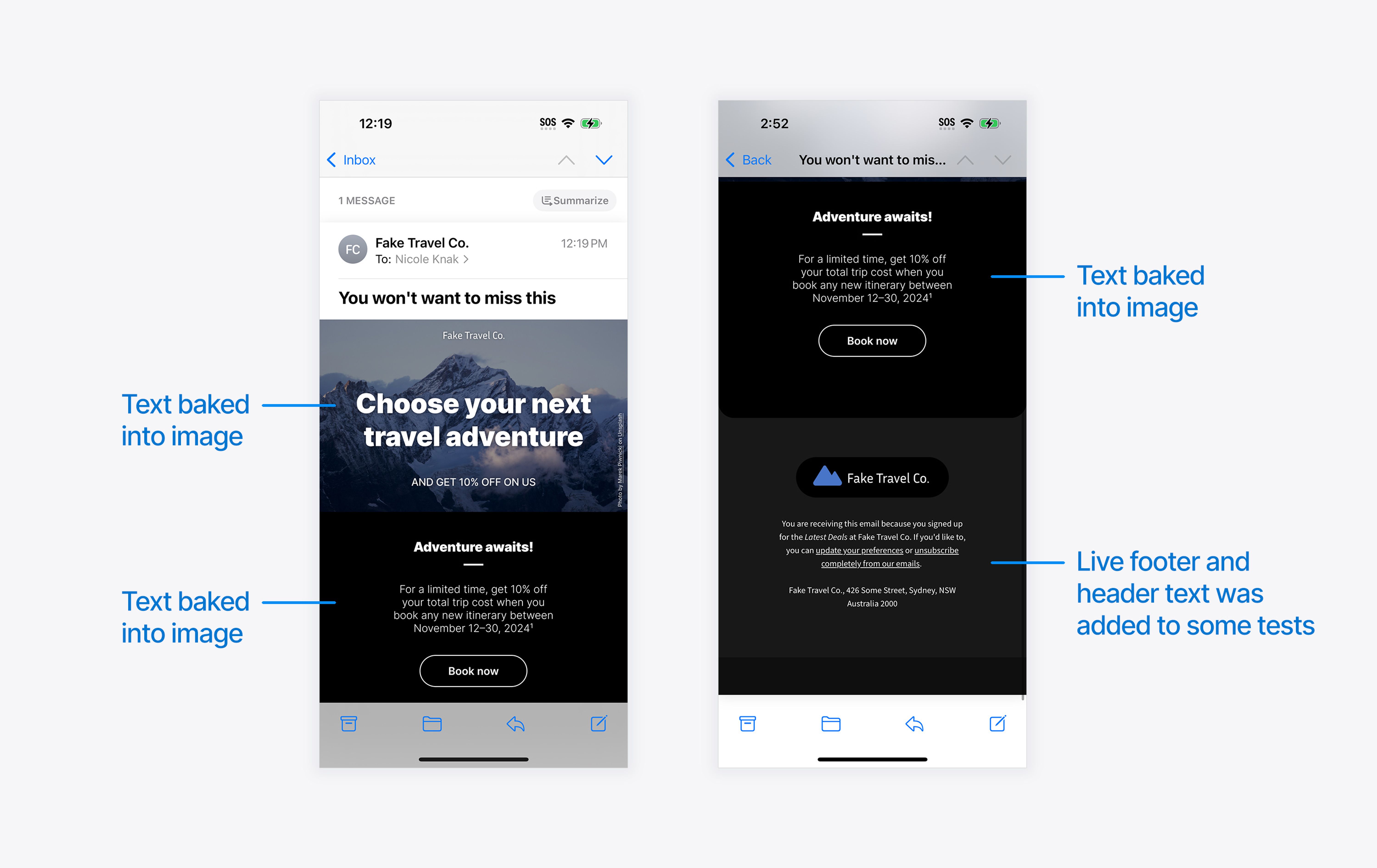
We created the following suite of tests to try out this design:
- An all-image email with no text at all (no ALT text, no preheader / preview text)
- An all-image email with ALT text on the images (no preheader)
- An all-image email with only ALT text on the images, and a preheader (“Enjoy 10% off your next adventure”)
- An email made up mostly of images, with live text in the header and footer, including the preheader
- A completely live-text version of the same email including the preheader.
Below is how that looks, on new devices with Apple Intelligence and without:
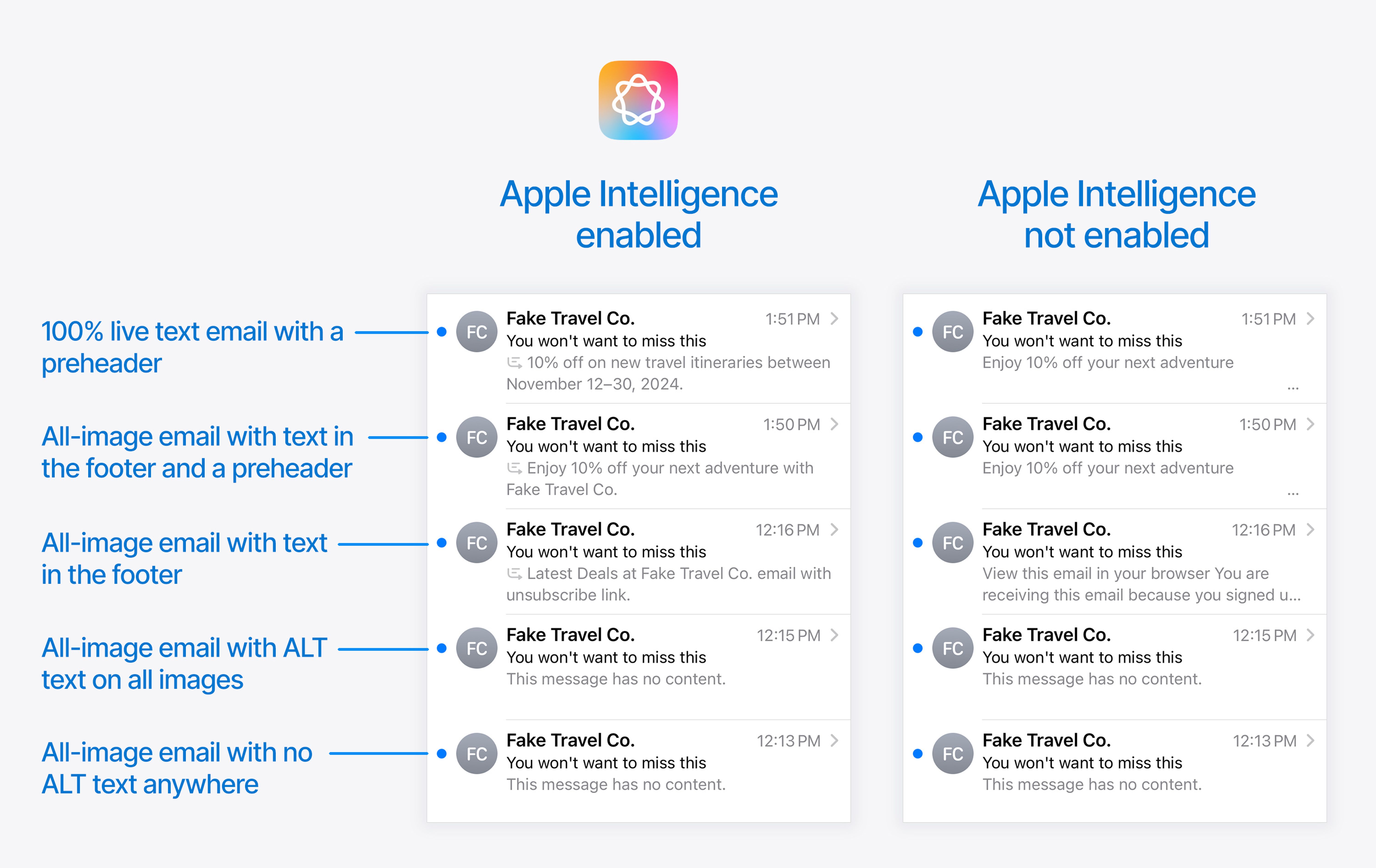
As you can see on the bottom two results, even when we provide ALT text on all of the images, this is not picked up at all.
The other results demonstrate that the AI-generated summaries never display the preheader verbatim.
The third result shows that you need to be mindful when mixing images with live text, particularly if the most important information is contained in images. In this case, the less important live text is what is going to end up in the message preview, which could really skew the impression your message gives in the inbox.
One practice like this that comes to mind is the popular method of creating a banner image for a webinar which has the webinar title, date, time and speaker photos all baked into a banner at the top. If you don’t repeat all of this important information a second time in live text, it cannot be used to create the message summary in the inbox.
Of course, your best bet is to switch to using live text for all your content, but if you are unable to immediately make this change, your first step should be ensuring that you repeat anything important as live text so that it isn’t omitted from any message summaries generated by AI.
ALT text is not detected by search or in-message summaries either
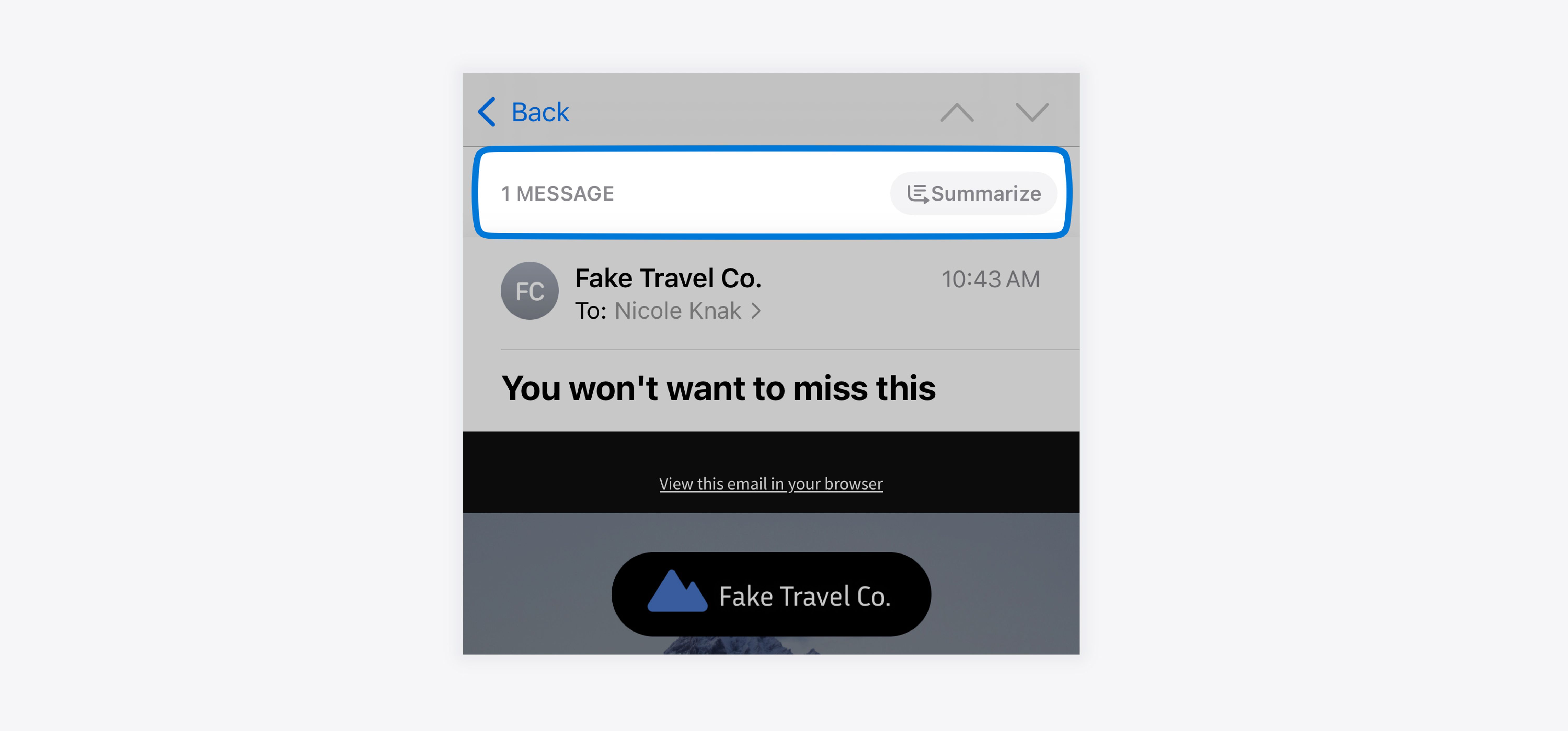
Even with comprehensive ALT text set on images, none of this content is picked up when using the Summarize feature at the top of individual messages.
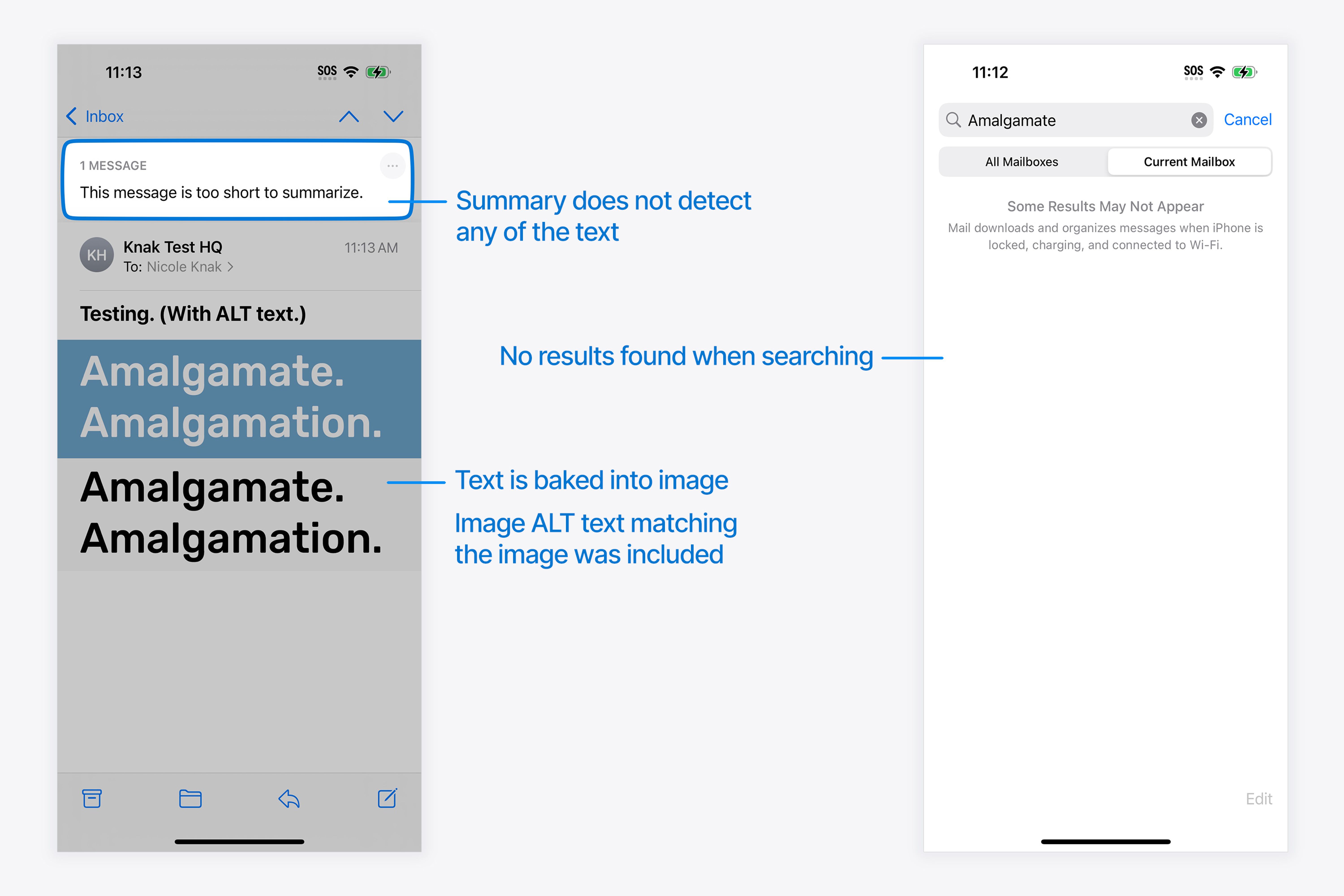
We created a test using an uncommon word which we baked into an image and accompanied with plenty of ALT text with the same words as the image. It was not detected for the purposes of search or the summary.
Conclusion
There’s certainly a lot of big changes coming in early December.
It’s worth bearing in mind that not all users are going to upgrade to the latest iPhone (or Mac or iPad) right away, so it will take a little while for the Apple Intelligence experience to become dominant, and for now most users will see the non-Apple-Intelligence version of these changes first. (See the devices that will support Apple Intelligence here.)
But even for those users on devices without Apple Intelligence, the impact of this update is going to be huge. To get ahead, we recommend the following:
- Start paying extra special attention to your Sender Name and Subject Lines in all messages, as these are the main two things you can control
- Get set up with Branded Mail on Apple Business Connect as soon as you can
- Continue to send timely, relevant and useful messages to your subscribers with clear structure, layout and content, to give your content the best chance of being summarized effectively
- Don’t embed text in your images, and instead focus on using live text for all messages
- Grab iOS 18.2 or the Public Beta as soon as you can to see how your emails look and feel, particularly in the Digest View
- Play around with optimizing your designs for the Digest View.


