How Knak Does Email: 8 Email Accessibility Best Practices

Jack Steele
Director of Engineering, Knak
Published May 28, 2020

According to the World Health Organization, at least 2.2 billion people worldwide have a vision impairment. Creating emails that every subscriber can read and understand, regardless of ability, is good business practice, and it’s something Knak helps email builders and marketers do.
Screen readers, magnifiers, and other assistive devices can make a big difference, but in order for them to do their jobs, emails must be coded correctly from the start.
Email accessibility starts at the development level
By implementing a few code and design best practices, you can improve accessibility and create a better experience for your end users.
Here are Knak’s email accessibility best practices.
- Add role=”presentation” to <TABLE> elements in the code to prevent tables from being misread by screen readers. This keeps screen readers from treating tables as data tables (and reading each piece of code aloud) when they’re actually being used for layout.
- Add custom ALT tags to images to convey the meaning of the image. If the image is just for space, entering an empty ALT attribute alt=”” prompts the screen reader to ignore the image. If the image contains text that will be valuable to the reader, setting ALT tags for the <IMG> tag will ensure the screen reader doesn’t skip over important content.

3. Set a logical reading order by using the mobile direction options. This prompts the screen reader to follow the logical column order in the same way that you create layouts that work across desktop and mobile email clients.

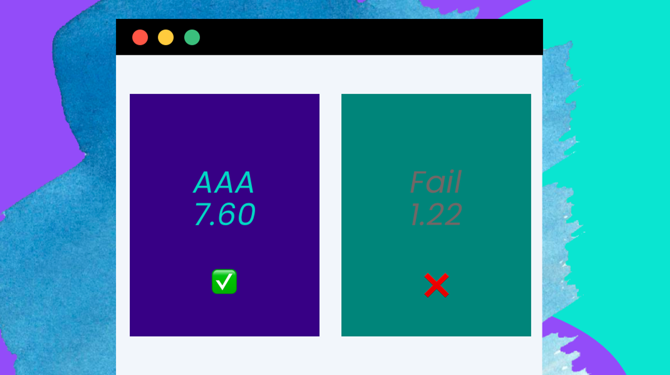
4. Set rules for font sizes and colours in your modules to ensure that colour contrast/sizing best practices are followed.

5. Left-align your copy. While it doesn’t affect screen readers, center-aligned copy puts the starting edge for each line in a different place, making it challenging for those with reading impairments like dyslexia to find the beginning of each line.
6. Use Knak to set a logical subject line and preview text. Knak also sets a title for the email automatically based on the email’s subject line.

7. Use semantic tags for paragraphs and headers. Header tags prompt screen readers to emphasize titles when reading, and should be written with header tags (<h1>, <h2>, <h3>, <h4>, etc.) Body copy should have <P> tags to keep your email from being read as one giant block of text.
8. Set the language. If a screen reader is reading your email, you want to make sure it’s in the right language by adding lang=“xx” to your code. A complete list of language codes, including distinctions for different accents, i.e.: Canadian, British, and American English, can be found here.
When you use Knak, your emails are built using custom modules. These best practices can be built directly into your modules as rules, making it easy for emails builders to follow them.
Plus, steps 1 and 2 are automatically taken care of by Knak, giving you one less thing to think about. It takes the guesswork out of accessibility so it’s simple for your team to create emails that follow the guidelines.
Adhering to these 8 steps will create a better experience for those with vision or other reading impairments. They’re simple to implement – even simpler if you’ve built the rules directly into your Knak modules – and they make a big difference for those who need them.
For more on How Knak Does Email, check out our Guide to Simple Design.


