A Balanced Approach to Email Design Trends

Asra Sarfraz
Senior Visual Designer, Knak
Published Jun 17, 2020

Summary
Explore email design trends with Knak! Discover new possibilities and make emails stand out. Learn more about staying on-trend with Knak's innovative solutions.
How do you feel about trends? Do you love to see what’s new so you can try it out? Ignore them and carry on with your own best practices? Wait and see what seems like it’s going to stick?
As a UI designer, I find myself in a love/hate relationship with trends. Part of what drew me to visual design in the first place was the chance to be different in a sea of repetitive tech trends. I love that I get to elevate my company’s visual identity while collaborating with the rest of the design team to give our users the best possible visual experience (check out our newly revamped about page and blog for some solid examples).
But whenever a new fad comes around, it can be uninspiring to see everyone jump on the bandwagon. Before long, my inbox starts to look homogenous, and homogenous is just a boring way to be.
Trying out new design elements is great. It keeps your work from looking stale, allows you to think outside the box, and hopefully keeps you away from the open source, stock photo, hipsters-working-hard imagery we’ve all seen a hundred times.
Remember these folks?
Images: Unsplash
The key to successfully incorporating trends into your email is to find the ones that amplify and enhance your brand voice, and then work that trend into your existing tone, rather than vice versa.
There are a few things, though, that I think anyone can take a crack at to level-up their design game and help their emails stand out.
Let’s dive in shall we?
#1: Bold Colours
Don’t be afraid to try a bold colour or two in your emails. Better yet, build your entire campaign around a bold colour.
One of the very first things I did when I became the Senior Designer at Knak was to introduce secondary colours to our palette. We still have our signature blue and green, but we now also have black, salmon, orange, and yellow to help accent our content when needed. It still looks like the OG Knak, but now it’s much more visually compelling, gives us greater versatility, and allows our company voice to shine in a new way.
If your colour palette is fairly limited, add some complementary colours to your existing options or check out this great tool to help you pick a palette. Start with one or two, and then gradually incorporate more until you’ve got a wide range of choices.

Best Practice: Don’t use two bold colours one after the other if it can be helped. Bold colours draw attention and give content greater prominence, but too much can overwhelm the viewer, leading them to skim over it.
Use colour to your advantage to make your readers feel something! Reference the colour emotion guide to better understand how colours can help you communicate ideas or influence readers’ opinions. Also, pay attention to the emotions associated with the colours you’re picking:
- Yellows are bright and happy
- Greens are environmentally friendly
- Reds are energetic and demanding
#2: 3D Illustrations/Artwork
3D illustrations are gradually making their way into the market and overtaking (the widely overused) 2D illustrations. In a really refreshing twist, companies are adopting a clean, chunky, and playful style to showcase their brands, like these beautifully done illustrations done from Pitch.com:

Best Practice: Keep these illustrations minimal and vague enough that they can be used in multiple areas of your emails/content/website. If they’re a bit generic (though still well-branded, obviously), you can express your company’s message without commissioning 50 different versions and getting stuck with a hefty price tag.
#3: Animated GIFs
Playful animated GIFs give your email an extra level of panache, but you gotta keep it smart. Too many animations can be distracting and lead to slower page load time, which in turn leads to higher bounce rates.
A balanced approach is key here. Use an animation to enhance your copy, but don’t use one to distract from content that isn’t as good as it should be.
Best Practice: To use these wisely, pick a style, and keep it consistent. Once you’ve selected an animation style, follow it throughout your entire communication with users. This builds brand awareness, familiarity, and trust.
And a word to the wise: keep your animation under 1MB. Any bigger and your email may be truncated or blocked. Plus, your readers may not want to use their data to download larger animations.
#4: Interactive Emails
Emails aren’t just for sharing information; they can also be used to collect information, so make ‘em work for you. Building interactive emails is a great way to learn more about your customers and get engaging, relatable content in front of your audience.
Here are some great examples:
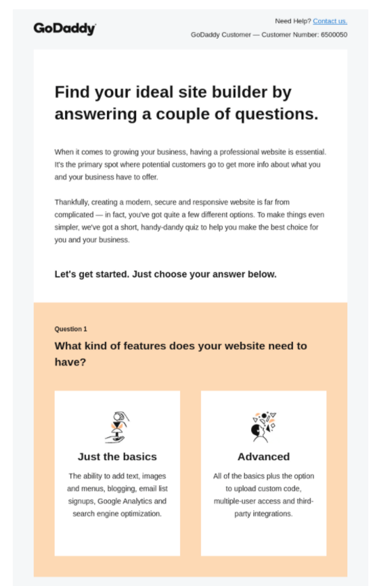
A super short quiz, like this one from GoDaddy, can help you find out what features your customers are looking for:
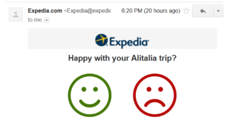
A short survey in a post-purchase email lets you collect product reviews/feedback easily, like this one from Expedia:

And a set of Yes/No buttons can help your guests RSVP to your events easily:
Best Practice: Keep these surveys concise, minimal, and clean: one question, a bold CTA, minimal distraction.
#5: Typographic Hierarchy

The right hierarchy can help guide readers through your content. I’m a huge fan of the bold font/layout that Tracksmith uses here. It’s clean, crisp, and visually compelling:
Best Practice: Use visual text hierarchy to make your content stand out. With no/limited hierarchy – i.e. all the text is weighted the same – the content you want to stand out the most can get buried. If you’re using it correctly, you can keep the images to a minimum and still have a clean, visually engaging email.
#6: Monochromatic Layouts
Who doesn’t love a monochromatic palette once in a while? Different shades of the same colour can be very successful if used correctly.
Best Practice: Don’t use two different colours and introduce their shades. Stick to one hue and play around with the tints to get a clean, polished layout. It is mono, after all!
#7: Texture, Texture, Texture!
Out-of-the box, textured images can draw more attention to your content than the repetitive, human-ish illustrations mentioned in #2.
Try textures like watercolour strokes or newspaper cut-outs, or maybe even tape textures:
Best Practice: Adding texture makes your content more visually appealing and sets you apart from the competition. Consider commissioning a couple of custom pieces from an artist or illustrator to create your own distinct look, like Intercom does on their blogs:
Or like we did for our Email Benchmark Report:
Experiment! But Remember Consistency is King
The great thing about emails (especially if you’re building them in Knak) is that you can experiment with different design elements without too much difficulty (or banging your head against the wall). Get creative and test out some of these trends, but keep consistency and branding top of mind.
Something that looks amazing for one organization might be totally off-brand for yours, so approach these (and every other trend, for that matter) from a brand-first perspective. If you can work a new idea into your existing branding in a way that feels cutting-edge but still looks like you, you’ll have an elevated, on-brand message that builds familiarity and develops loyal readers and fans.
Is there a trend you love that we didn’t cover? Let us know! Send us a note and fill us in on your favorite email design trends.
With Knak, anyone can build beautiful emails that keep your brand at the centre. Want to see how it works? Let’s chat! Schedule a demo and let us show you how Knak makes it easy to create incredible emails from start to finish.