7 User Experience (UX) Strategies for Great Email Design


We all know a great email when we see one. But, on the other hand, the design may be a brand masterclass, like when Apple launches a new iPhone or a timely email from an online retailer informing you about a sale.
As digital marketers, we seek to create iconic brand experiences through email. However, it is more than just making one great email – we want to create consistently great emails.
What do all great emails have in common? First, they follow user experience (UX) design principles beyond the visual experience and account for performance, user context, and technical specs.
What is email user experience (UX) design?
Email UX design encompasses all end-user interactions with your email communication, including the visual design, performance, and content. Email UX aims to create a compelling brand experience while also achieving marketing objectives such as purchases, sales inquiries, or event follow up emails.
By adopting a UX design approach, we widen our perspective from what we can see in the inbox and can see the email as one event in a series of user interactions. For example, if you’re a software-as-a-service (SaaS) organization, you might send onboarding emails to new users using email automation. Your product team may also use in-application onboarding tours to help educate new users – how does this impact the information you share in emails?
Why is UX important for enterprise email design?
For enterprise organizations, email UX carries weight beyond individual campaigns. When you're sending thousands or millions of emails monthly, poor UX compounds into measurable business impact. Your email represents your brand in the inbox, and with personalized subject lines increasing open rates by up to 50%, getting the experience right matters more than ever.
Think about the operational side: confusing layouts and unclear CTAs generate support tickets, waste marketing spend, and frustrate users who might otherwise convert. Enterprise teams that prioritize email UX see average open rates between 32-36% and build stronger customer relationships through consistent, accessible design. When your emails work seamlessly across devices and respect accessibility standards, you're not just avoiding compliance issues, you're demonstrating professionalism that builds trust.
The bottom line? Neglecting email UX at scale means leaving revenue on the table. More than half of consumers make purchase decisions based on marketing emails, and they actively want well-designed messages that respect their time and attention. For enterprises competing in crowded inboxes, strong UX becomes your differentiator.
You can already see that email UX is about understanding your end user’s context. Once you have that, the specific design decisions are a lot easier.
1. Define your audience
Knowing your audience is the first step in sending consistently great emails. The more you know about your audience, the more you can incorporate that into your email design.
UX and product teams use segments, or cohorts, to examine user behaviour and make design decisions. In the context of email, we can take our list building to the next level by segmenting our list by behaviour, acquisition source, or even real-time interactions.
Marketing automation platforms like Marketo and Eloqua provide robust toolsets for segmenting your database. This is the first step in true personalization, beyond standard tokens like first name, last name, and company name. Then, like a UX designer, you can design experiences for your audience based on their membership in a segment.
Why is this important for consistently great emails? As you scale your email marketing efforts, you’ll also want to scale your ability to communicate at a personal level. For example, sending personal communications to an email list with 100 contacts is easy compared to 10,000 contacts.
Like eliminating technical debt and bugs is part of the UX design lifecycle, email marketers must perform regular database hygiene. Make a regular habit of removing duplicates, invalid, and outdated contacts, and you’ll be rewarded with more accurate tracking and fewer deliverability issues.
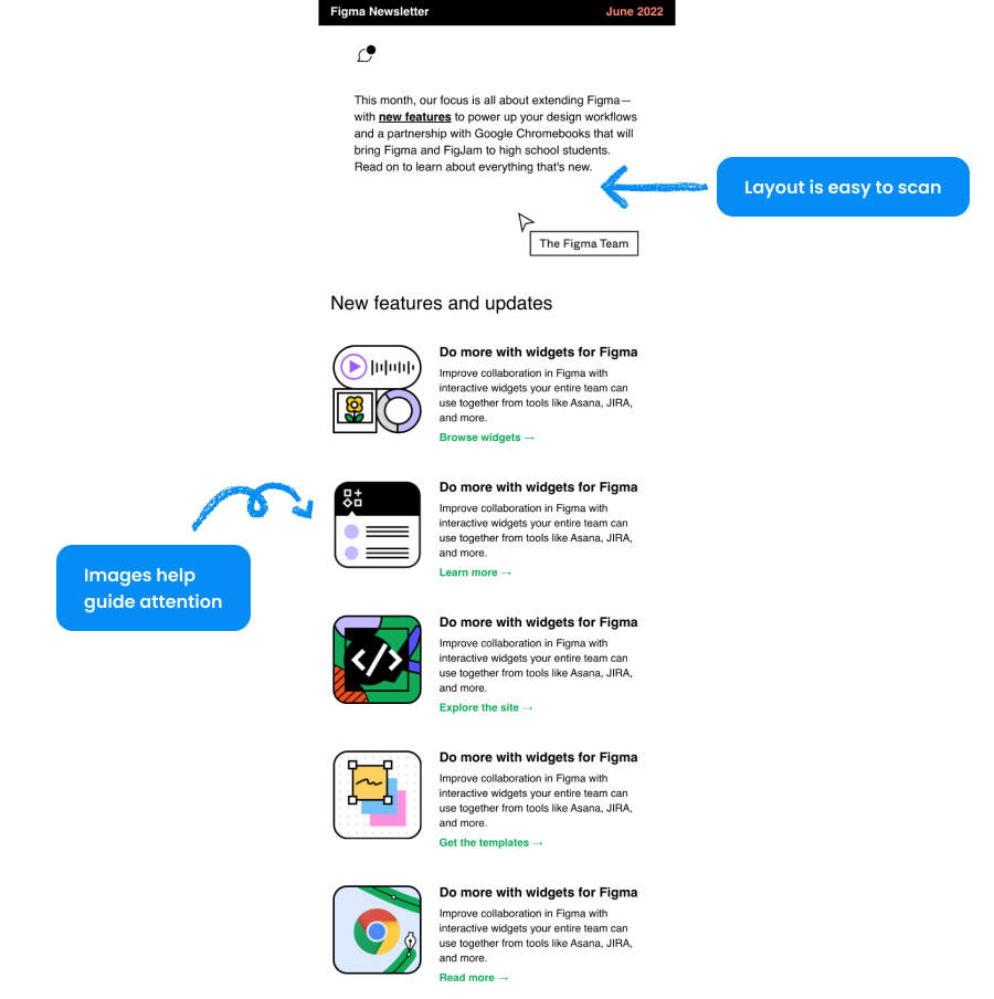
2. Make your content scannable
Emails that are easy to skim will help you win and get results. UX designers are experts at conveying the maximum amount of information with minimum content and design elements.
When it comes to email design, there are two categories to consider:
- Email layout design patterns
- Email content that is easy to scan
Your email’s layout has a significant impact on the scannability of your content. No single layout will automatically make your emails more or less scannable. It will depend on what you’re promoting, your audience, and the content of the email.
That said, some common email design patterns may be precisely what you’re looking for. Here are a few to consider:
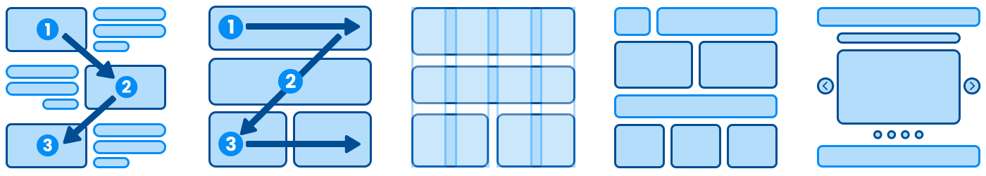
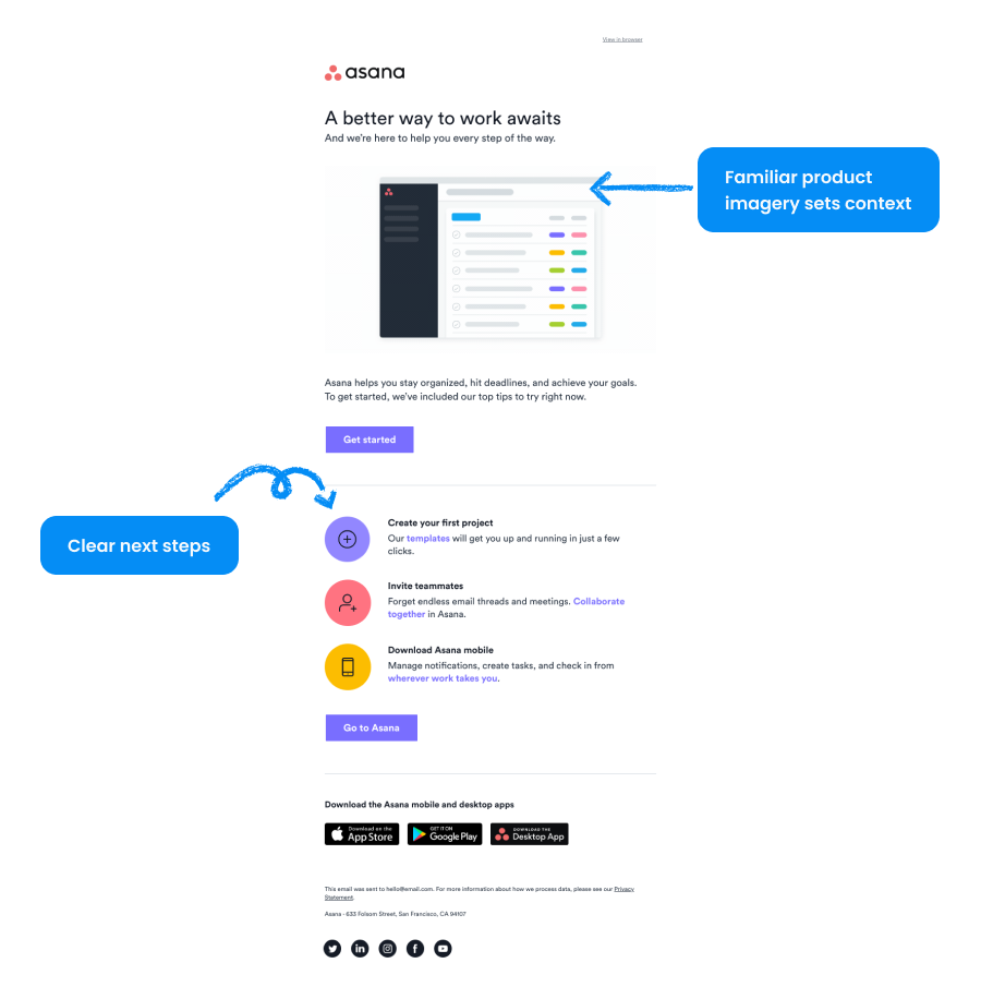
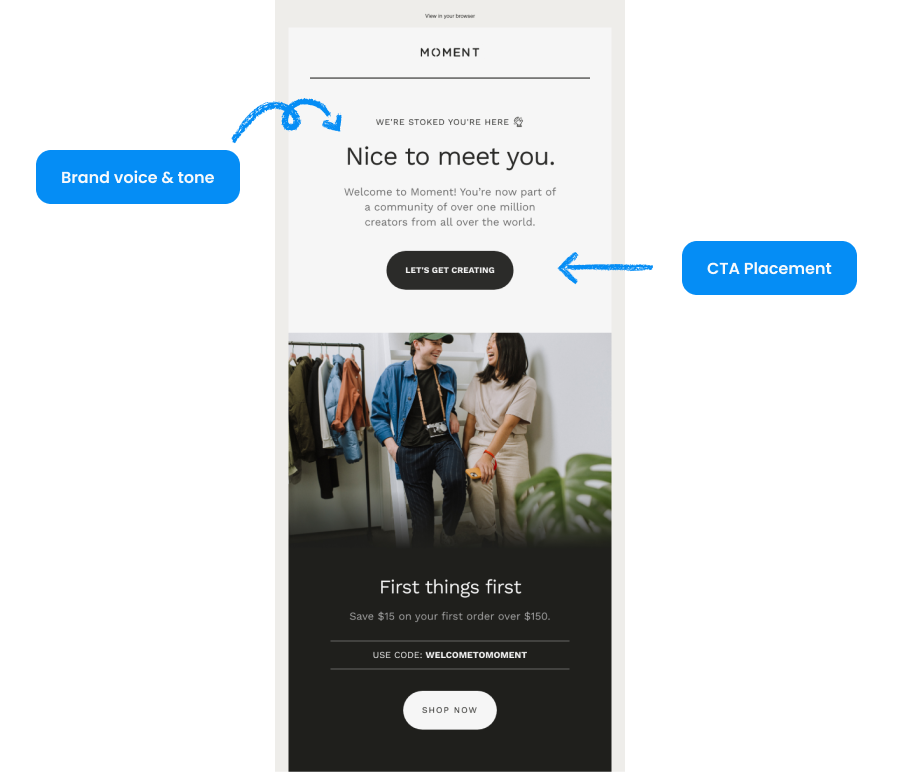
- S-curve design: Create a visual “S” pattern with the most critical information and calls-to-action positioned at the top and bottom of the curve.
- Z-pattern design: Create a visual “Z” pattern with a main header at the top left, followed by content arranged diagonally across the page, and ending with a call-to-action (CTA) at the bottom right. This can effectively guide the reader’s eye through the email naturally and intuitively.
- Grid-based design: Create a grid of columns and rows to provide flexibility for presenting content while maintaining balance and order.
- Single-column design: Classic approach to email design, but familiar to any reader
- Magazine-style design: Create a layout that resembles a magazine or newspaper, with multiple columns, headlines, and images. Be careful, as it’s easy to get cluttered!
- Interactive design: Use elements like buttons, sliders, and animations to create engaging, immersive email experiences. Keep an eye on email load time and deliverability for this layout.
Email content that is easy to scan
Content choices have a significant impact on the scannability of your email. Follow these guiding principles, and you’ll create a better email:
- Use a clear and concise subject line that accurately reflects the content of the email
- Use the preview text to add additional information about your content and encourage the reader to open the email
- Use headings and subheadings to break the content into smaller, easily digestible sections
- Use bullet points or numbered lists to present information in an easy-to-read format
- Use short paragraphs and sentences to make the content easier to read
- Use bold or italicized text to highlight key points or essential information
- Use white space to make the email easier on the eyes and separate different content sections
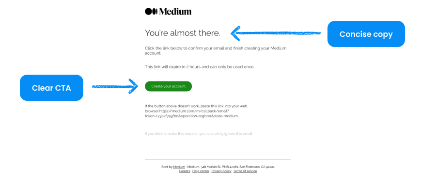
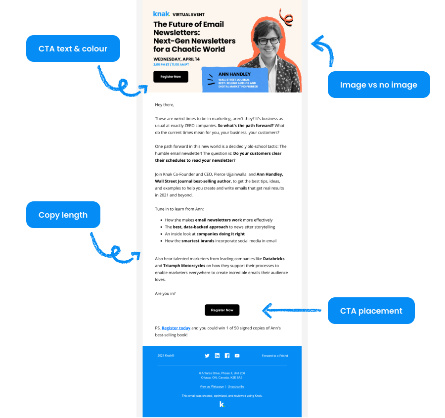
3. Use a clear call-to-action
A clear call-to-action (CTA) in your email gives your readers a direct path to action. Common CTAs in the email include purchasing, signing up for a service, registering for an event, or replying to an email. Getting your CTA right can result in higher click-through rates and more conversions.
From a UX design perspective, it’s important to remember a desire for clarity and ease of use drives users. A clear CTA reduces confusion and gives users a straightforward path to complete the desired action. If a user is going to complete the action, it’s our job to make it as easy as possible.
Marketers should conduct research and analysis to optimize the CTA design to gain insight into user interactions. For example, you can draw insights from how users interact with a similar CTA on your website. Like product and UX teams, you’ll also want to A/B test your CTAs to improve your email design continually.
4. Design for accessibility
Creating more accessible emails ensures everyone can fully access and engage with your brand’s content. Web browsers and desktop applications enable anyone to interact with your brand, and by designing accessible emails, you can be consistently awesome at email.
Creating a digital experience accessible to all users is the responsibility of all content creators and brands. Thankfully, modern accessibility standards can help guide our design decisions to make.
Here are some ground rules to follow when designing emails for accessibility:
- Use simple, easy-to-understand language that is free of jargon or complex terms
- Use alt text for images so people using screen readers can understand the content of the image
- Use colours with high contrast to make it easier to read the text against the background of the email
- Use scalable fonts to make it easy to adjust the text size
- Use descriptive link text and not “click here.”
- Use semantic HTML and HTML 5 elements better to convey the meaning and structure of the content to screen readers
5. Reduce email load time
Product designers and user experience researchers know how performance can impact user experience. Email is no exception – reducing email load time is a proven way to deliver consistently great user experiences.
Here are some tips for reducing email load time:
Optimize images
Properly format and optimized images that load quickly minimize the time to value for your email reader. Here are some quick tips:
- Keep image file size under 1MB
- Compress images
- Use modern file formats
- Use appropriate resolution
Minimize code
The amount of code included in the email impacts load time. Ensure to reduce unnecessary HTML or CSS and use inline styles to reduce or eliminate requests to an external CSS file.
Pro-tip: Knak users don’t have to sweat this part, as Knak Enterprise takes care of this part for you.
Test on various devices and email clients
Test the email on different devices and email clients to ensure it loads quickly and correctly on all platforms.
Use responsive design
Adopt a mobile-first design approach to your emails and reduce the time email clients need to compile your email for your recipient’s device.
A mobile-first design approach puts your user’s experience first by accounting for screen size and potential data limitations. For example, mobile accounts for 46% of email opens, increasing as younger generations enter the workforce.
Concise copy and content
Content decisions can impact load time. For example, consider moving some of the content in your email to a landing page to reduce the email load time.
6. Authentication and deliverability
To ensure your email reaches your audience, you must ensure your brand has the correct protocols. Authentication and deliverability through proper usage of SPF and DKIM are key to user experience; getting these details right is essential to landing in your audience’s inbox.
Sender Policy Framework (SPF)
SPF is an email authentication protocol that helps to prevent spoofing by verifying that the incoming email messages match against the authorized servers. You or your IT team will create a TXT record that verifies which IP addresses are used to send an email on behalf of your organization. Any email claiming to be from our organization but sent from a suspicious IP will be caught.
DomainKeys Identified Mail (DKIM)
DKIM is a standard email authentication method that adds an encrypted digital signature to outgoing messages. By adding a signature within the message header (in a way that is only visible to email servers), DKIM provides an additional layer of security with SPF.
Domain-based Message Authentication, Reporting and Conformance (DMARC)
DMARC is an email policy framework that adds an additional layer of protection to prevent email spoofing and phishing attacks. DMARC provides instructions for reporting incidents to the domain owner, allowing them to check and follow up on emails. Emails may be delivered, quarantined or rejected.
Email Reputation
Email providers assign to an email sender based on their history of sending emails. How users interact with your previous emails will determine where it is placed in the inbox.
Simple things like providing a straightforward way to opt out of communications can prevent your email from getting marked as spam and your reputation from taking a hit.
List hygiene
Good list hygiene is one of the best ways to maintain high deliverability standards. Make it a habit to review contacts lists regularly, removing old and unengaged contacts.
Finding a few “spam trap” email addresses in your database is common. These addresses may have been legitimate at one point but, for whatever reason, are abandoned or invalid. By practicing good list hygiene, you can avoid unnecessary headaches while providing a better experience for your audience.
7. Track email analytics and metrics
Modern UX research uses analytics tools to track how users behavior and interact with software applications. A similar data-driven approach in email marketing is natural for marketers – the types of conclusions you draw from the data should help guide your approach to designing better emails.
UX teams will often put their assumptions to the test using data-driven A/B testing. By testing out different design elements, such as subject lines, calls-to-action, and content, email marketers can identify design practices that will result in better business outcomes.
Here are some ideas for testing common email design elements:
Email Design Element | What to test |
|---|---|
Subject Line | Test different lengths, personalization, and messaging to determine what resonates best with your audience. |
Call-to-Action (CTA) | Test different placement, wording, and design of your CTA to see which generates the most clicks and conversions. |
Email Content | Email Content Test different content formats, such as videos or images, to determine what your audience responds to best. |
Sender Name | Test different sender names, such as a specific individual versus a brand name, to see which generates the highest open rates. |
Timing | Test different send times and days of the week to see when your audience is most likely to engage with your emails. |
Email Design Element | Subject Line |
|---|---|
What to test | Test different lengths, personalization, and messaging to determine what resonates best with your audience. |
Email Design Element | Call-to-Action (CTA) |
|---|---|
What to test | Test different placement, wording, and design of your CTA to see which generates the most clicks and conversions. |
Email Design Element | Email Content |
|---|---|
What to test | Email Content Test different content formats, such as videos or images, to determine what your audience responds to best. |
Email Design Element | Sender Name |
|---|---|
What to test | Test different sender names, such as a specific individual versus a brand name, to see which generates the highest open rates. |
Email Design Element | Timing |
|---|---|
What to test | Test different send times and days of the week to see when your audience is most likely to engage with your emails. |
Metrics to track email UX
Understanding which metrics reveal UX effectiveness helps you move beyond vanity numbers to actionable insights. Email UX metrics span the entire user journey, from inbox to action, giving you a complete picture of how design impacts performance.
Most teams already weight the same two numbers: click-through rate (69%) and conversion rate (58%) dominate how email and landing page performance gets measured.
Delivery & First Impressions
Bounce Rate: The percentage of emails that fail to reach inboxes. High bounce rates signal list quality issues before users even see your design. Keep hard bounces under 2% through regular list maintenance.
Spam Complaint Rate: When recipients mark your email as spam, it damages sender reputation and future deliverability. Rates above 0.1% indicate UX problems like difficult unsubscribe processes or misleading subject lines.
Engagement & Interaction
Click-to-Open Rate (CTOR): The ratio of unique clicks to unique opens, showing how compelling your content is once opened. This metric isolates email design effectiveness from subject line performance. Strong UX typically achieves CTORs above 20%.
Time Spent/Read Time: How long recipients engage with your email content. Quick exits suggest scanability issues, while extended reading indicates your layout successfully guides attention through key messages.
User Error Rate: Frequency of broken links, rendering failures, or inaccessible content. Even one broken CTA can tank campaign performance, making this a critical UX health indicator.
Conversion & Business Impact
Task Success Rate: The percentage of users who complete intended actions like form submissions or purchases directly from email. This connects UX quality to business outcomes.
Mobile vs Desktop Performance: Compare metrics across devices to identify responsive design issues. With mobile accounting for 46% of email opens, significant performance gaps reveal UX problems.
Unsubscribe Rate: While some attrition is normal, rates above 0.5% per campaign suggest content relevance or design friction. Track this alongside engagement metrics to distinguish UX issues from targeting problems.
Modern Email Design + UX Strategy = Winning Strategy
Where does modern email design start and end? By adopting user experience strategies, we can see emails as one step in interactions someone takes with our brand. The history of email marketing is about creating engaging, authentic user experiences. Therefore, crafting well-designed emails is as much about considering the customer journey as beautiful visuals and a solid layout.
Email analytics and metrics give email marketers a rich toolset to dissect and analyze results. However, email marketing is an iterative process – the same as UX and product design –and our goal should be improvement versus perfection. A UX approach is a cycle of continuous optimization that will result in consistently great emails.
Looking for UX inspiration for your next email campaign? Check out our Email Gallery to see 50+ high-converting enterprise email examples spanning over 10+ campaign categories.
Email UX Strategies FAQ
How do different segmentations influence the choice of UX strategies in UX design?
One of the core principles of UX is designing for your audience. This means understanding who is potentially opening the email, their context, preferences, and needs. A well executed segmentation strategy lets you apply a data-informed approach to sending emails. Each segment in your database may have different, albeit subtle, preferences when it comes to email. What works with one segment may not work with the others. This is where continuous testing and optimization are important, as they will help you refine your approach against the backdrop of real-world data.
What tools can I use to track metrics to determine my email's performance?
Getting real-world data on your email performance is the best way to evaluate your email's UX and effectiveness. With authentication requirements coming into effect for platforms like Yahoo and Gmail, it can be a challenge to get pin-point accuracy from your email data. However, using tools like Marketo or your email sending platform is your first opportunity to analyze the impact of your email's UX. Tools like Google Analytics 4 can also help trace the experience of users who find your website through email.
Can you provide an example of how to use A/B testing to improve email design?
Data is at the heart of good UX strategy. A/B testing is an effective way to compare two versions of email to see which performs better. As a simple example, you could modify the subject line to see which gets a higher open rate. For example, testing first name personalization, using emojis in the email, or trying special characters.
For a more complex example, you could try testing the layout of your newsletter template. Does one email template get more clicks than the other? Try using different design patterns in your email like S-curve design, Z-pattern design, and grid-based design to determine what works best for your brand.
What are common mistakes in email UX design?
We are inundated with email and notifications; it's easy to overwhelm users already drowning in message overload. Our job is to design emails that cut through the noise, and deliver a simple message. Common mistakes in email design include:
- Including too much content in your email
- Using unclear calls-to-action
- Not optimizing for mobile devices