How to build effective forms for Marketo landing pages

Jack Steele
Director of Engineering, Knak
Updated Apr 15, 2024
Published Feb 1, 2022

What makes a good Marketo form? A good form has a direct impact that can be measured as on-page conversion rate. But it's not just about conversion rates – it's also about the user experience.
We often think about forms from the perspective of our demand generation programs. While this isn't inherently wrong – I mean, we put forms on our website to capture and qualify leads – it can also be a narrow view. Forms are the doorway to your customer journey; as the first step in that journey, it's key to get it right.
In this post, we're going to go deep on Marketo forms to help you turn them into high converting, user-friendly entry points to your customer journey.
Designing user-friendly Marketo Forms
Good design is easy to spot, but can be hard to describe. When it comes to forms, getting the user experience just right is key – it is often one of the most important points in the early customer journey. Think about it: this is the moment when an anonymous web visitor takes the step to formally introduce themselves and declare their intentions.
Good design principles apply to your Marketo forms. Here are our top tips for form design:
- Responsive form design
- Form placement
- Make the form easy to complete
- Use supplementary visual aids
- Form elements are all on-brand
Responsive form design
Mobile design is a must for the modern web. According to Semrush, there are 313% more visits on mobile devices compared to desktop. Making your Marketo forms responsive is key, but how to apply this knowledge? Well, responsive mobile design accounts for a few principles:
- Form placement on smaller screen sizes
- Form fields fit on the screen with no horizontal scroll
- Form text is easy to read
- Form button placement is logical and intuitive
- Touch friendly inputs on mobile devices
- Visual feedback for validation
Form placement
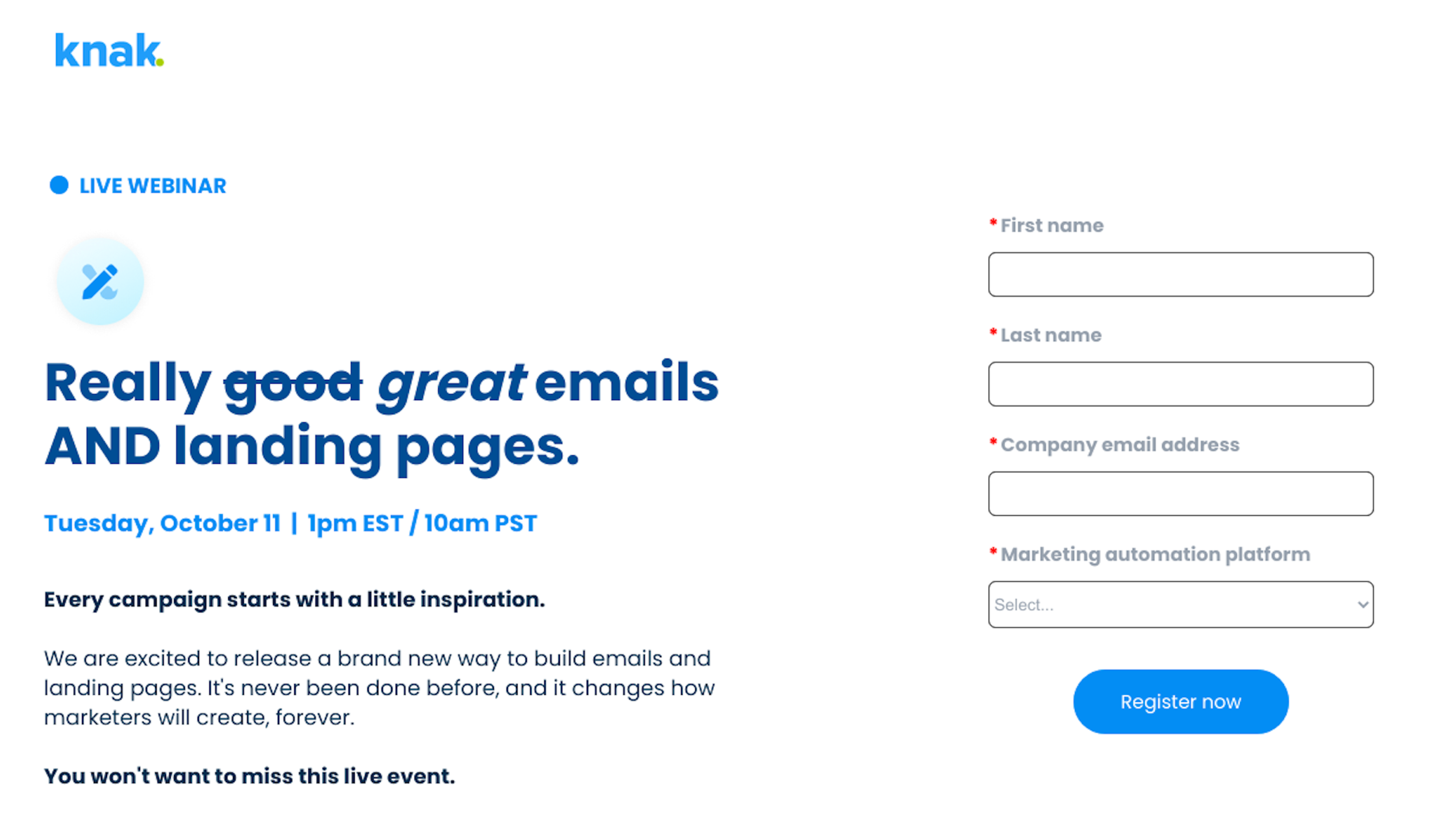
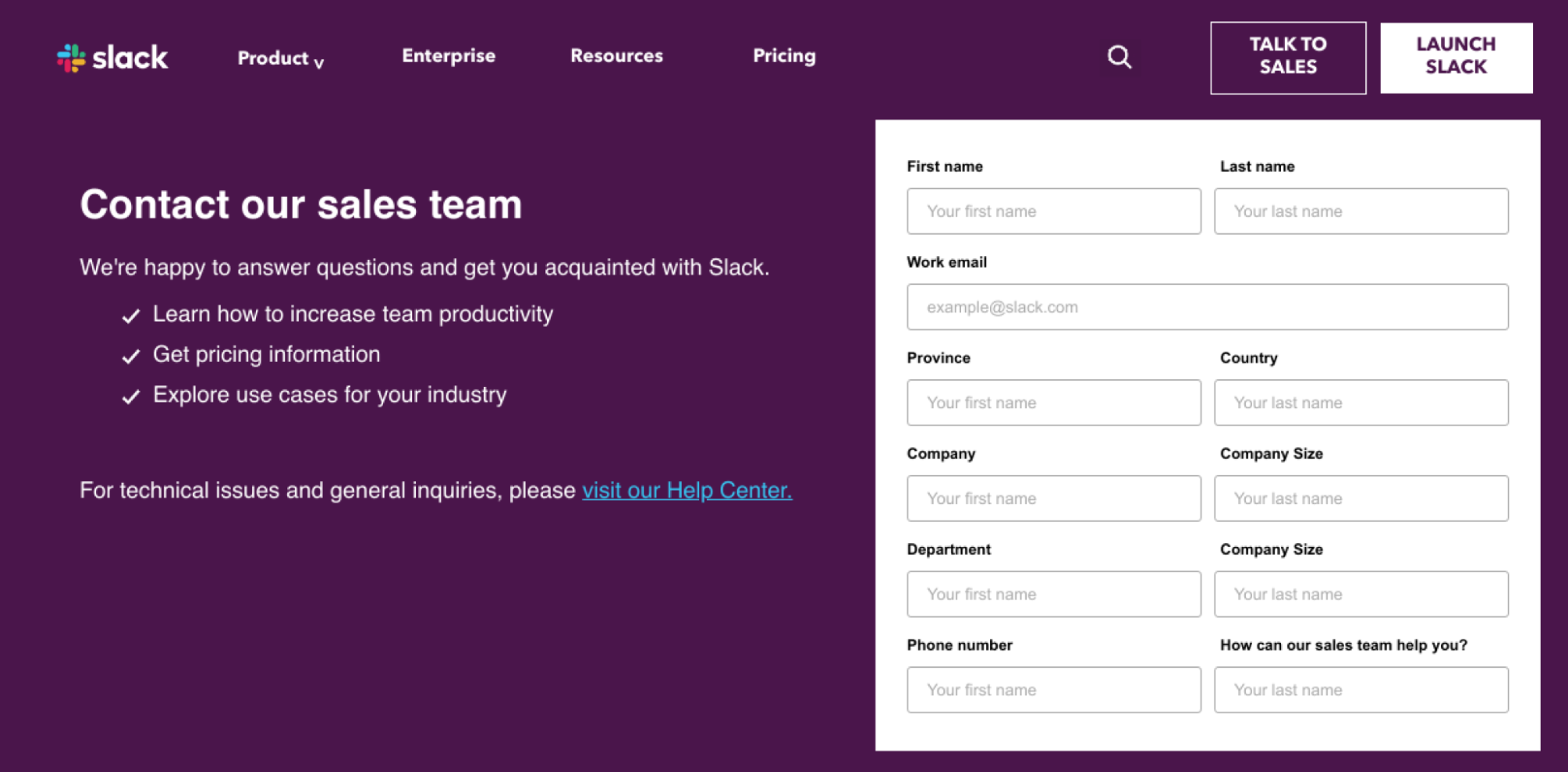
Where you place your form has an impact on conversion rates and user experience. As a guiding principle, it's best to place the form above the fold and use a clear call-to-action. There are lots of opinions about whether to place the form on the left or right side of the screen, it's something that is easy to A/B test and to decide for yourself. Regardless of where you place the form, it's important to use white space around the form to reduce visual clutter and allow your user to focus on the form itself.

Make the form easy to complete
HTML5 input types like email, telephone, and datetime are supported in Marketo forms and help to make form fields easier to complete. Reducing friction during this step is essential, especially in B2B demand generation as we like to capture as much information as possible. Marketo provides functionality for autocomplete if the user is a known Marketo lead.
Use supplementary visual aids
Simple visual aids can go a long way to helping users complete the form. Icons such as an email or telephone can make it easy for users to add their information. Even providing hint text can make a difference on the user experience.
Form elements are all on-brand
Forms are an extension of your brand – as noted earlier, they are also one of the most important early engagement points you have with your customer. Set the tone by making sure your form elements are on-brand. Marketo forms support custom CSS, and landing page tools like Knak also allow you to style pages without having to write code.

Marketo form best practices
Marketo provides lots of functionality for creating, designing, and deploying custom forms. Here are some best practices we've picked up in our journey with this marketing automation tool:
- Double check your Marketo fields
- Use picklists, not free text
- Use hidden fields to parse additional data
- Use prefill for returning visitors
- Use progressive profiling
- Use visibility rules
- Use global forms to be efficient, scalable
Double check your Marketo fields
When building a Marketo form, it's easy to select fields from across your lead database. This is a great feature as it allows you to append data captured from a form to your leads, which can be useful for segmentation and lead nurturing.
However, in larger Marketo instances or in cases where multiple fields exist using similar names, it's possible to use the wrong field and start populating similar data across multiple fields. For example, imagine having a property for industry and lead_industry. If you use these properties interchangeably across multiple forms, you'll eventually have to reconcile the data.
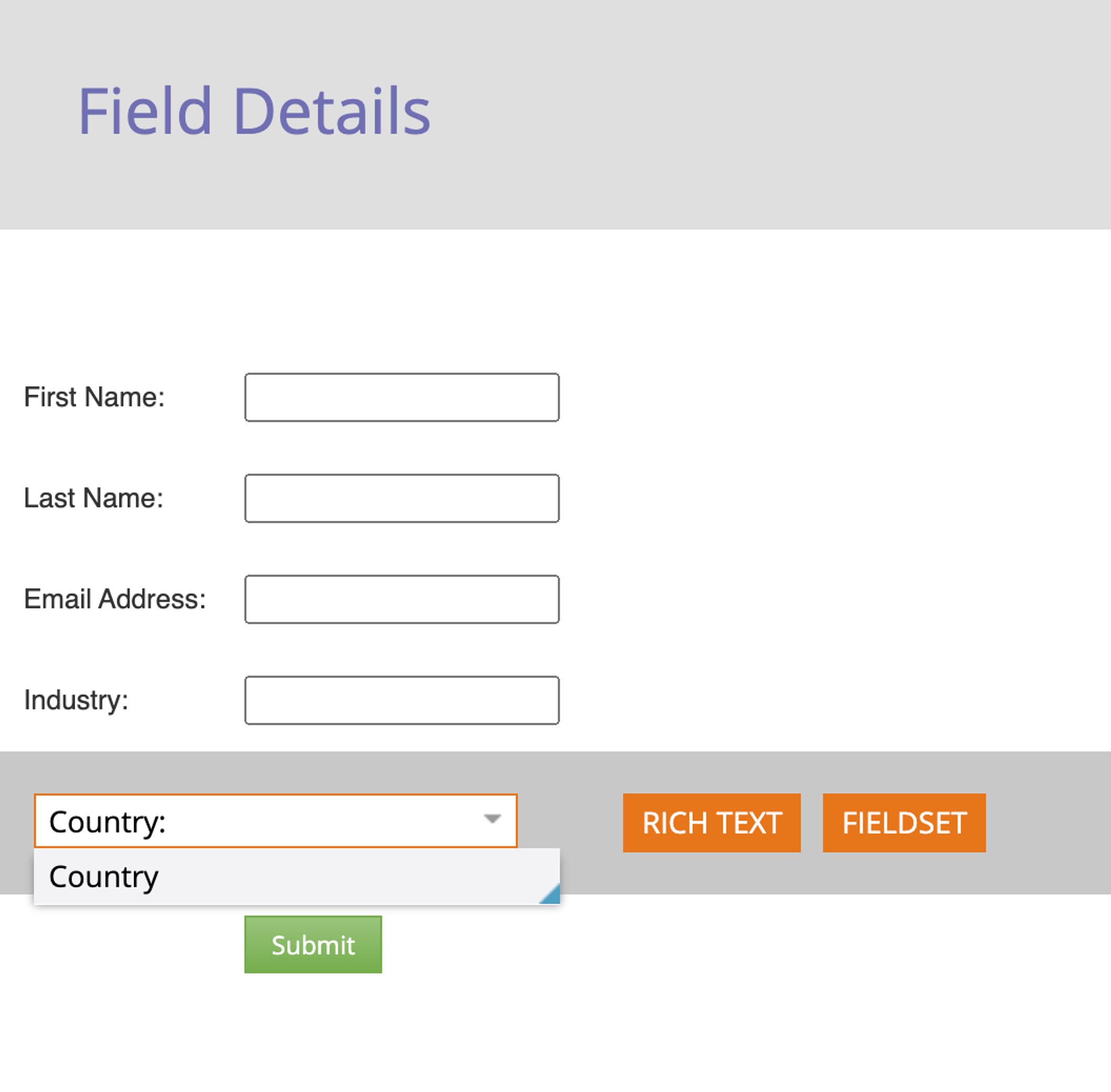
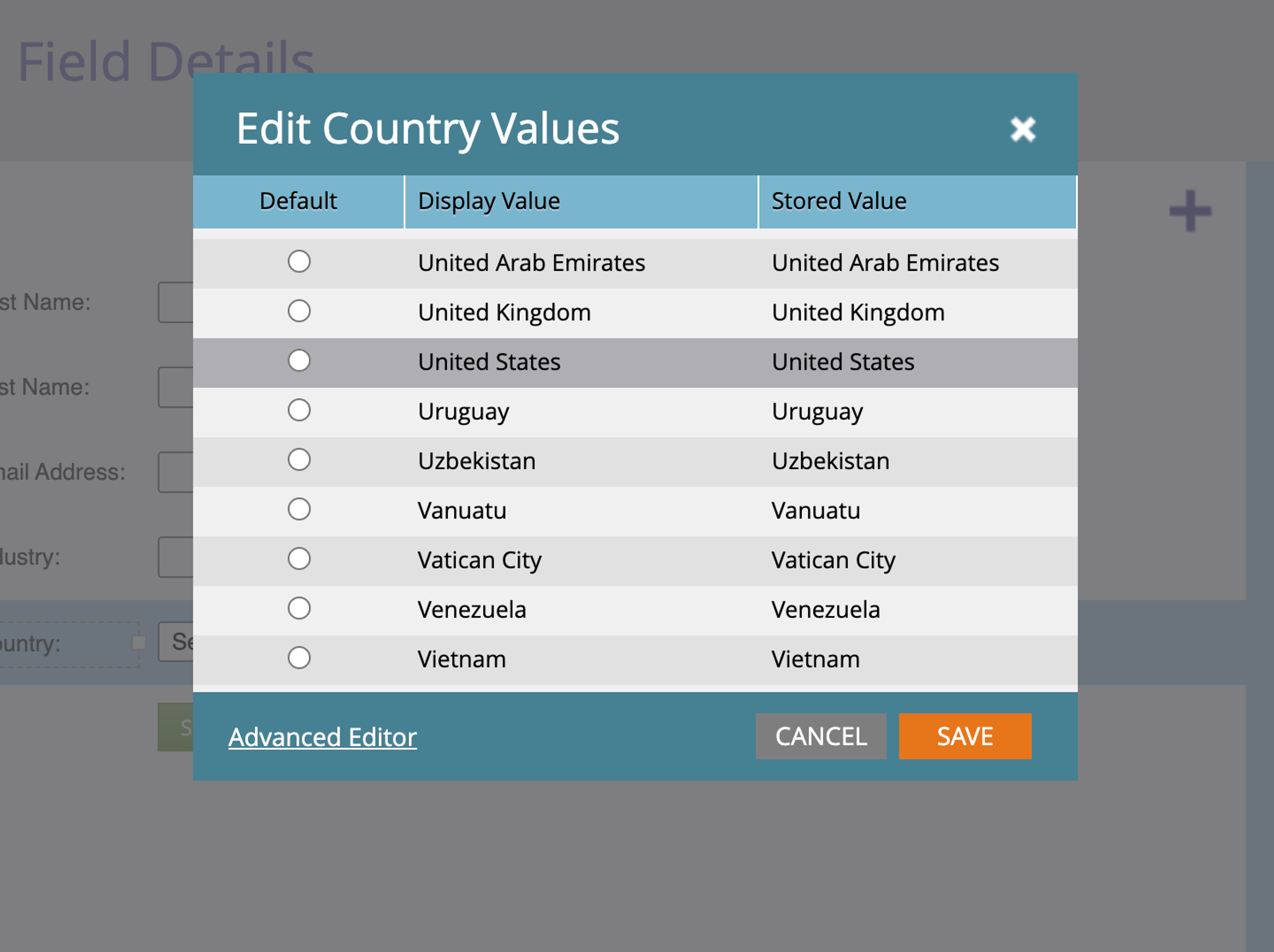
Use picklists for Marketo form fields
When you use a free text field, you're inviting users to submit unclean data in your Marketo instance. Cleaning up the USA to match your standard United States is time consuming and low value yet obligatory for reporting purposes. By using picklists for Marketo forms, where appropriate, you can save yourself work down the road while making it easier for users to complete form fields.
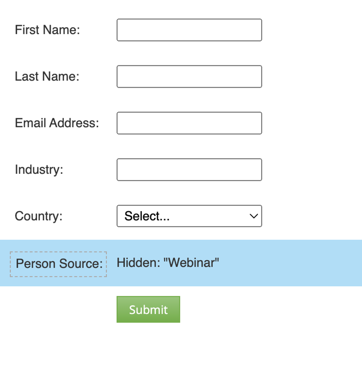
Use hidden fields to parse additional data
With Marketo forms, you can also include hidden fields to parse additional data from the lead. This could be fetching data like UTM parameters to ingest and use in your campaign attribution. It could also be pushing values from the web page with the help of a developer.
Use prefill for returning visitors
You can use the form prefill feature to fill out fields for known Marketo leads visiting your landing page. This can help smooth the form completion process but only works for known leads where the data fields are known.
Use progressive profiling
While it may be tempting to put a dozen or more fields on your lead forms, studies show that the number of fields impacts conversion rates. Marketo's progressive profiling feature allows you to swap out fields where the value is known for a field where the value is unknown. Similar to the prefill functionality, this allows you to get more information about leads over time. It does require multiple form fills to be effective.
Use Marketo form visibility rules
Marketo visibility rules are like a hidden gem of forms. They can take a minute for you to set up, but they take care of subtle details for the end user that makes for a better experience. For instance, have you ever gone to a form and entered your country such as "United States" and then wonder why the company still displays provinces from Canada? As Canadians, this happens to us all the time.
You can use form visibility rules to display certain properties conditionally. So if a user selects "United States," you only display States. This could apply to other use cases like opt-in rules or additional questions based on segmentation rules.
Use global forms versus local forms
This is a common mistake in Marketo owing to how easy it is to clone and make forms. As a best practice, it's better to create a limited number of global forms that serve broad purposes such as "Content Download", "Contact Us", and "Webinar Registration". The reason why Marketo users sometimes prefer local forms is because the trigger or conditional logic is a bit easier to implement.
However, this starts to fall apart when you have a large website with dozens, even hundreds of forms across it. It is much easier and preferable to use a global form with logic that identifies the form, such as page location.
Using Marketo forms in a landing page builder

A landing page builder like Knak provides marketers with the ability to build and design landing pages without needing to know any code. Knak's feature set extends to Marketo forms and allows users to design without needing to know any CSS.
Form styling with CSS can be complex and challenging, particularly for responsive design. No-code landing page builders allow for styling without needing to write code. It's not magic but it might feel like it if you've ever fought with a form to make it responsive on a mobile device!
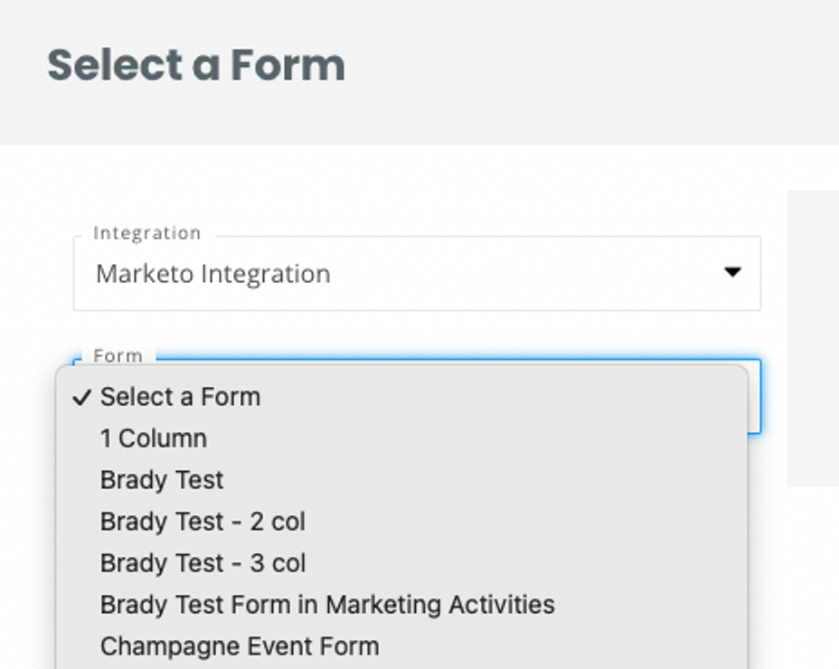
The design of the form is only half the battle – sometimes just getting the right form in place can be tough. If you're using global forms, then your marketing operations team will want you to stick to the same forms in your landing pages. Knak provides a simple menu for selecting forms from Marketo so you can pull those forms directly from your instance.
Using a landing page builder can help streamline your campaign creation process. Software like Knak gives your team a no-code editor as well as collaboration and approval tools. This last part is important when building landing pages that must adhere to brand guidelines. With Knak, you're creating reusable templates that are approved for broader use – from the landing page design right down to the styling of form fields.
Marketo Forms FAQ
How do I use progressive profiling in Marketo forms?
Marketo forms support the progressive profiling feature. This feature lets you incrementally gather more data about your leads over time by showing new questions to users each time they fill out a form. For instance, if you already know a lead's industry, you could prompt them to provide their job role on their next form submission.
How do I embed a form in an email in Marketo?
Marketo doesn't support directly embedding forms in your emails. The best practice in this case is to add a call-to-action button that will take users to a landing page with a form.
How do I use hidden fields to parse additional data in Marketo forms?
Hidden fields in Marketo forms can capture extra data such as UTM parameters or tracking information. By adding these fields to your form and configuring them to gather the specific data you need, you can better track and analyze user behavior. This enhances your ability to tailor marketing efforts based on detailed insights.
How do I create an embedded form in Marketo?
To create an embedded form in Marketo, design your form using the form editor. Once it's ready, generate the embed code provided by Marketo. Copy and paste this code into the HTML of your website or landing page where you want the form to appear.