Microsoft introduces controversial new “Advanced Typography” features for Outlook Classic

Have you recently started to notice that the text in your emails in Outlook is starting to look a little strange?
If you are currently on Outlook Classic for Windows (meaning you aren’t yet using New Outlook) then it may be that your version of Outlook has been updated to include Microsoft’s new “Advanced Typography” features.
These features apply a special text formatting algorithm to all text in all emails that you read in Outlook.
They have a dramatic effect on text rendering, in particular the alignment, letter-spacing, word-spacing and hyphenation. In Microsoft’s own words:
“The feature's refinements apply intelligent, adaptive justification, kerning, and OpenType ligatures to the email in the reading pane. These changes are applied automatically, without major layout changes, only when the layout scoring algorithm determines that the changes will improve the layout.”
The specific changes that it makes to text are:
- Changing left-aligned text to be fully justified
- Adding hyphenation to words
- Adjusting spacing between words, and
- Adjusting spacing between letters.
Their ‘vision’ seems to be to make email text look more like printed books or magazine layouts:
“Full justification is one of the hallmarks of fine typography, and is present in most professional books, magazines, and editorial design. Aligning the text on both the right and left creates a clear box of the text, which in turn reinforces the graphic organization and underlying structure of the page.”
But despite aiming for a typographically harmonious layout, the algorithm also works on a paragraph-by-paragraph basis, meaning some paragraphs may receive the treatment, while others do not:
“Our algorithm doesn’t force justification, either – if it determines that the text would look better without justification, it’ll automatically leave it off.”
What it looks like
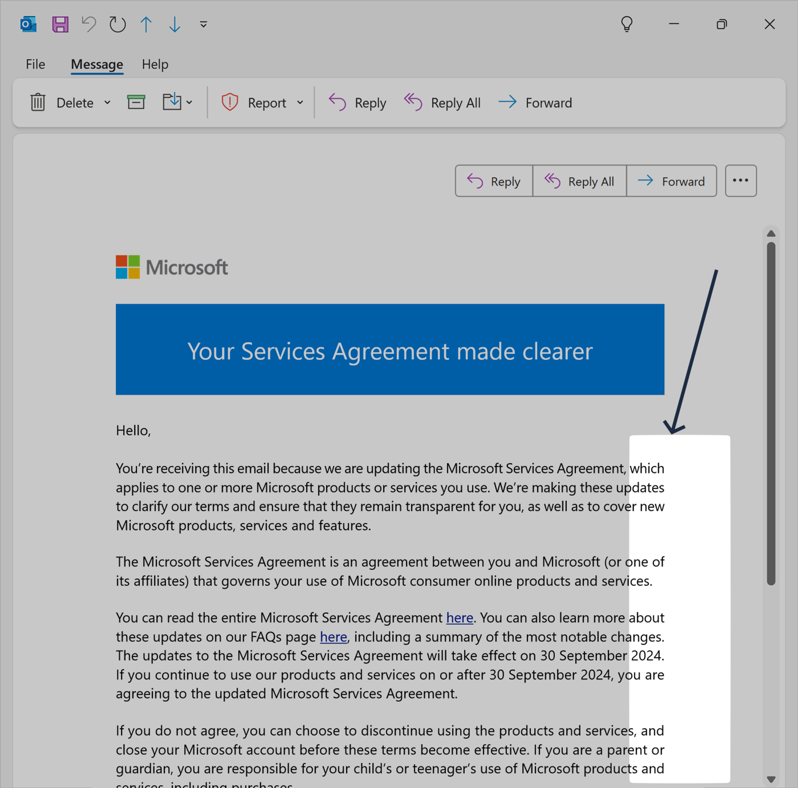
Here is how a recent Microsoft email looks in Outlook Classic when this feature is active:
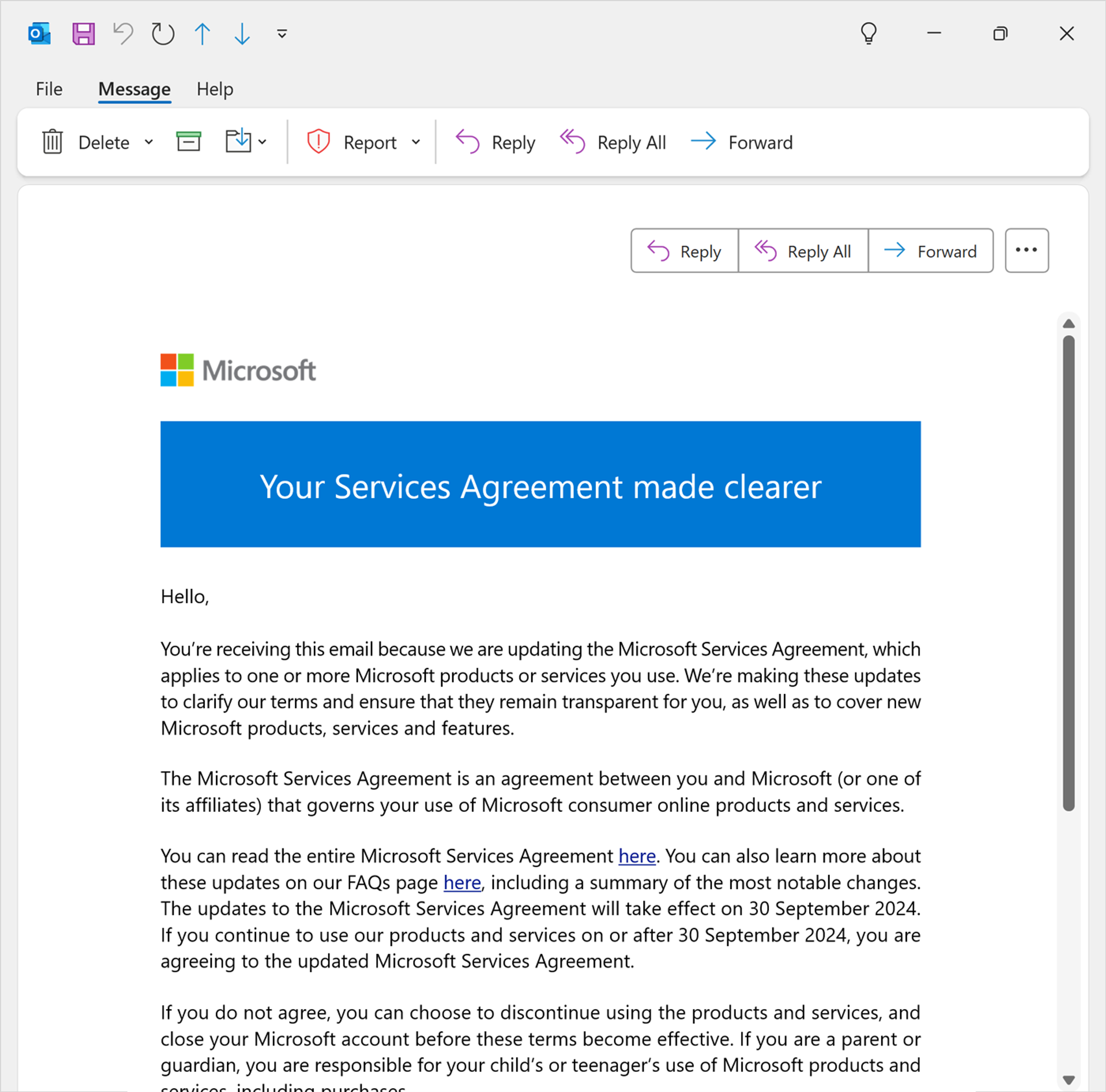
You can see the fully justified alignment of the text on the right-hand side:
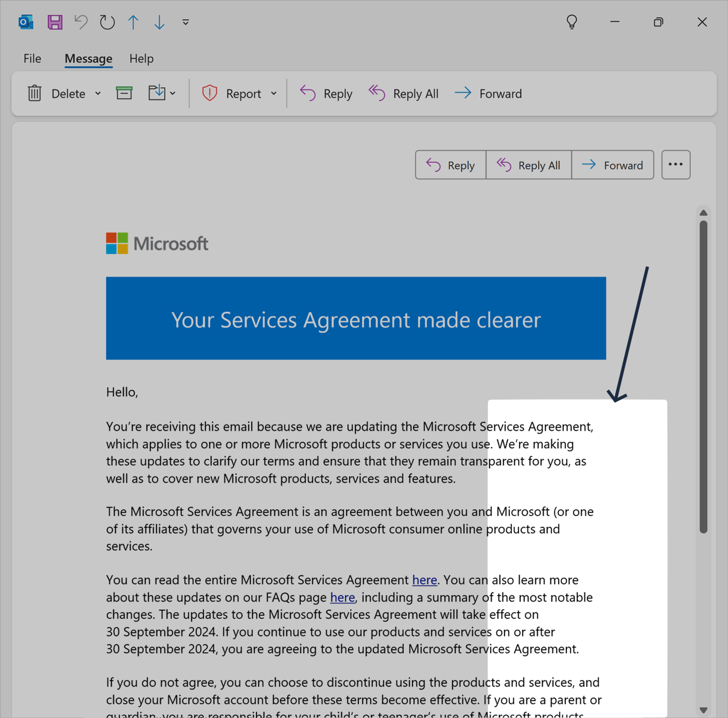
In contrast, here is how that email looks normally in every other email client, and when the new feature has been disabled:
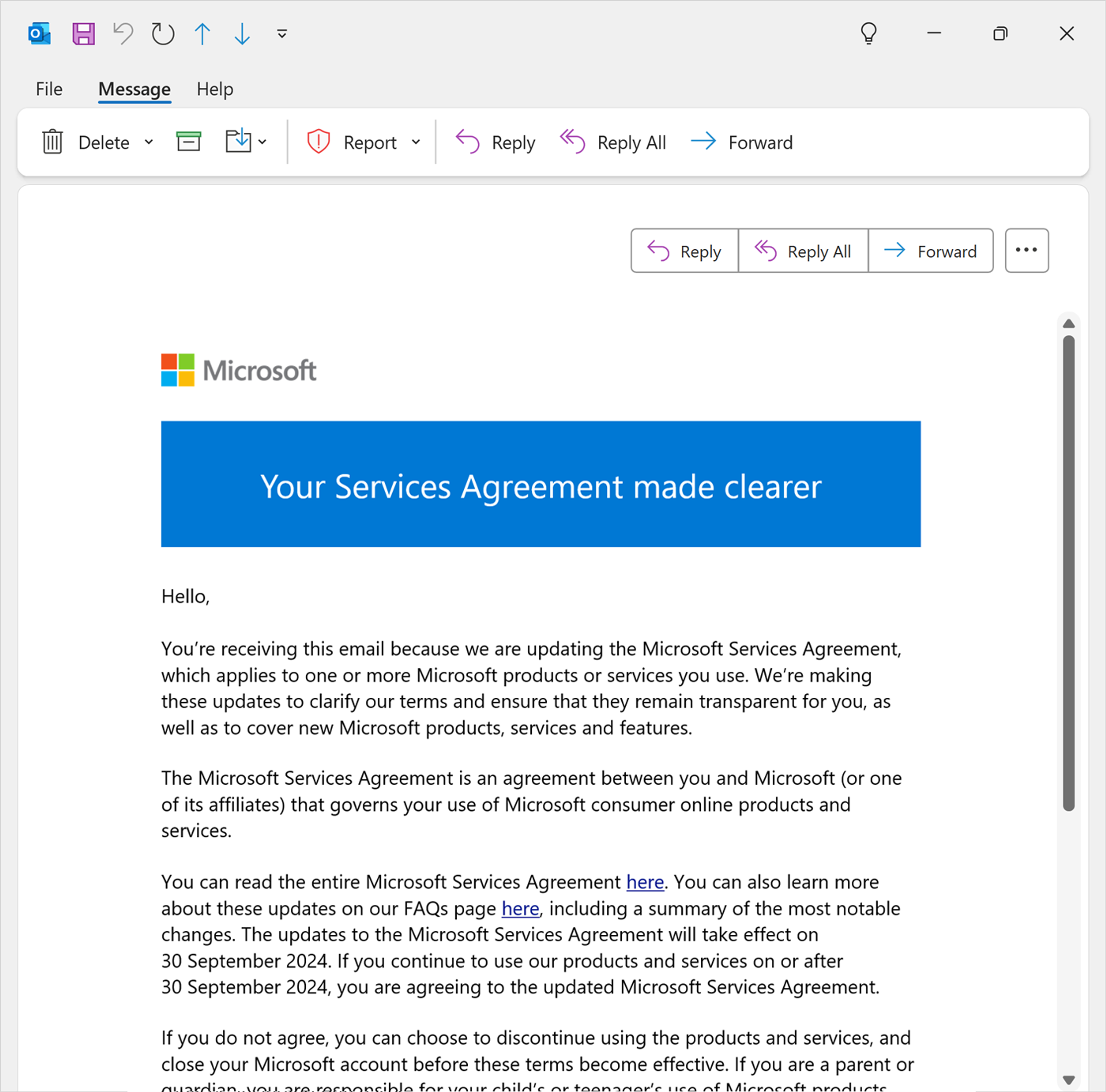
The alignment on the right-hand side is completely normal, and matches how it was designed:
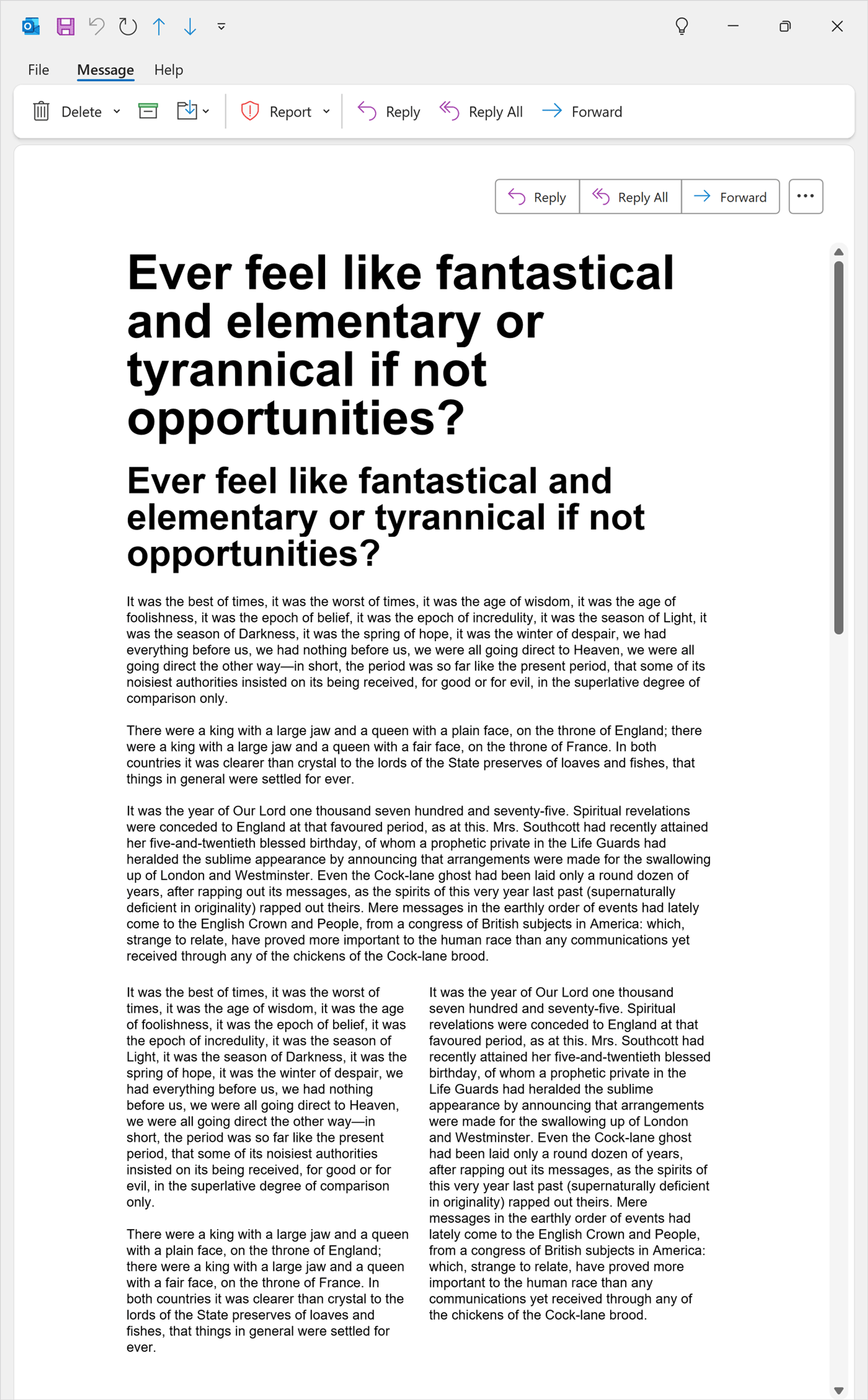
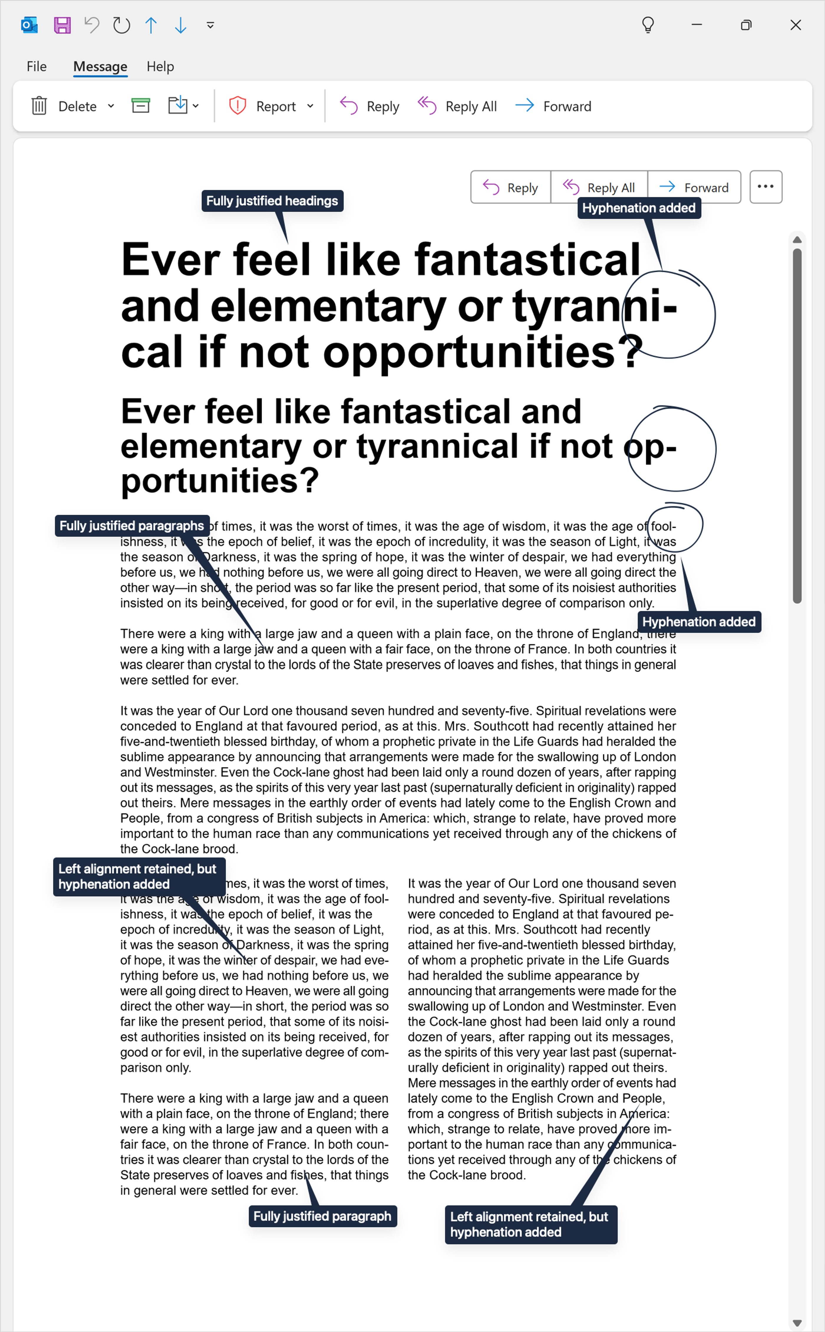
The worst outcomes appear to be on headings and multi-column layouts. In these cases, we have found that the algorithm can apply different treatments to different blocks of text in the same email.
Particularly shocking is the hyphenation of headings.
Below is a sample email with the feature turned off:
And below are the transformations made by Outlook when Advanced Typography is turned on:
When the feature was added
Microsoft made one failed attempt at releasing this feature in 2023, but due to widespread backlash they quickly rolled it back. You can see the rollback announcement at the bottom of the page after expanding replies on this Microsoft Community post (page 5).
After this, they continued to work quietly on the feature. Thankfully, in response to the initial backlash, during this time they also added an opt-out feature. (See How to disable this feature for more on this.)
They then quietly started rolling the feature out again starting in April 2024.
A blog post announcing the initial failed beta from December 2023 is the only official piece of documentation that currently exists about this feature; curiously they have not posted a single thing about it on the Outlook Roadmap or the official Outlook blog.
Affected users
In April 2024, Microsoft announced the start of the second rollout: “The next step is that the feature is now being enabled by default starting with Current Channel Version 2403 (Build 17410.20000).”
This means you will have the feature enabled by default in your version of Outlook Classic for Windows if you are on the Current Channel and you are on version 2403 or later. You will also have it enabled by default if you are enrolled in the Microsoft 365 Insider program and subscribe to either Current Channel (Preview) or the Beta Channel.
The change has not yet been released to the Monthly Enterprise or Semi-Annual Enterprise Channels, which means that most users at large organizations have not yet seen this change.
To check which Channel you are on, in Outlook go to File and then Account. The name of the update channel appears in the Product Information section under the About heading. (You can also read an explainer of the different channels here.)
How the changes are applied
Thankfully, this process does not actually make any changes to the underlying email’s HTML or CSS. Microsoft state this themselves:
“This feature applies read only changes to emails in the Outlook Reading Pane and Word’s Read Mode to make the content more impactful and easier to read.”
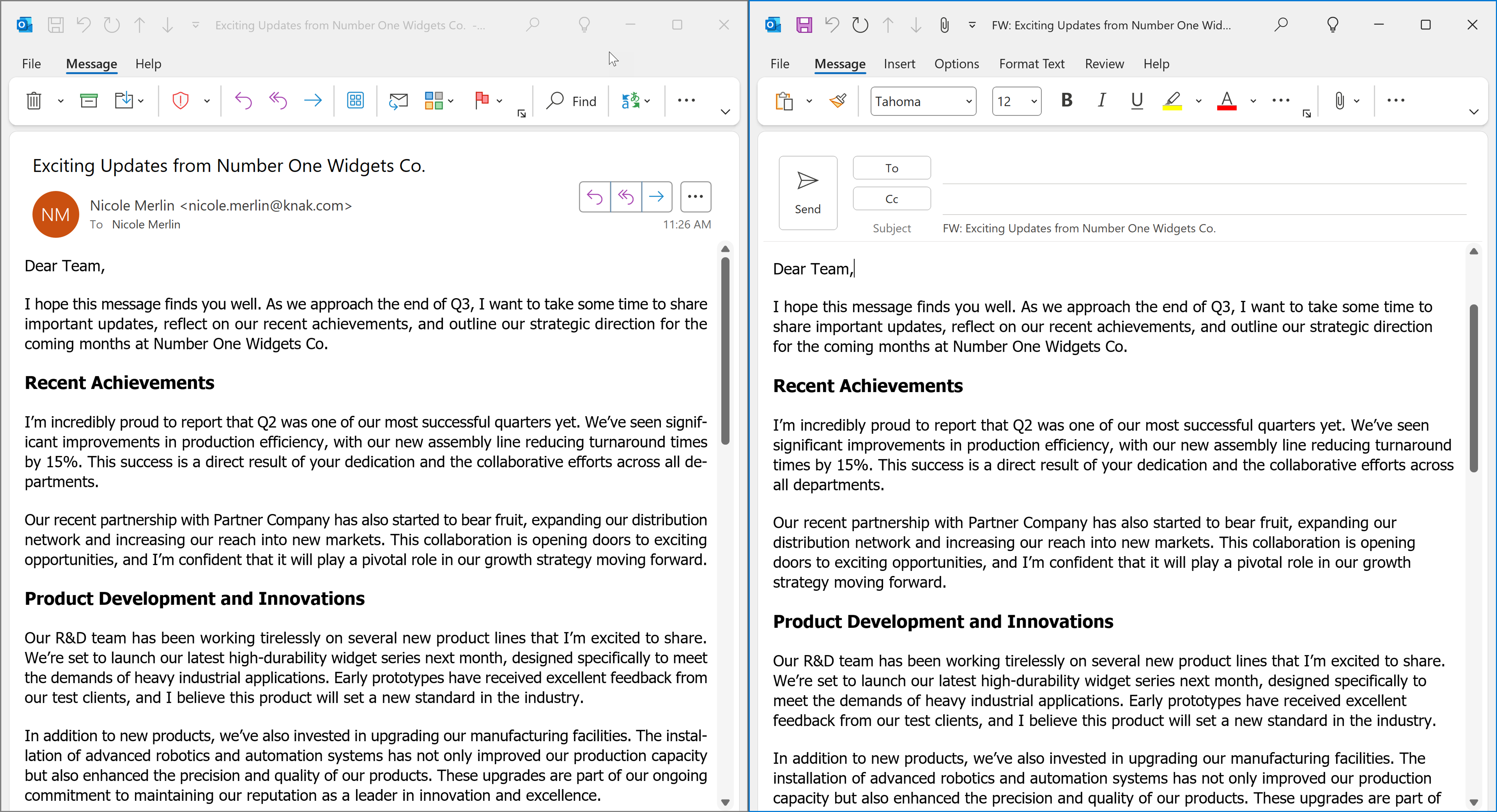
You can also see this in action when you write an email, and when you forward an email that has been modified when you were reading it.
For example, see a sample received email (below, left) where the text has been fully justified while you read it, but when you click “Forward” and it opens in a compose window (below, right) the text alignment has returned to normal, i.e. left-aligned.
Problems caused by this feature
Justified text fails WCAG accessibility
However well-intentioned they were, there is no denying that this change is going to be extremely problematic.
The biggest issue is the fact that fully justified text is an accessibility failure, specifically failure F88 of Visual Presentation SC 1.4.8:
The Success Criterion of 1.4.8 is: “Text is not justified (aligned to both the left and the right margins).” Clearly, this is an instant failure for every paragraph of text that Outlook’s new Advanced Typography Features has decided to adjust.
This failure has huge implications for organizations sending emails that are required to comply with accessibility standards in every email.
Hyphenated headings are more difficult to read
While not technically an accessibility failure, it’s well-known in design and publishing that headings should never be hyphenated because it makes them more difficult to read and scan.
It negatively impacts carefully formatted text
Emails go through multiple careful review stages before they are sent out. The text layout, alignment, justification, line breaking and general formatting are a huge concern for a range of reviewers, including marketers, designers, art directors, copywriters and legal departments.
Once an email has been signed off and sent, the fact that Outlook can modify that email using a completely secret algorithm introduces a huge array of concerns.
It looks bad
For something that is intended to make text look better, in most cases it simply looks bad.
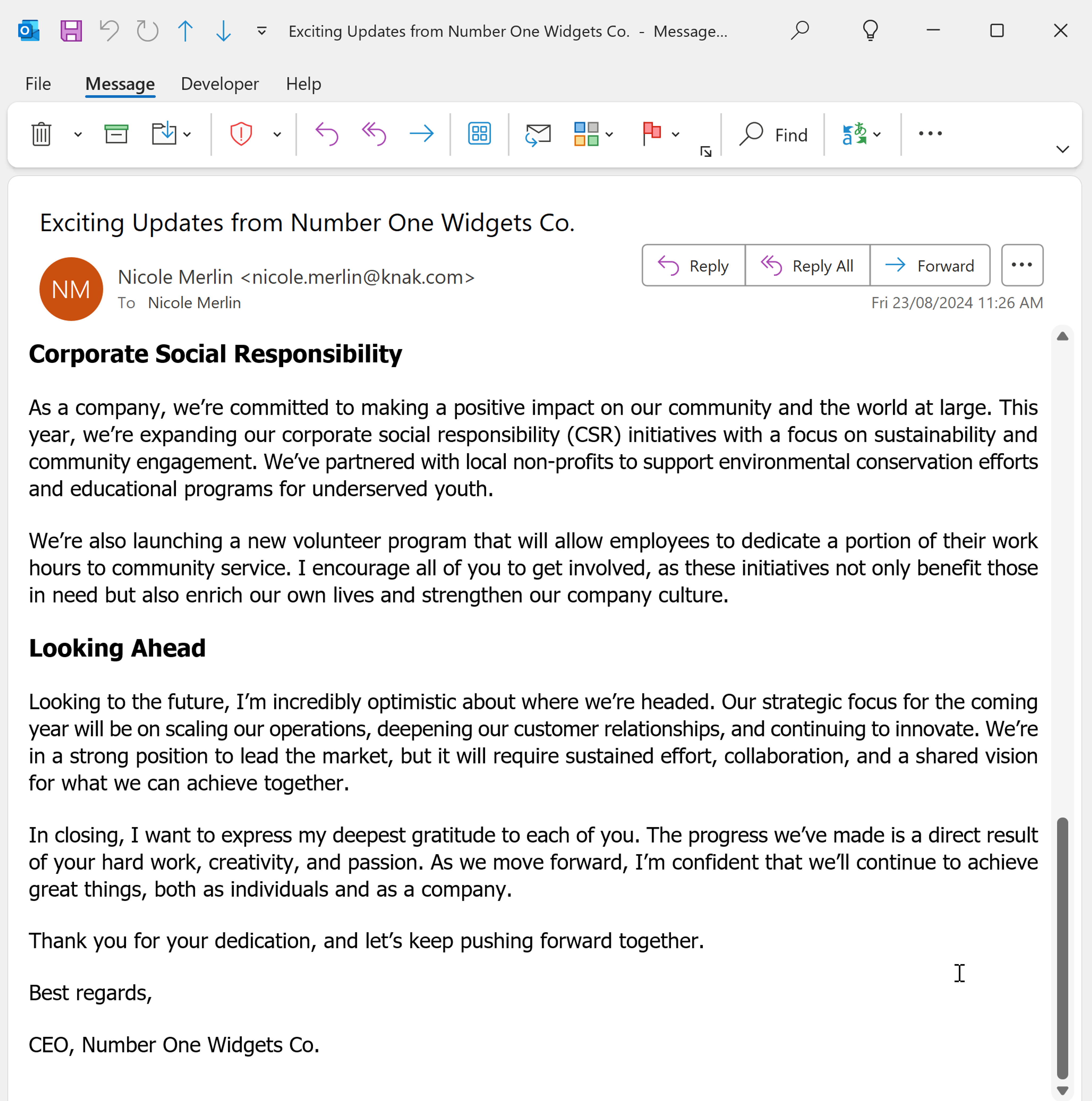
Even if we step out of the world of Marketing and imagine that Microsoft were considering day-to-day users of Outlook, it’s difficult to believe that anyone would favor fully justified columns of text when reading standard business, work, school, or even personal emails, which all generally contain lots and lots of unstyled text. These emails end up fully justified into one big, flat, square block of text:
How to disable this feature
Disable Outlook Advanced Typography for your copy of Outlook
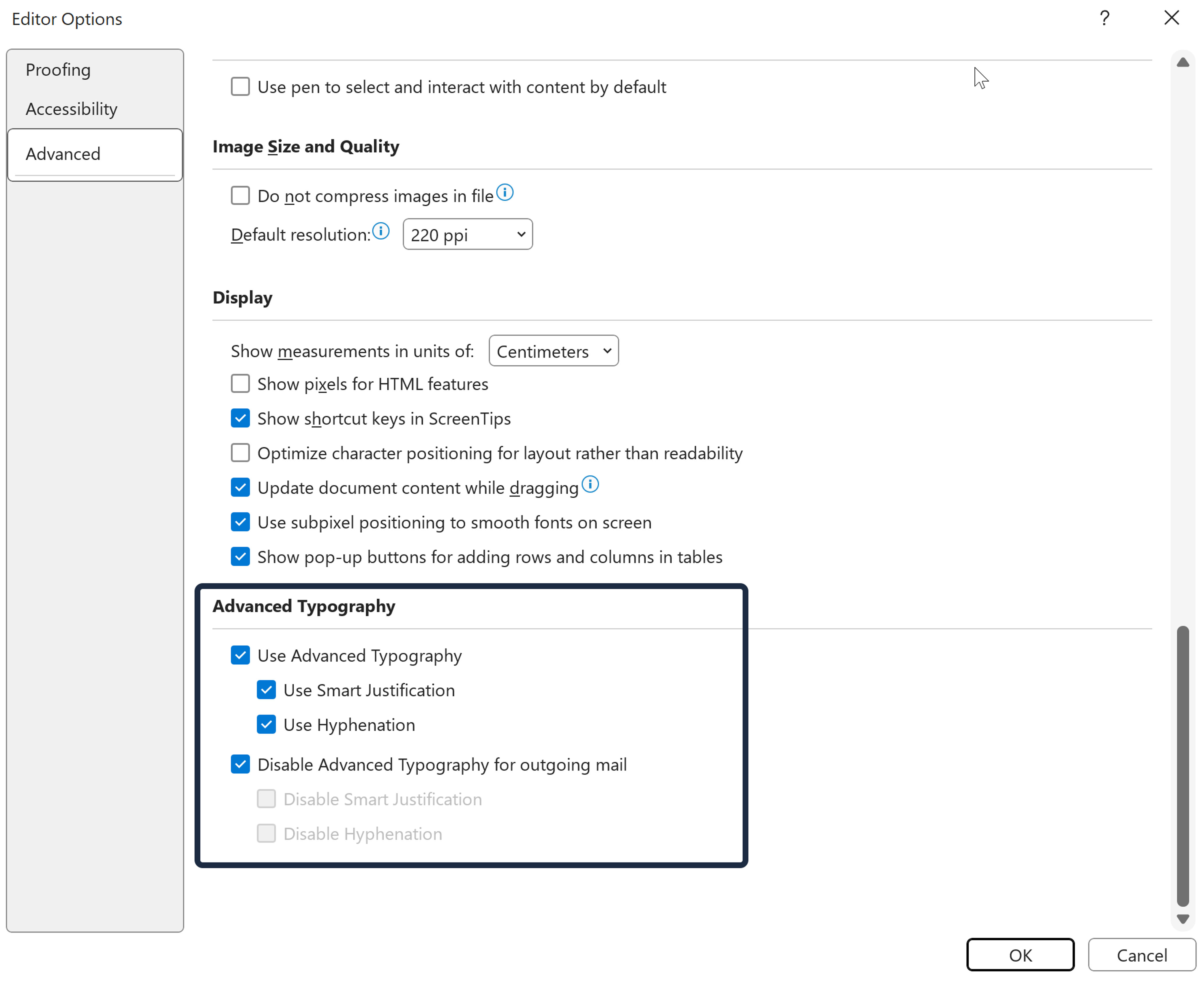
If you simply want to disable the behavior for your own copy of Outlook, simply go to File > Options > Mail > Editor Options > Advanced > Advanced Typography, and then clear the Use Advanced Typography checkbox.
Disable Outlook Advanced Typography features in your outgoing emails
To make sure this feature is disabled on every email you send, regardless of whether the recipient has the feature enabled or not, go to File > Options > Mail > Editor Options > Advanced > Advanced Typography, and then tick the Disable Advanced typography for outgoing mail checkbox.
Below is where these settings appear in the panel:
Disable Outlook’s Advanced Typography features in your marketing emails
If you are a Knak customer, this has already been taken care of for you. We have already implemented the “opt-out” flag that Microsoft themselves add to outgoing emails when you tick the “Disable Advanced typography for outgoing mail” option in the settings (shown above).
If you don’t use Knak, you should work with your email developer to add the “opt-out” code snippet below:
<!--[if gte mso 9]><xml>
<w:WordDocument>
<w:DontUseAdvancedTypographyReadingMail/>
</w:WordDocument>
</xml><![endif]-->
To work, this also requires the following xmlns (XML namespace) attribute on the HTML tag:
<html xmlns:w="urn:schemas-microsoft-com:office:word">
A Microsoft Agent also shared the above code on Page 8 of this forum discussion however they left off the XML namespace component, meaning their version of this fix will not work. Be sure to use the snippets above instead.
Alternatively, you could also apply the namespace directly to the element, and just specify if mso since gte mso 9 simply says “greater than or equal to Outlook 2000”, which is a little redundant. In this case, you can simply use this single standalone code block, inserted anywhere in the head of your email’s HTML:
<!--[if mso]><xml>
<w:WordDocument xmlns:w="urn:schemas-microsoft-com:office:word">
<w:DontUseAdvancedTypographyReadingMail/>
</w:WordDocument>
</xml><![endif]-->
What you can do about this change
Tell Microsoft what you think!
If you agree that this is a very misguided feature, please provide your feedback to Microsoft!
If you are a commercial customer, as suggested by the support agents, open a commercial support case with Outlook Support. If you have a Premier contract, they note “that will expedite the process”
You can also submit an in-app ticket from Outlook (by going to Help and Contact Support).This option is generally only available to Beta or Current Channel Preview channel users.
All users can report bugs and issues with this feature to Microsoft by going to Help and then Feedback in Outlook.
Make your voice heard and ensure Microsoft knows how you feel about this change!


