Five Email Design Trends to Watch in 2021

Asra Sarfraz
Senior Visual Designer, Knak
Published Dec 9, 2020
All email designs are not created equal. Some of them are pretty darn incredible – in fact, I’ve been known to open emails from my favourite companies just to see what kind of slick design they’re working with to inspire their readers. It’s Nice That has a newsletter that’s one of my favourites!
As the senior designer at Knak, I’m always excited (or sometimes not so excited) to see new email design trends take off. Here are five design trends that I project will be big in 2021. Check them out, and get some tips for making your own campaigns stand out next year.
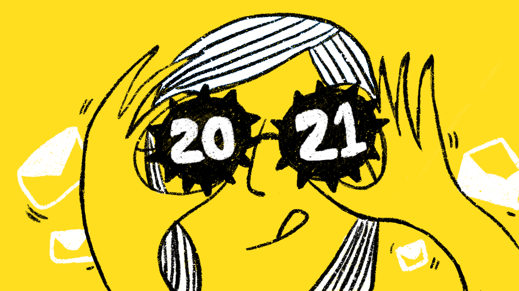
01. We’re on the Mooove
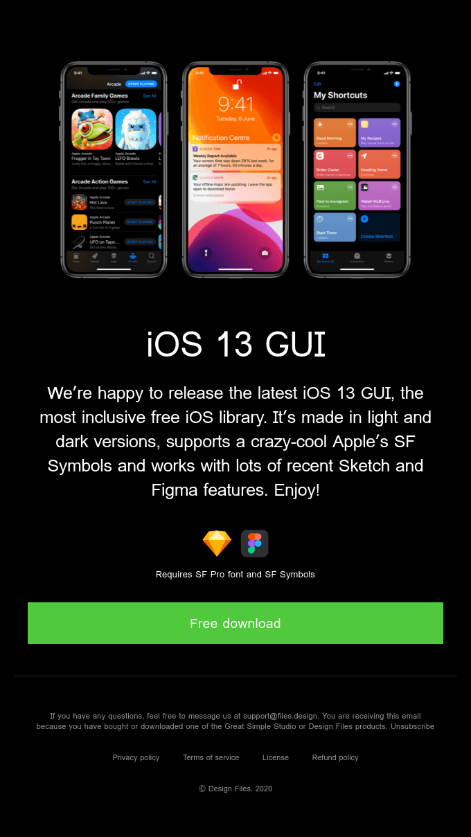
Let’s face it, in the age of Tik-Tok, Instagram Reels, and sped-up timelapses of Tasty videos (many of which I’m guilty of watching), we’ve gotten used to preferring interesting visuals over text. We find information easier to digest if it’s in visual format, so it’s no surprise that illustration and animation, which have now entered the 3D space, are here to stay.
From quirky characters and typography to realism – or a play on it – 3D visuals are definitely in the works for 2021. These visuals transcend the boundary between virtual space and real life, making them an excellent choice for product-based campaigns.
Bonus: Keep an eye out for more 3D animations as softwares like Blender and Cinema 4D become more accessible to designers and design enthusiasts.
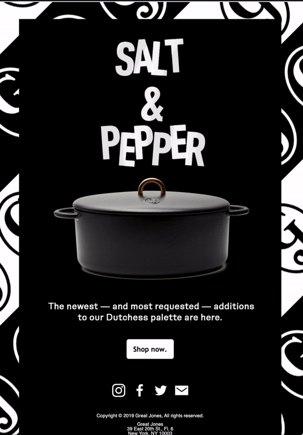
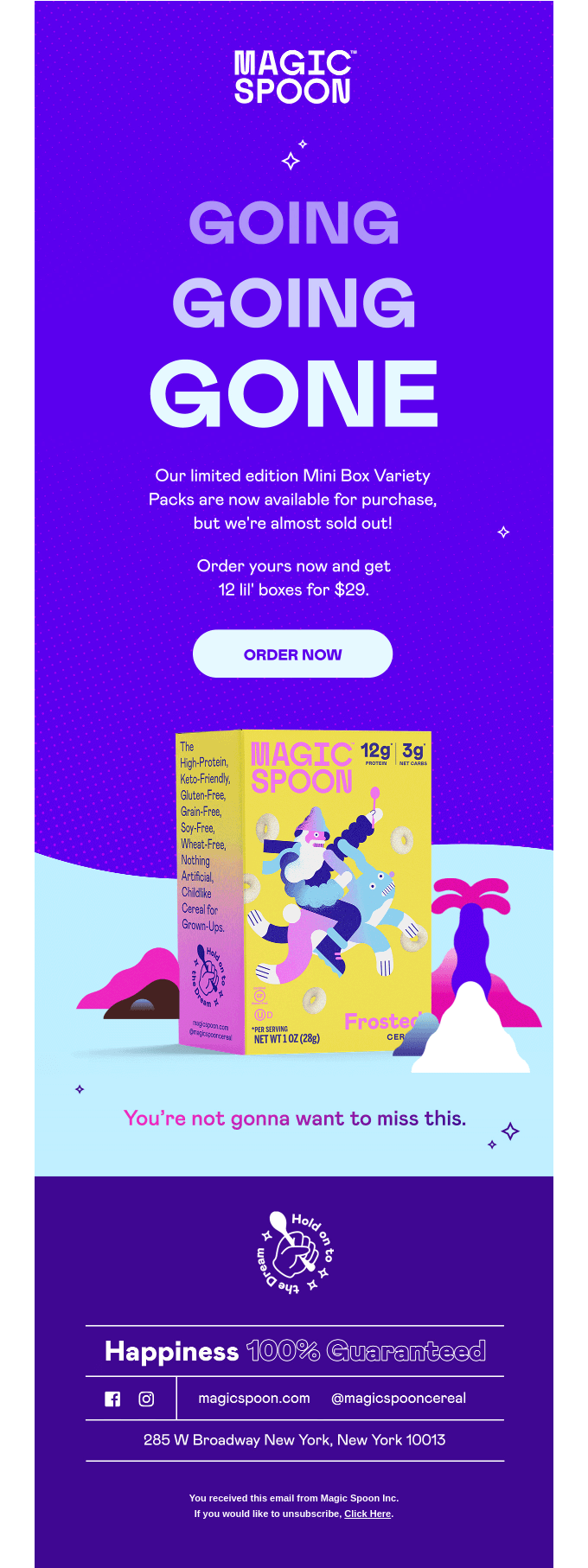
02. The Bold and the Beautiful (Type)
Large typography is going to be big (get it?) in 2021 because it commands attention and delivers pizazz and a wow factor. Combined with killer copywriting and visual hierarchy, it’s eye-popping in the best way.
Many brands are going so far as to remove their headers completely and replace them solely with big typography to get their message across, like Magic Spoon does below. When you use big type, you can say a lot with very little.
03. Crossing Over to the Dark Side
Dark Mode is still in its early stages, but it’s catching on quickly. For one thing, it’s easier on the reader’s eyes – less eye strain is always a win – and its clean, minimal lines deliver a modern, refreshing look for modern-day techies.
For more on Dark Mode and to make sure your Dark Mode emails don’t lead to rendering issues, check out our recent post.
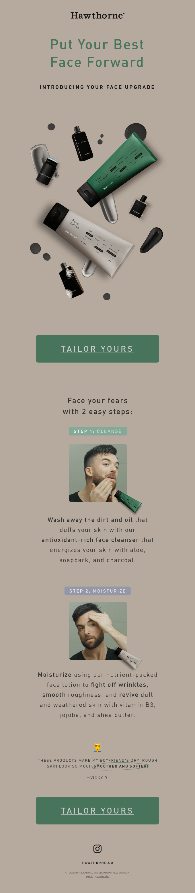
04. Minimal Design Cleaner Than Mr. Clean
More and more companies and brands are beginning to introduce themselves with neutral/muted tones and colours. I love the mix of big, bold headlines with softer, more relaxed background colours and just-the-right-amount of visuals.
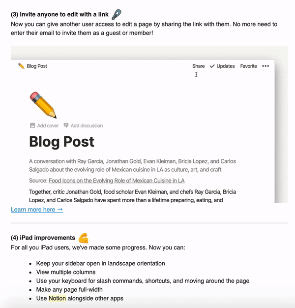
Notion really nails this: their emails showcase simplicity with their product GIFs and get their point across without a big fuss.
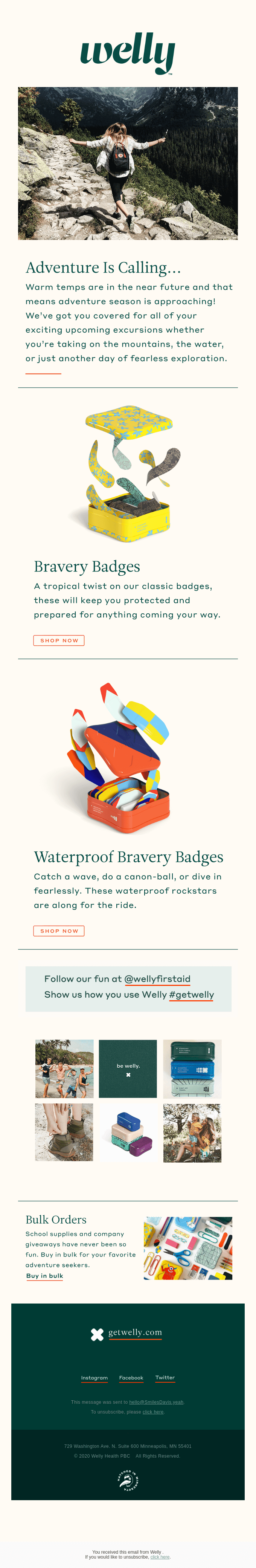
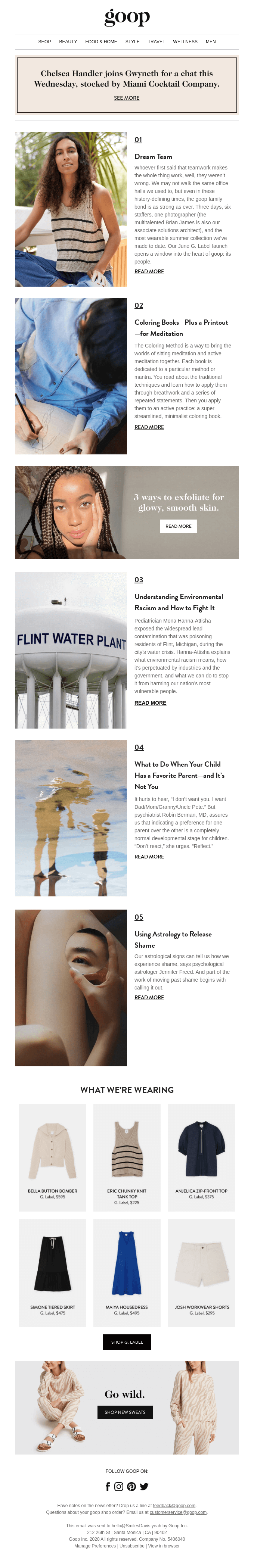
Other brands such as Welly approach the game with soft, earthy tones that feel blissful. It’s a blend that appeals to the massive millennial generation, and it’s successful because it imparts a sense of luxury and affordability at the same time. Readers are meant to feel they can get expensive things without the hefty price tag. The more polished, the better. Mejuri anyone?
05. Life Imitates Art
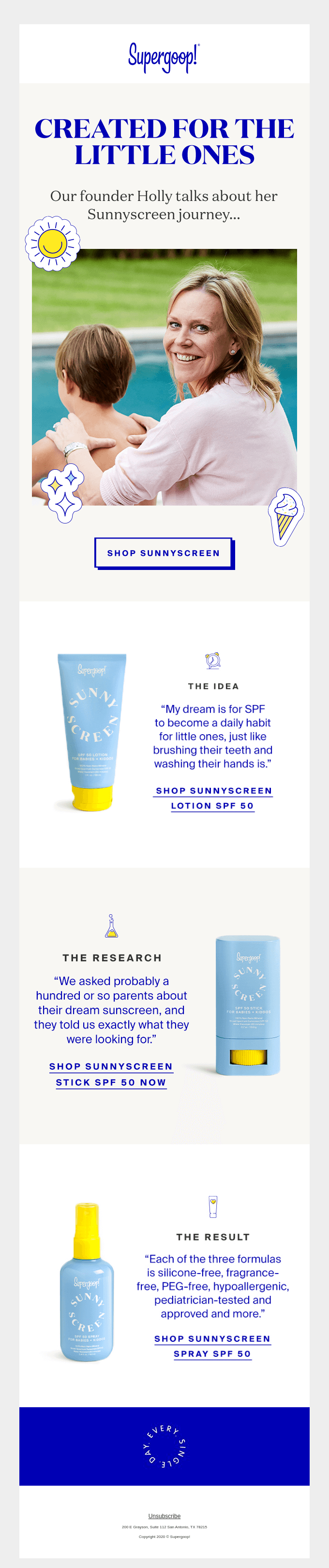
Say goodbye to stock imagery featuring people with a Colgate smile (who may or may not be dead on the inside, lol). Using real-life photography featuring everyday people instead of cookie cutter models to voice brand values is going to be huge in 2021.
Buyers are much more likely to connect with a brand/company if they can relate to what they’re seeing without feeling that the company is just out to get their money.It’s also going to be more critical than ever for emails and other communications to show inclusivity and diversity. As a woman of colour myself, I’m more than happy to see this become status quo instead of just a trend.
If you need help adding any of these designs to your own campaigns, let us know! Knak is all about helping Marketers get emails to market faster while maintaining their creative edge. Reach out here to see how we do it.And if you want to read more about my take on email design trends, check out A Balanced Approach to Email Design Trends.