Dark Mode: Avoiding Common Rendering Issues

Tania Blake
Director of Marketing, Knak
Published Oct 16, 2020

Summary
Master Dark Mode in email design with Knak's tips: from transparent images to color inversions, ensure your emails shine in every inbox setting.
It’s #darktober, and since Dark Mode is making headlines right now, we had a chat with our Senior Visual Designer, Asra Sarfraz, and Knak Developer & Email Specialist, Jack Steele, to get their tips for using Knak to create emails that look great in the dark.
We’ve come to realize that we are an office divided when it comes to the use of Dark Mode. Several of us (our CMO and COO among them), keep it enabled all the time, while everyone else uses it sparingly.
You may find similar results if you were to poll your subscriber base, but even if only a small percentage of them use Dark Mode, you could still be talking about a fairly large number. After all, 2% of a million-subscriber database is still 20,000 people, and that is 20,000 potential customers you don’t want to ignore.
What is Dark Mode?
Dark Mode is an accessibility setting that changes your email’s colour palette to display it in high contrast using a dark background and a light foreground. It’s meant to minimize blue light and help prevent eye strain.
It’s gaining traction in email inboxes, but it can be a design stumbling block for a couple of reasons:
- Creativity is limited – Dark Mode alters your colours, so if you want your emails to look good no matter how they’re viewed, you have to be careful with your colour selection.
- You can’t control what ESPs do to your email – Outlook, Gmail, and other ESPs all render emails differently in Dark Mode, which means there’s no one way to design.
Gmail app (iOS13) and Outlook 2019 (Windows) invert the colour scheme of an email. Further, they don’t provide a control for developers to indicate when an email is dark by default. This can cause emails that are designed to be dark by default to be inverted to light colours when a recipient is using dark mode.
To advocate for better control over this crucial accessibility feature, we encourage you to communicate feedback directly with Gmail’s Accessibility team.
In the meantime, we are keeping our eye out for improvements in rendering and control so that we can adapt Knak’s builder functionality as dark mode technology progresses.
Is Dark Mode worth the hype?
Dark Mode is still a relatively new feature, and while we fully expect that it will stick around and improve over time, there’s still a lot to learn about it. On the bright side, it allows you to deliver a better experience to Dark Mode users. On the other hand, you have no way of knowing if your email is being viewed in Dark Mode or not, and you have to sacrifice some creativity to ensure a good experience for everyone.
Designing in Dark Mode may not be optimal (yet), but if you’re a Knak user, we’ve got some best practices you can follow to maximize your creativity and build great-looking Dark Mode emails.
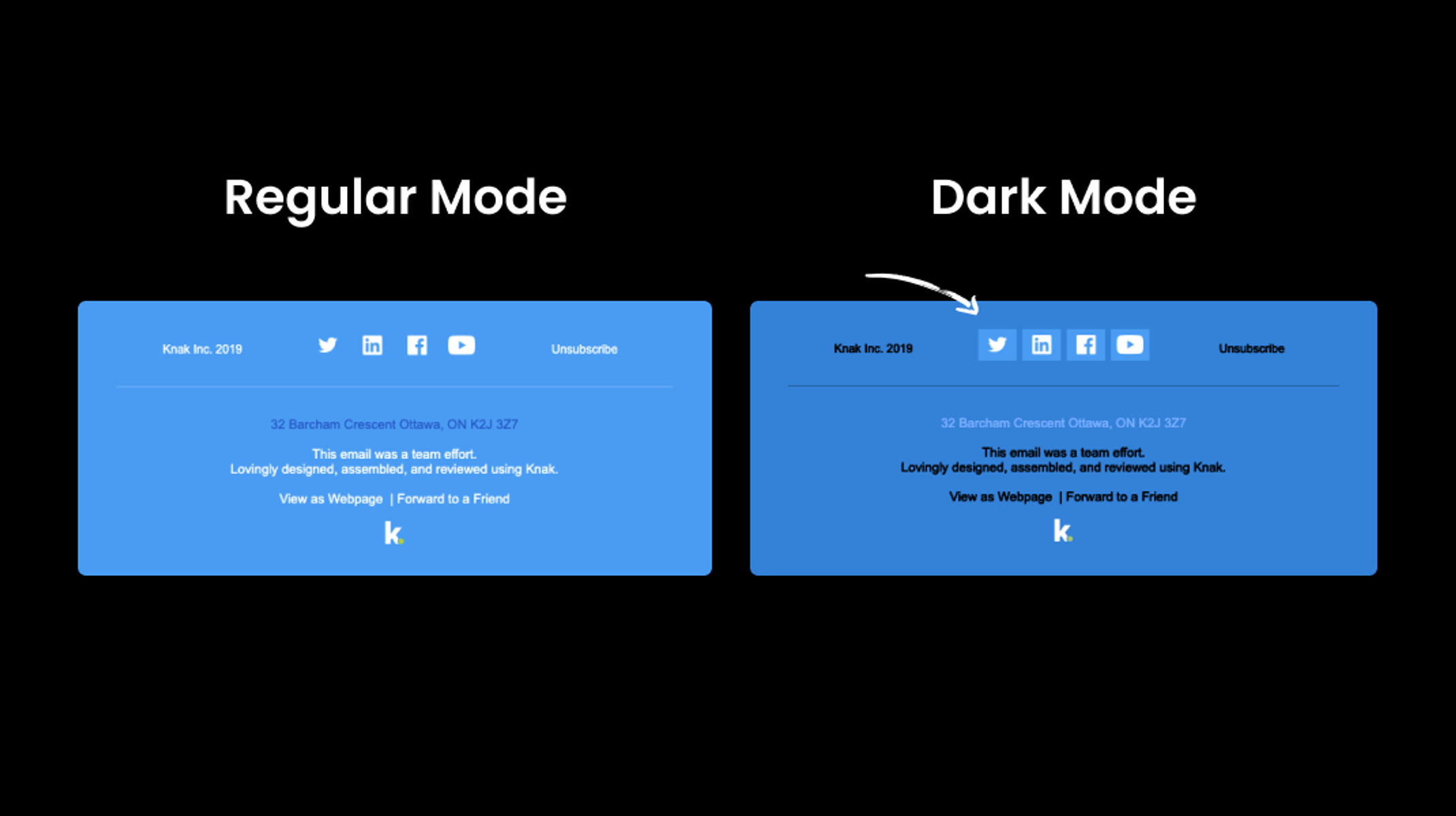
#1: Use Transparent Images
ESPs that allow for dark mode settings automatically alter the colours in CSS, but NOT when they’re within images.
Using transparent backgrounds on your images lets you work around the automatic colour change so your images adapt to the background colour.
Note that this applies to icons and logos as well, so if those images are dark and transparent, they may blend in once the background is dark.
A good workaround for this is to add a stroke around images that match the light mode background color. This won’t impact the way light mode imaes render, but it will ensure that the graphic is visible against a dark background.
#2: Translate Background Colours
We use solid background colours in our emails, and when they’re combined with images, things get tricky because when the theme switches from regular to dark, our emails can look off-brand. The bright colours, like green and blue, and the muted colours, like cream and light blue, that we use translate differently.
When this happens, you have two choices: either choose shades that don’t look so different in Dark Mode, or turn your backgrounds into images so the code isn’t altered.
#3: Watch Out for Inversions
Most things are going to flip when you switch modes:
- White become blacks
- Creams become warm toned grays
- Light blues become cool toned grays
Each will have its own hue, too, but it is possible to cater your design to the inversions. Use this helpful guide to understand how the colour inversions work and develop a mirrored colour system to support both themes.
#4: Keep Testing
Test your emails in Dark Mode and regular mode before you hit “send.” You may not be able to optimize every block in your email for Dark Mode, but you’ll be able to better understand how text, GIFs, and images render so you can keep your emails on-brand.
Dark Mode email rendering logic changes often, so test every email and stay aware of the changes.
Dark Mode is here to stay, and as it continues to gain traction, hopefully email designers won’t have to choose between inventive design and Dark Mode best practices. For now, use these tips to keep your emails on-brand, even in the dark.