Here’s what you need to know about designing emails for dark mode

Felix Higgs
Director of Implementations & Support, Knak
Published Sep 30, 2021

Summary
Explore Dark Mode in emails: Enhance user experience and readability. Learn why people use it, supported platforms, and design tips.
What is dark mode?
Dark mode is a setting available in most popular email platforms that partially or fully inverts the colours in your emails to give them a “dark” appearance. According to Android Authority, 81.9% of people they surveyed said they use dark mode on their phones as much as they can. If you send emails as a part of your marketing mix, you should definitely be considering dark mode when designing them.
Why do people use dark mode?
There are four main reasons people tend to prefer dark mode.
- It can reduce eye strain significantly
- It can improve readability
- It can increase battery life (especially on devices with OLED screens)
- It’s the cool kid on the block in UX design
Which email platforms support dark mode?
At the time this article was published, most major email platforms supported dark mode.
Desktop:
- Apple Mail
- Outlook 2019 (Mac OS)
- Outlook 2019 (Windows)
- Windows 10 Mail
Mobile
- iPhone Mail
- Gmail App (Android)
- Gmail App (iOS)
- Outlook App (Android)
- Outlook App (iOS)
Web Clients
- Gmail.com (or Chrome)
- Outlook.com
- Yahoo.com
Be cautious, though. Odds are your designs won’t look the same across all platforms. Each of them has its own way of rendering dark mode emails. Currently, there are three different ways in which your emails can render. Keep reading to learn all about them.
What does dark mode actually do to my emails?
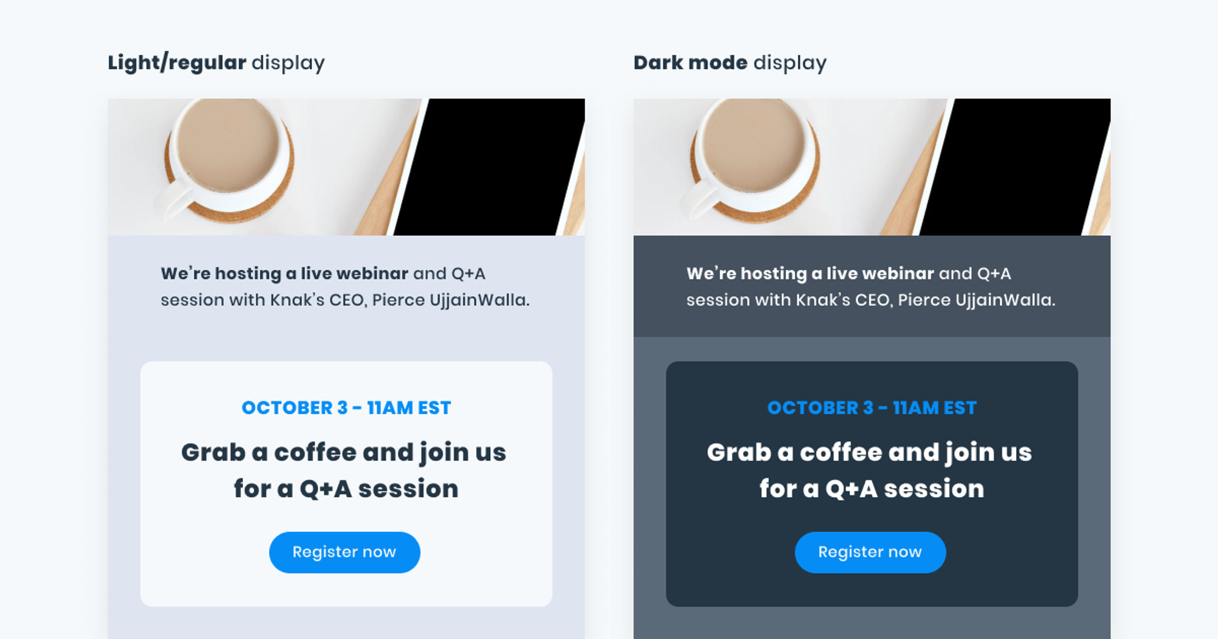
Dark mode primarily affects email backgrounds, borders, and text colours, inverting them from light to dark and, in some cases, from dark to light.
Image and logo colours are not affected, so it’s important to keep that in mind when you design.
The way dark mode changes your emails will vary between email platforms and won’t always be the same. At the moment, Gmail and Outlook have the most “comprehensive” dark modes.
All-in-all, there are generally three versions of dark mode applied across email clients today.
No colour change
The surrounding interface of the email platform changes to a dark theme, but there’s no actual change to the email.

Partial colour change
Areas with light backgrounds are changed to dark, and dark text is changed to light.

Full colour change
In this version of dark mode, areas with existing dark backgrounds are changed to light, and light text is changed to dark. But the opposite happens with light backgrounds and dark text. This means an email with an original dark design will actually render with lighter colours in a full colour change scenario.

How to design emails for dark mode
It’s surprisingly easy to make sure the emails you design are dark-mode-ready. Just keep these three simple design rules in mind.
Rule #1: Make sure there’s enough colour contrast.
Ensure your background and text colours have sufficient contrast to be easily visible in both regular and dark colour schemes. WCAG 2.0 standards require a minimum contrast ratio of 4.5:1 for regular text and 3:1 for large text (18pt or larger).
I would recommend contrast-ratio.com as a handy tool to check your contrast ratio.
Rule #2: Always use transparent PNGs for logos.
Using other formats will result in a box showing around your logo in dark mode.
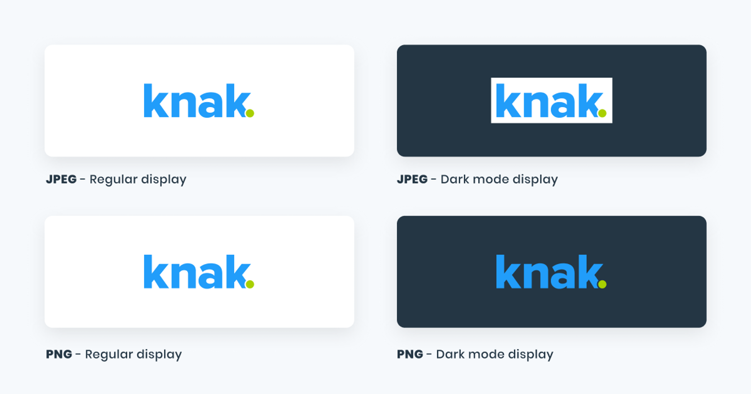
If your logo is white and you’re using a black background or vice-versa, you might run into display issues in dark mode. I would encourage you to use a bold, brand-approved colour for your logo so it’s definitely visible when the background colour changes.
Rule #3: Consider how you use borders in your designs.
Some email platforms render background and border colours differently in dark mode. That means that if you use the same colour for a background and a border, they may not render the same colour in dark mode.
It is best practice to use “invisible” borders for padding. That means you should ensure you’re adjusting the padding in your email’s code to get the same effect.
If you use the Knak platform, you can skip code altogether and simply use the built-in padding feature to increase and decrease the padding.
Keeping these three simple rules in mind will allow you to design emails that render just as beautifully in dark mode as they do without it. That said, I’d like to humbly add that Knak makes designing for dark mode incredibly easy. Our platform allows you to create beautiful codeless emails that are fully compatible with dark mode.
Click here to book a demo and see it for yourself.