Designing accessible content is a must – here’s how you do it

Felix Higgs
Director of Implementations & Support, Knak
Published Jan 20, 2022
Summary
Master the art of creating accessible emails and landing pages with Knak's comprehensive guide on design, CTAs, and more.
When we think about accessibility, we so often limit our perspective to physical settings. We think about elevators, ramps, and accessible parking spots, which are all designed to make life easier for people with mobility impairments. But that’s just a small part of the whole. Accessibility should be just as important a consideration in online spaces so that everyone can access the content they want in a format that makes sense to them.
The truth of the matter is that a lot of online content – whether it’s an email, landing page, or mobile application – isn’t fully accessible. And, unfortunately, for many businesses, making that content accessible isn’t always at the top of the list of priorities. But it should be.
To help those who are interested in rethinking their content with accessibility in mind, in this post we’re taking a look at what it means to make emails and landing pages more accessible. Let’s get started.
What it means to make content accessible
Starting with the basics, it’s important to first understand what we mean by accessible content. According to the Web Content Accessibility Guidelines (WCAG), a set of recommendations developed by the World Wide Web Consortium (W3C), there are four key principles for creating accessible digital content that meets the needs of auditory, cognitive, neurological, physical, speech and visual disabilities.
- Perceivable: Information and user interface components should be presented to users in ways that they can perceive easily.
- Operable: Accessible content should have user interface components and navigation that are easy to use. This includes keyboard navigation and shortcuts.
- Understandable: Content on the user interface should be understandable both by the reader and any assistive technologies including text-to-speech readers.
- Robust: The content produced should be easily interpreted by a wide variety of user agents, including assistive technologies.
The WCAG 2.1 guidelines aren’t the only ones out there. Other helpful standards include the Americans with Disabilities Act and the Accessibility for Ontarians with Disabilities Act, which ladders up to broader Canadian regulations.
Why is accessible content so important?
Let’s put this in perspective. According to the World Bank, 15% of the world’s population lives with some form of disability. That’s 15% of the population that spans across multiple age, cultural, and professional demographics. That means that within your target audiences, there are bound to be people who live with some form of disability, and you should make sure that your content reaches them in a way that they can fully experience it.
Today, the cost of not getting this right is steep. On the one hand, you risk alienating a large segment of your target audience. On the other, you risk compromising your brand’s reputation by opening yourself up to getting sued. Big brands that have seen web accessibility litigation include Netflix, Nike, and Domino’s – and that’s not a good look.
So, how can you stay out of the headlines and better serve your audience with accessible content?
Accessible content in practice
As mentioned above, to make content accessible, you should make sure that it’s easily accessed, understood, navigated, and interacted with by everyone – whether they’re using assistive technology or need a different way of engaging with your content. When it comes to emails and landing pages, these are some of the elements you should consider adjusting to make the overall experience more accessible.
Subject lines & preview text
Your subject lines and preview text should be descriptive and tell people what they’re going to find in the email. You should also be careful with how you use emojis. Emojis can’t be read by screen readers, so if you use one to replace an actual word, it won’t be clear to someone using text-to-speech technology.
A title at the top of the email – one that’s not an unreadable image – can also play an important role here.
Images
All of your images should have alt text that describes what’s in the image and how it relates to the piece of content. Just listing the items in the image isn’t enough here, you should also include distinctive features such as colour and shape.
Another thing to remember with images is that if you have text embedded within them, a screen reader won’t be able to capture that. So, if you’re using images as headers or section dividers, people could lose out on important context.
Something to note here, particularly for landing pages, is that there’s currently a tension between SEO best practices and accessibility requirements. While an SEO professional will tell you to include your keyword in your featured image’s alt text, it doesn’t necessarily make sense to do that if it detracts from the accessible experience.
Behind the scenes elements
There are many attributes that you can add to your content that operate under the surface. For example, you can add roles or labels to each section of your email so that assistive technologies can read them accordingly. You can also use HTML language attributes to guide screen readers to pronounce words correctly.
Another important best practice here is to have a plain text version of your email. This extracts the text from your email and makes it much easier to read for assistive tech.
Links and CTAs
Instead of using simple terms like “click here” or “shop now” in your links and CTAs, give your readers a bit more context. If you add a bit more detail (e.g. shop our Christmas catalogue now), your readers will be better able to choose from different CTAs.
You should also provide clear instructions in your content that don’t rely entirely on visual cues like a giant arrow or a line that flows from one content section to another. This will help guide your readers through the content more effectively.
Forms and other inputs
On landing pages, if you’re including a form, the input fields should be sized appropriately and paired with descriptive sentences. Any drop-down elements should also be compatible with assistive technologies such as voice-enabled tools and navigation shortcuts.
Video
This is a big one. If you’re embedding a video of any type on your email or landing page, it should always include an option for captions for people with hearing impairments.
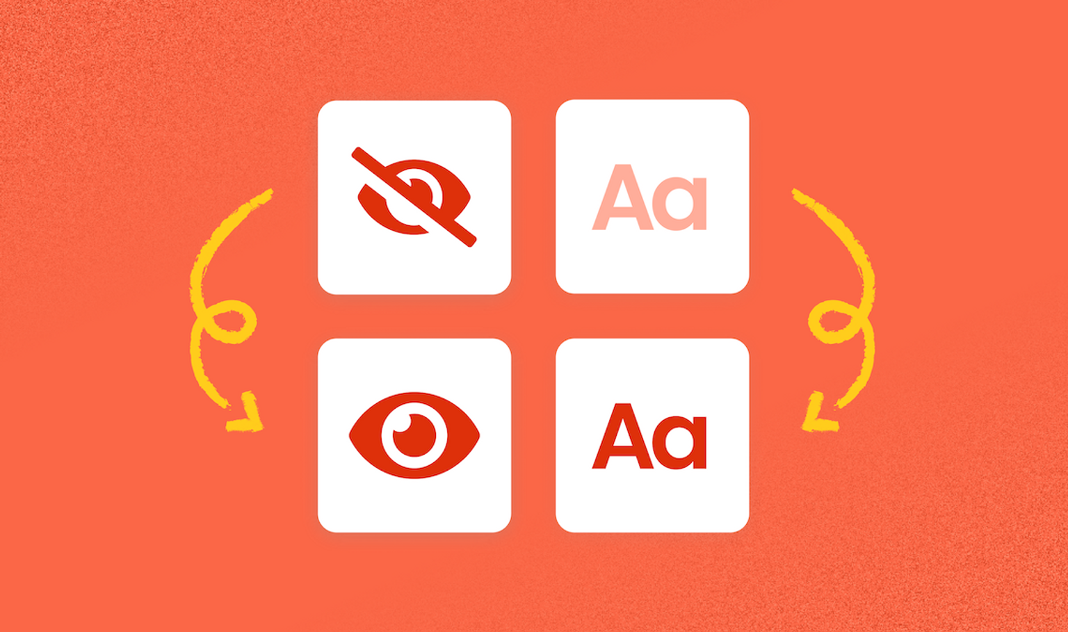
Design
As you’re designing your content, use modern, responsive design elements that make things clear and easy to understand.
- Use legible fonts that are at least 14pt in size.
- Make sure you have good colour contrast (tools like WebAIM’s Contrast Checker or Contrast Ratio can help here).
- Underline or bold your links to make them easy to see.
- Use a logical structure and be careful with multi-column designs that aren’t responsive to smaller screens.
- Avoid blinking or flashing elements that get in the way of people digesting your content.
It’s important to note that this isn’t an exhaustive list. As you learn more about what makes content accessible – and the space continues to evolve – there will be other best practices that you can implement for your audience.
Remember: you’re not making a compromise
The design principles that make content accessible are generally the same ones behind good design practices. At the end of the day, you’re creating content that’s simple, logical, and easy to understand – and that benefits absolutely everyone. So it shouldn’t feel like you’re compromising your campaign or its messaging by making it accessible.
As we keep refining our knowledge around the content that does – and doesn’t – make sense for all our readers, there’s still a lot to learn. At Knak, we’re excited to continue being part of the conversation and ensuring that our emails and landing pages are truly equipped to reach anyone who wants to read and engage with them.
Want to quickly build emails and landing pages that are reliably accessible for your audience? Check out Knak or request a demo.